SwiftUI Backports
Introducing a collection of SwiftUI backports to make your iOS development easier.
Many backports support iOS 13+ but where UIKIt features were introduced in later versions, the same will be applicable to these backports, to keep parity with UIKit.
In some cases, I’ve also included additional APIs that bring more features to your SwiftUI development.
Note, all backports will be API-matching to Apple’s offical APIs, any additional features will be provided separately.
All backports are fully documented, in most cases using Apple’s own documentation for consistency. Please refer to the header docs or Apple’s original documentation for more details.
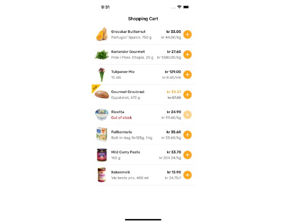
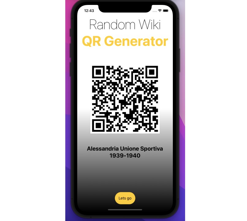
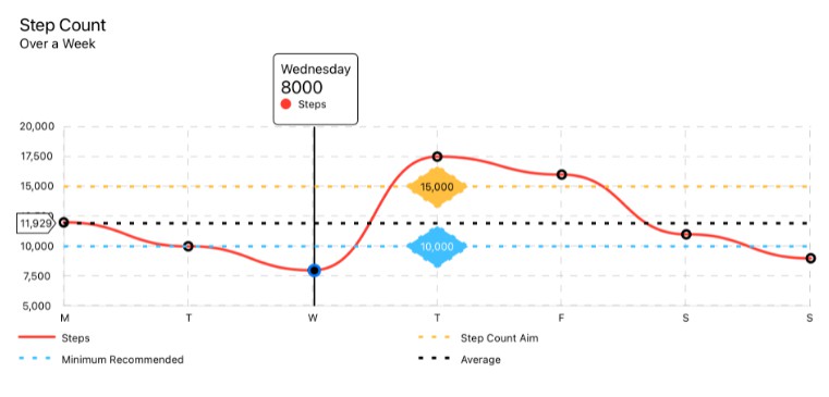
There is also a Demo project available where you can see full demonstrations of all backports and additional features, including reference code to help you get started.
Usage
The library adopts a backport design by Dave DeLong that makes use of a single type to improve discoverability and maintainability when the time comes to remove your backport implementations, in favour of official APIs.
Backports of pure types, can easily be discovered under the Backport namespace. Similarly, modifiers are discoverable under the .backport namespace.
Unfortuantely
Environmentbackports cannot be access this way, in those cases the Apple API values will be prefixed withbackportto simplify discovery.
Types:
@Backport.AppStorage("filter-enabled")
private var filterEnabled: Bool = false
Modifier:
Button("Show Prompt") {
    showPrompt = true
}
.sheet(isPresented: $showPrompt) {
    Prompt()
        .backport.presentationDetents([.medium, .large])
}
Environment:
@Environment(\.backportRefresh) private var refreshAction
Backports
AsyncImageAppStoragebackground– ViewBuilder APINavigationDestination– uses a standard NavigationViewnavigationTitle– newer APIoverlay– ViewBuilder APIonChangeProgressViewpresentationDetentspresentationDragIndicatorRefreshableScaledMetricSection– header asStringorLocalizedStringKeytask– async/await modifier
Extras
Modal Presentations
Adding this to your presented view, you can use the provided closure to present an ActionSheet to a user when they attempt to dismiss interactively. You can also use this to disable interactive dismissals entirely.
presentation(isModal: true) { /* attempt */ }
FittingGeometryReader
A custom GeometryReader implementation that correctly auto-sizes itself to its content. This is useful in many cases where you need a GeometryReader but don’t want it to implicitly take up its parent View’s bounds.
FittingScrollView
A custom ScrollView that respects Spacer‘s when the content is not scrollable. This is useful when you need to place a view at the edges of your scrollview while its content is small enough to not require scrolling. Another great use case is vertically centered content that becomes top aligned once the content requires scrolling.
PageView
A pure SwiftUI implementation of a page-based view, using the native TabView and my custom FittingGeometryReader to size itself correctly. Since this uses a TabView under-the-hood, this allows you to use the same APIs and features from that view.
Installation
You can install manually (by copying the files in the Sources directory) or using Swift Package Manager (preferred)
To install using Swift Package Manager, add this to the dependencies section of your Package.swift file:
.package(url: "https://github.com/shaps80/SwiftUIBackports.git", .upToNextMinor(from: "1.0.0"))


