SwiftUI Circular Control
A custom circular progress bar made in SwiftUI.
Features
- Highly customizable
- Animatable
- Updated to the latest syntax
Usage
- Install via Swift Package Manager
- Create a
PZCircularControlParamsobject to configure the style of your control (optional) - Instanciate a
PZCircularControland pass in the params
Basic example
PZCircularControl(
    PZCircularControlParams(
        innerBackgroundColor: Color.clear,
        outerBackgroundColor: Color.gray.opacity(0.5),
        tintColor: LinearGradient(gradient: Gradient(colors: [.red, .orange]), startPoint: .topLeading, endPoint: .bottomTrailing)
    )
)
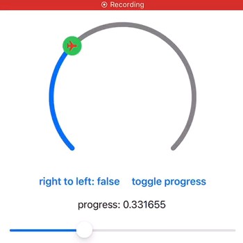
This produces the following output:
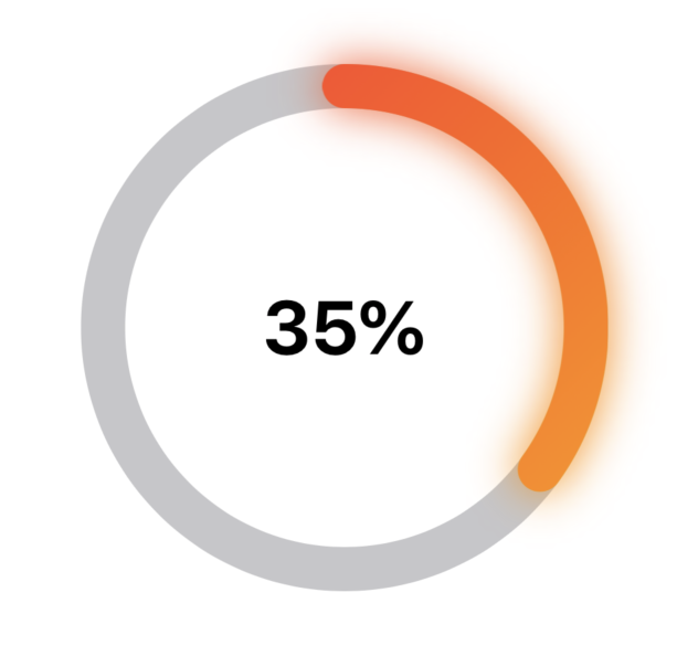
The params object's instance data can be modified and animated. For example, the following code animates the control to the 35% state when the button is tapped:
PZExampleButton(label: "35%", font: .headline) {
    withAnimation(.easeInOut(duration: 1.0)) {
        control.params.progress = CGFloat(0.35)
    }
}
More examples
Dark background (see cover image)
PZCircularControl(
    PZCircularControlParams(
        innerBackgroundColor: Color.black,
        outerBackgroundColor: Color.black,
        tintColor: LinearGradient(gradient: Gradient(colors: [.yellow, .pink]), startPoint: .bottomLeading, endPoint: .topLeading),
        textColor: .orange,
        barWidth: 24.0,
        glowDistance: 15.0,
        initialValue: CGFloat(Float.random(in: 0...1))
    )
)
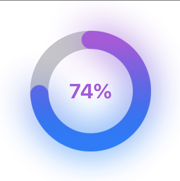
Purple text and gradient fill
PZCircularControl(
    PZCircularControlParams(
        innerBackgroundColor: Color.clear,
        outerBackgroundColor: Color.gray.opacity(0.5),
        tintColor: LinearGradient(gradient: Gradient(colors: [.blue, .purple]), startPoint: .bottomLeading, endPoint: .topLeading),
        textColor: .purple,
        barWidth: 30.0,
        glowDistance: 30.0,
        initialValue: CGFloat(Float.random(in: 0...1))
    )
)
Customization
PZCircularControlParams object is accessible through the params instance field of a PZCircularControl. Any change to the instance will be reflected on the control automatically, without the need to refresh it or reload any data.
Some customization options include:
progress(accessible via<<yourControlInstance>>.params.progress) – the current progress the control displays (from 0.0 to 1.0, asCGFloat).glowDistance– the radius of the glow effect around the control (CGFloat). Set to 0.0 to remove the glow.barWidth– the width of the stroke of the control.textColor– the progress label color (as SwiftUIColor).font– the progress label font (as SwiftUIFont).innerBackgroundColor– the color of the inner part of your control (inner radius). Has to conform toShapeStyle(ie. anything fromColortoGradient).outerBackgroundColor– the color of the active part's background. Has to conform toShapeStyle(ie. anything fromColortoGradient).tintColor– the tint color of the active area of your control. Has to conform toShapeStyle(ie. anything fromColortoGradient).textFormatter– an optional closure that takes in a CGFloat value of the current progress between 0.0 and 1.0 and returns formatted text that will be displayed in the center of the progress bar.