ToastSwiftUI
A simple way to show a toast or a popup in SwiftUI
About
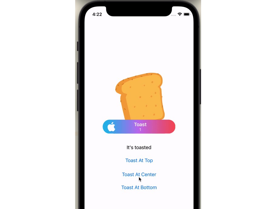
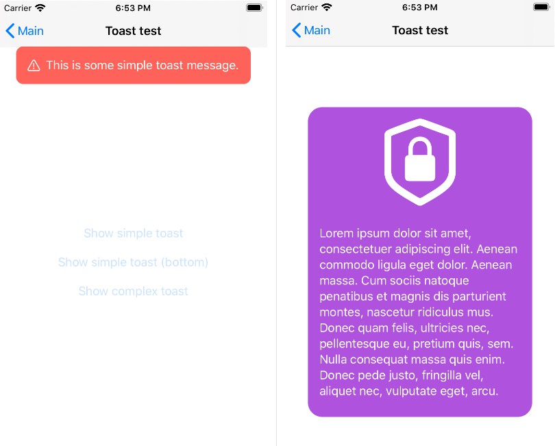
SwiftUI is a great thing that Apple brought to iOS developers in 2019. But it still hasn’t provided us a way to show a toast, a short time message. Toast message is quite popular in iOS applications, even it is not a native view. This ToastSwiftUI open source will help you to do that easily.
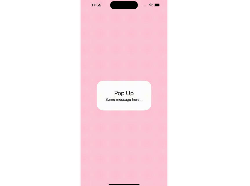
Showing a popup is the same, not too difficult, but there is no native API for it. This open source also helps you.
Example
To run the example project, clone the repo, and run pod install from the Example directory first.
Requirements
- Swift 5.0 or later
- iOS 13 or later
Installation
Cocoapod
ToastSwiftUI is available through CocoaPods. To install
it, simply add the following line to your Podfile:
pod 'ToastSwiftUI'
Then run pod install in your command line.
Swift Package Manager
In Xcode, select menu File -> Swift Packages -> Add Package Dependency. Select a target, then add this link to the input field:
https://github.com/huynguyencong/ToastSwiftUI.git
Manual
Sometimes you don’t want to use Cocoapod to install. In this case, you need to add it manually. It is very simple, just add Swift files in the ToastSwiftUI/Classes to your project.
Usage
Showing a popup
- Step 1: Add a @State variable to control when showing the popup.
@State private var isPresentingPopup = false
- Step 2: Add
popupmodifier to your view with the binding variable in step 1.MyPopupis a view that you want to show as a popup. Setting frame is not necessary if you are happy with the intrinsic size of the pop up view
.popup(isPresenting: $isPresentingPopup, overlayColor: Color.black.opacity(0.4)) {
    MyPopup(isPresenting: $isPresentingPopup)
        .frame(width: 300, height: 500)         // it is not required
}
- Step 3: Show the toast by set variable in the step 1 to true. You can also dismiss it by set it to false:
self.isPresentingPopup = true
Showing a toast
- Step 1: Add a @State variable to control when showing the toast.
@State private var isPresentingToast = false
- Step 2: Add
toastmodifier to your view with the binding variable in step 1.
.toast(isPresenting: $isPresentingToast, message: "Success", icon: .success)
- Step 3: Show the toast by set variable in the step 1 to true. You can also dismiss it by set it to false:
self.isPresentingPopup = true
Showing a toast with a message state variable
- Step 1: Add a optional
String@Statevariable. When this optional variable has value, it will trigger a toast.
@State private var toastMessage: String?
- Step 2: Add
toastmodifier, pass theBinding($) of the above message variable as the first param.
.toast($toastMessage)
- Step 3: Show the toast by setting variable in the step 1 to a
String. You can also dismiss it by set it tonil:
toastMessage = "Hello world!"
See the completed code below, it has 3 examples to show both toast and popup in different way:
import SwiftUI
import ToastSwiftUI

struct ContentView: View {
    // 1.1. Example 1: Add @State variables to control when showing the popup
    @State private var isPresentingPopup = false

    // 1.2. Example 2: First way to show a toast. Add @State variables to control when showing the toast
    @State private var isPresentingToast = false

    // 1.3. Example 3: Second way to show a toast. Add an optional String @State variables to control when showing the toast
    @State private var toastMessage: String?

    @State private var count = 0

    var body: some View {
        VStack(spacing: 20) {
            Button("Show a success toast with a boolean variable") {
                // 3.2.1. Set state variable to true if you want to show the toast
                self.isPresentingToast = true
            }

            Button("Dismiss the success toast") {
                // 3.2.2. Set state variable to false if you want to hide the toast
                self.isPresentingToast = false
            }

            Divider()

            Button("Show toast with a text binding") {
                // 3.3.1. Set text variable you want to show
                toastMessage = "Toast number \(count)"

                count += 1
            }

            Button("Dismiss toast") {
                // 3.3.2. Set text variable to nil
                self.toastMessage = nil
            }

            Divider()

            Button("Show popup") {
                // 3.1.1. Set state variable to true if you want to show the popup
                self.isPresentingPopup = true
            }

            Button("Dismiss popup") {
                // 3.1.2. Set state variable to true if you want to hide the popup
                self.isPresentingPopup = false
            }

            Spacer()
        }
        .padding()

        // 2.1. Add a `popup` modifier to your view with the binding variable in step 1
        .popup(isPresenting: $isPresentingPopup, popup:
            MyPopup(isPresenting: $isPresentingPopup)
                .background(Color(.systemBackground))
        )

        // 2.2. Add a `toast` modifier to your view with the binding variable in step 1
        .toast(isPresenting: $isPresentingToast, message: "Success", icon: .success)

        // 2.3. Add a `toast` modifier to your view with the binding variable in step 1
        .toast($toastMessage)
    }
}
Customization
popup modifier parameters:
-
autoDismiss
- none: No auto dismiss, you have to dismiss manually.
- after(TimeInterval): Auto dismiss after a duration that you pass to.
- auto(String): Auto dissmiss after a duration that calculated base on the text you show.
-
hasShadow
-
cornerRadius
-
overlayColor
-
isTapOutsideToDismiss
toast modifier parameters:
-
autoDismiss
- none: No auto dismiss, you have to dismiss manually.
- after(TimeInterval): Auto dismiss after a duration that you pass to.
- auto: Auto dissmiss after a duration that calculated base on the text you show.
-
icon
- info
- error
- success
- custom(Image): Show icon as the image you provided.
- loading: Show icon as a rotating loading indicator.
-
backgroundColor
-
textColor
UIKit version
Author
Huy Nguyen, [email protected]
License
ToastSwiftUI is available under the MIT license. See the LICENSE file for more info.


