VerticalSplit
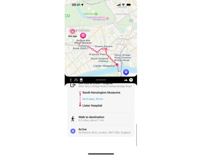
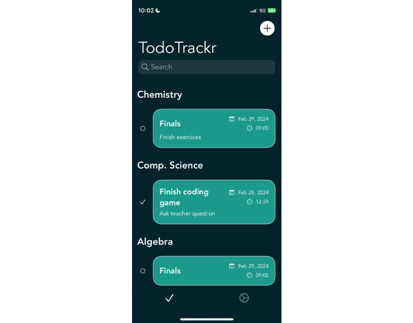
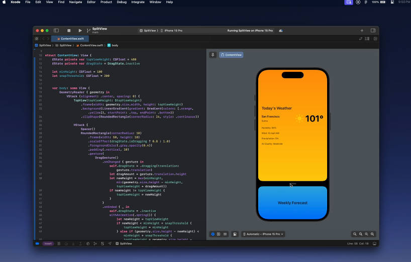
This package is heavily inspired by the splitscreen impelementation from the Amie iOS app.
Usage
import VerticalSplit

VerticalSplit(
    topTitle: "Top View",
    bottomTitle: "Bottom View",
    topView: {
        // Top Content
    },
    bottomView: {
        // Bottom Content
    }
)
Mini Overlays
Add custom content to show when the top or bottom views are in their smallest size.
VerticalSplit(
    topTitle: "Top View",
    bottomTitle: "Bottom View",
    topView: {
        // Top Content
    },
    bottomView: {
        // Bottom Content
    },
    topMiniOverlay: {
        // Shown instead of the Top Content when Top View is minimised
    },
    bottomMiniOverlay: {
        // Shown instead of the Bottom Content when Bottom View is minimised
    }
)
SplitDetent Binding
Use a binding to control the split between the top and bottom views.
@State var currentDetent: SplitDetent.fraction(0.5)

VerticalSplit(
    detent: $currentDetent
    topTitle: "Top View",
    bottomTitle: "Bottom View",
    ...
)
Accessories
Use the leadingAccessories and trailingAccessories modifiers to add buttons in the drag region.
VerticalSplit(...)
    .leadingAccessories([
        SplitAccessory(systemName: "plus.circle.fill") {
            // Perform action
        },
        SplitAccessory(systemName: "minus.circle.fill") {
            // Perform action
        }
    ])
Menu Accessories
Use the menuAccessories modifier to add buttons in a pop-out menu un the drag region.
VerticalSplit(...)
    .menuAccessories([
        MenuAccessory(title: "Plus", systemName: "plus.circle.fill", color: .green) {
            // Perform action
        },
        MenuAccessory(title: "Minus", systemName: "minus.circle.fill", color: .red) {
            // Perform action
        }
    ])
Background Color
Set the background color for the top and bottom view containers, as well as the menu buttons,
VerticalSplit(...)
    .backgroundColor(.gray)
Debugging
Control whether or not logs are made for debugging.
VerticalSplit(...)
    .debug(true)
