LazyPager for SwiftUI
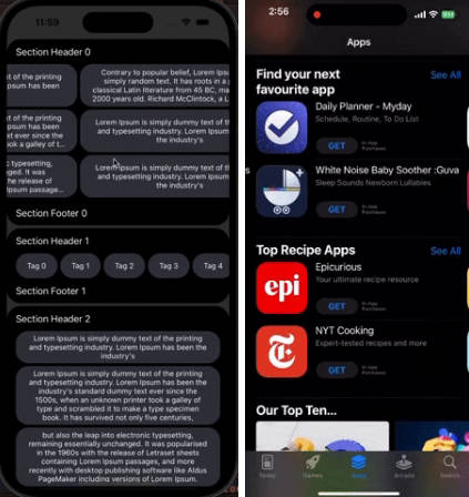
A buttery smooth, lazy loaded, panning, zooming, and gesture dismissible pager view for SwiftUI.
The goal with this library is to expose a simple SwiftUI interface for a fluid and seamless content viewer.

The above example is from dateit demonstrating the capabilities of this library. Note: the overlay is custom and can be added by putting LazyPager inside a ZStack
Usage
Add the Swift Package
- Right click on your project ->
Add Package - In the search bar paste:
https://github.com/gh123man/LazyPager - Click
Add Package
Or add the package to your Package.swift if your project is a Swift package.
Example
@State var data = [ ... ]
@State var show = true
@State var opacity: CGFloat = 1 // Dismiss gesture background opacity
@State var index = 0

var body: some View {
    Button("Open") {
        show.toggle()
    }
    .fullScreenCover(isPresented: $show) {

        // Provide any list of data and bind to an index
        LazyPager(data: data, page: $index) { element in

            // Supports any kind of view - not only images
            Image(element)
                .resizable()
                .aspectRatio(contentMode: .fit)
        }

        // Make the content zoomable
        .zoomable(min: 1, max: 5)

        // Enable the swipe to dismiss gesture and background opacity control
        .onDismiss(backgroundOpacity: $opacity) {
            show = false
        }

        // Handle single tap gestures
        .onTap {
            print("tap")
        }

        // Get notified when to load more content
        .shouldLoadMore {
            data.append("foobar")
        }

        // Set the background color with the drag opacity control
        .background(.black.opacity(opacity))

        // A special included modifier to help make fullScreenCover transparent
        .background(ClearFullScreenBackground())

        // Works with safe areas or ignored safe areas
        .ignoresSafeArea()
    }
}
For a full working example, open the sample project in the examples folder, or check out the code here
Features
- All content is lazy loaded. By default content is pre-loaded 3 elements ahead and behind the current index.
- Display any kind of content – not just images!
- Lazy loaded views are disposed when they are outside of the pre-load frame to conserve resources.
- Enable zooming and panning with
.zoomable(min: CGFloat, max: CGFloat) - Double tap to zoom is also supported.
- Notifies when to load more content with
.shouldLoadMore - Works with
.ignoresSafeArea()(or not) to get a true full screen view. - Drag to dismiss is supported with
.onDismiss– Supply a binding opacity value to control the background opacity during the transition. - Tap events are handled internally, so use
.onTapto handle single taps (useful for hiding and showing UI) - Use
.settingsto modify advanced settings
Detailed usage
Working with fullScreenCover
fullScreenCover is a good native element for displaying a photo browser, however it has an opaque background by default that is difficult to remove. So LazyPager provides a ClearFullScreenBackground background view you can use to fix it. Simply add .background(ClearFullScreenBackground()) to the root element of your fullScreenCover. This makes the pull to dismiss gesture seamless.
Double tap to zoom
You can customize the double tap behavior using the zoomable(min: CGFloat, max: CGFloat, doubleTapGesture: DoubleTap). By default doubleTapGesture is set to .scale(0.5) which means “zoom 50% when double tapped”. You can change this to a different ratio or set it to .disabled to disable the double tap gesture.
Dismiss gesture handling
By default .onDismiss will be called after the pull to dismiss gesture is completed. It is often desirable to fade out the background in the process. LazyPager uses a fully transparent background by default so you can set your own custom background.
To control the dismiss opacity of a custom background, use a Binding<CGFloat> like .onDismiss(backgroundOpacity: $opacity) { to fade out your custom background.


