KeyboardToolbar
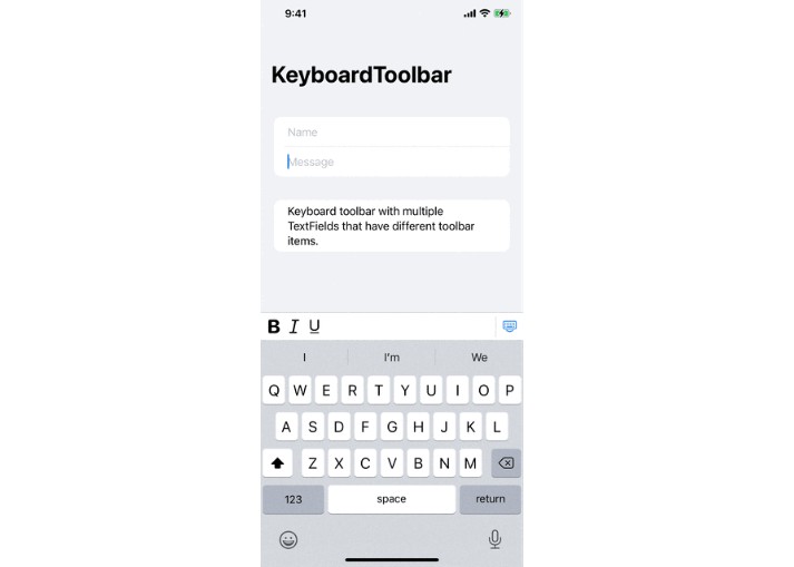
A SwiftUI Toolbar that sits on top of the keyboard.
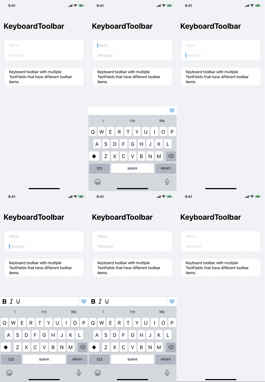
You can find example files in Tests/ExampleViews
Installation
Supports iOS 14.0+.
Swift Package Manager
Add https://github.com/cameronshemilt/KeyboardToolbar to your Package Dependencies.
Usage
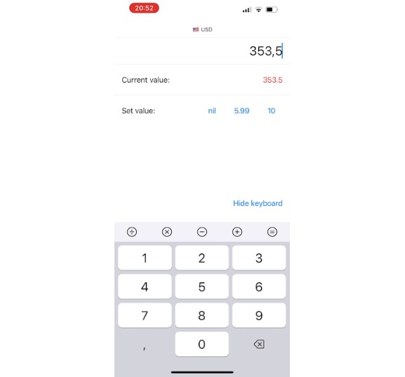
The KeyboardToolbar can contain multiple KeyboardToolbarItems you provide.
You can additionally style the toolbar (size, color, padding etc.) via a KeyboardToolbarStyle.
import KeyboardToolbar

let toolbarItems: [KeyboardToolbarItem] = [
    .init("bold", callback: {}),
    .init("italic", callback: {}),
    .init("underline", callback: {}),
    .dismissKeyboard
]

struct ContentView: View {
    @State private var text: String = ""

    var body: some View {
        Form {
            TextField("Input", text: $text)
        }
        .keyboardToolbar(toolbarItems)
    }
}
API
KeyboardToolbar
| Parameter | Type | Optional | Description |
|---|---|---|---|
items |
[KeyboardToolbarItem] |
No | All of the KeyboardToolbarItems you want the Toolbar to contain. |
style |
KeyboardToolbarStyle |
Yes | The styling of the toolbar. |
Use by attaching .keyboardToolbar(...) to the outermost part of your View.
KeyboardToolbarItem
| Parameter | Type | Optional | Description |
|---|---|---|---|
image |
Image |
Yes | The image/icon of the toolbar icon. Convenience initializers exist for systemName and name |
text |
String |
Yes | The text of the toolbar icon. Alternative to displaying an image. |
color |
Color |
Yes | Color of the image/icon |
isFixed |
KeyboardToolbarEdge? |
Yes | Whether the item should be sticky or not. Possible values: nil, .leading or .trailing. |
callback |
() -> Void |
No | Action the item should perform when pressed |
Presets
.dismissKeyboard: A button fixed to the right side that will dismiss the keyboard when tapped.
KeyboardToolbarStyle
| Parameter | Type | Optional | Description |
|---|---|---|---|
backgroundColor |
Color |
Yes | The background color of the toolbar. |
height |
CGFloat |
Yes | Height of the toolbar. |
itemSize |
CGFloat |
Yes | Size of the toolbar items. |
itemSpacing |
CGFloat |
Yes | Spacing between the toolbar items. |
dividerColor |
Color |
Yes | Color of the divider above the toolbar, as well as the dividers between the fixed and not fixed items. |
dividerWidth |
CGFloat |
Yes | Width of the dividers. |
Presets
.standard.contrast
