ActionButton
Button alternative providing built-in states for .enabled, .disabled, and .loading.
action-button-example.mov
How to Use
- Import
ActionButton - Create a state or binding variable of type
ActionState. This will drive the content ofActionButton - Add
ActionButtonto your view and configure it.
Below is a an example of the code used in the video demo above. So how do we animate between states?
@State var actionButtonState: ActionButtonState =
    .enabled(.init(title: "Load Something", systemImage: "bolt"))

var body: some View {

    VStack {

        Text("Just a little button.")
        ActionButton(state: $actionButtonState, onTap: {

            loadSomething()
        }, backgroundColor: .red)
            .frame(maxWidth: 250)
    }
}
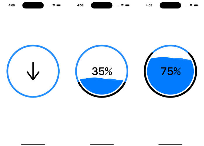
Animating between states.
Animating between states is handled automatically. Take a look at our loadSomething() function.
private func loadSomething() {

    actionButtonState = .loading(.init(title: "Loading", systemImage: "bolt"))

    DispatchQueue.main.asyncAfter(deadline: .now() + 1.25) {

        actionButtonState = .disabled(.init(title: "Loaded", systemImage: "checkmark"))
    }
}
In our example, we use a delay to simply change the state variable actionButtonState. The view responds accordingly.
Configuration
ActionButton takes in a handful of parameters in its initialization.
state:ActionButtonState– This is an enum (enabled, loading, disabled) with an associated value of typeActionButtonModelwhich allows you to set the SFSymbol and text of the button.onTap:(() -> Void)– A callback to handle any taps. This is required sinceActionButtonhandles its own tap animation. Your ownonTapGesturewon’t work here.backgroundColor:Color– the background color for the button during itsenabledstate.foregroundColor:Color– the foreground color for the button during all states.