CompositionalLayoutDSL
CompositionalLayoutDSL is a Swift library. It makes easier to create compositional layout for collection view.
Requirements
CompositionalLayoutDSL is written in Swift 5. Compatible with iOS 13.0+, tvOS 13.0+ and macOS 10.15+.
Documentation
An online documentation can be found here.
Getting started
To see some usage of this library you can look to:
- An example project is available and contains an iOS and a macOS application.
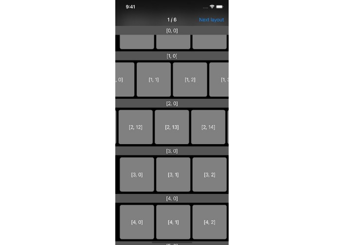
- The testing target which contains snapshot tests. The tests verify that the DSL behave the same way of using UIKit directly, the snapshot can be found here.
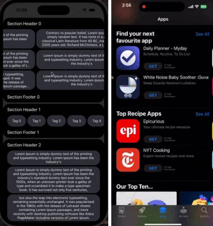
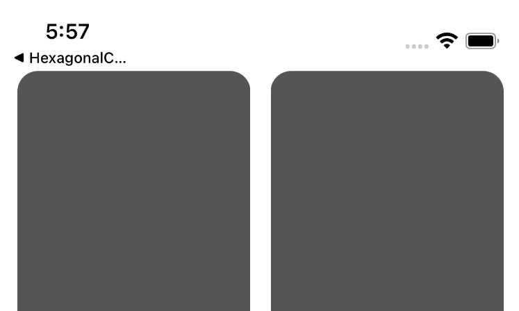
Here some layout examples:
| Screenshot for the layout code | Layout code |
 |
Here an example from the test target: GroupDSLTests.swift (contains the same layout without the DSL) let layout = CompositionalLayout { section, environment in
Section {
HGroup {
Item(width: .fractionalWidth(1 / 3))
.contentInsets(trailing: 4)
VGroup(count: 2) { Item() }
.width(.fractionalWidth(1 / 3))
.interItemSpacing(.fixed(8))
.contentInsets(horizontal: 4)
VGroup(count: 3) { Item() }
.width(.fractionalWidth(1 / 3))
.interItemSpacing(.fixed(8))
.contentInsets(leading: 4)
}
.height(.absolute(100))
.contentInsets(horizontal: 16)
}
.interGroupSpacing(8)
}
.interSectionSpacing(8)
// Apply to a collection view
collectionView.setCollectionViewLayout(layout, animated: false)
// or
collectionView.collectionViewLayout = LayoutBuilder { layout }
|
 |
Here is an example from the Example project: GettingStartedCompositionalLayout.swift collectionView.collectionViewLayout = LayoutBuilder {
Section {
VGroup(count: 1) { Item() }
.height(.fractionalWidth(0.3))
.width(.fractionalWidth(0.3))
.interItemSpacing(.fixed(8))
}
.interGroupSpacing(8)
.contentInsets(horizontal: 16, vertical: 8)
.orthogonalScrollingBehavior(.continuous)
.supplementariesFollowContentInsets(false)
.boundarySupplementaryItems {
BoundarySupplementaryItem(elementKind: UICollectionView.elementKindSectionHeader)
.height(.absolute(30))
.alignment(.top)
.pinToVisibleBounds(true)
}
}
|
Installation
Cocoapods
To integrate CompositionalLayoutDSL into your Xcode project using CocoaPods, specify it in your Podfile:
“>
pod 'CompositionalLayoutDSL', '~> 0.1.0'
Carthage
To integrate CompositionalLayoutDSL into your Xcode project using Carthage, specify it in your Cartfile:
“>
github "faberNovel/CompositionalLayoutDSL" ~> 0.1.0
Swift Package Manager
CompositionalLayoutDSL can be installed as a Swift Package with Xcode 11 or higher. To install it, add a package using Xcode or a dependency to your Package.swift file:
.package(url: "https://github.com/faberNovel/CompositionalLayoutDSL")
Behind the scene
Here some explanation of how this library work, it can be divided in 3 parts: the role of the core blocks, how does the modifiers works, and how the conversion to the UIKit world is handled
Core structs
This library contains all the core structs for creating a compositional layout, here the exhaustive list:
ConfigurationSectionHGroupVGroupCustomGroupItemDecorationItemSupplementaryItemBoundarySupplementaryItem
Each of those building blocks conforms to their respective public protocol and handle the immutable properties of their associated UIKit object.
For example SupplementaryItem conforms to LayoutSupplementaryItem and handles the immutable properties of NSCollectionLayoutSupplementaryItem, which are: layoutSize, elementKind, containerAnchor and itemAnchor.
Those immutable properties can only be changed on those core structs, and are not available globally on LayoutSupplementaryItem. This is the same for all core structs.
Modifiers
Mutable properties of the UIKit objects are handled by the extension of the Layout... protocols. Here some example: contentInset(_:), edgeSpacing(_:), zIndex(_:), interItemSpacing(_:), scrollDirection(_:). Changing those mutable values are done with modifiers, which are internal struct (e.g. ValueModifiedLayoutItem). As those methods provided through extension of the Layout... protocol, their are available for custom elements outside the library.
Something to note is once you applied a modifier for mutable properties you no longer have an Item, but you have a LayoutItem, so changing immutable values will not be possible afterward.
DSL to UIKit Conversion
Finally once we have combined the core structs and the modifiers, the last step is the conversion of the Layout... to the UIKit world. This is done with builders, they all work in a similar way. As an example here how ItemBuilder works:
- It tries to find a layoutItem conforming to the internal protocol
BuildableItemby calling repeatedly.layoutItem. - Then it calls
makeItem()on the candidate and returns it
⚠️
Warning
⚠️
This means that only internal struct can be converted to a UIKit object, if you try to define a custom LayoutItem and write var layoutItem: LayoutItem { self } like it is done internally, it will cause an infinite loop inside the ItemBuilder.
User of the library needs to base their custom layout on core structs provided by this library.
Credits
CompositionalLayoutDSL is owned and maintained by Fabernovel. You can follow us on Twitter at @Fabernovel.
License
CompositionalLayoutDSL is available under the MIT license. See the LICENSE file for more info.


