Grid
Grid view inspired by CSS Grid and written with SwiftUI
We are a development agency building phenomenal apps.
Overview
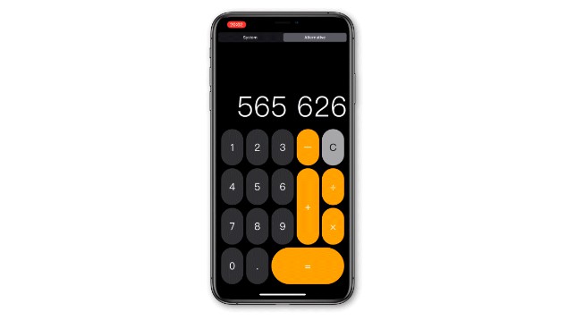
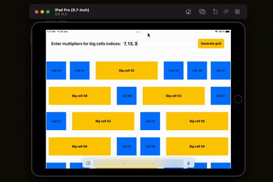
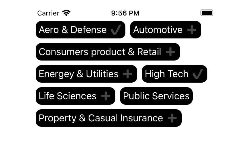
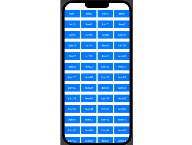
Grid is a powerful and easy way to layout your views in SwiftUI:

Check out full documentation below.
Installation
CocoaPods
Grid is available through CocoaPods. To install
it, simply add the following line to your Podfile:
pod 'ExyteGrid'
Swift Package Manager
Grid is available through Swift Package Manager.
Add it to an existing Xcode project as a package dependency:
- From the File menu, select Swift Packages › Add Package Dependency…
- Enter "https://github.com/exyte/Grid" into the package repository URL text field
Requirements
- iOS 14.0+ (the latest iOS 13 support is in v0.1.0)
- MacOS 10.15+
- Xcode 12+
Building from sources
git clone [email protected]:exyte/Grid.git
cd Grid/Example/
pod install
open Example.xcworkspace/
Documentation
- Initialization
- View containers
- Track sizes:
- Grid cell background and overlay
- Spanning grid views:
- by rows
- by columns
- View position specifying:
- automatically (implicitly)
- start row
- start column
- both row and column
- Flow direction:
- Content mode:
- Packing mode:
- Vertical and horizontal spacing
- Alignment
- Content updates can be animated
- Caching
- Conditional statements / @GridBuilder
- Release notes
- Roadmap
1. Initialization

You can instantiate Grid in different ways:
- Just specify tracks and your views inside ViewBuilder closure:
Grid(tracks: 3) {
    ColorView(.blue)
    ColorView(.purple)
    ColorView(.red)
    ColorView(.cyan)
    ColorView(.green)
    ColorView(.orange)
}
- Use Range:
Grid(0..<6, tracks: 3) { _ in
    ColorView(.random)
}
- Use Identifiable enitites:
Grid(colorModels, tracks: 3) {
    ColorView($0)
}
- Use explicitly defined ID:
Grid(colorModels, id: \.self, tracks: 3) {
    ColorView($0)
}
2. Containers
ForEach
Inside ViewBuilder you also can use regular ForEach statement.
There is no way to get KeyPath id value from the initialized ForEach view. Its inner content will be distinguished by views order while doing animations. It's better to use ForEach with Identifiable models or GridGroup created either with explicit ID value or Identifiable models to keep track of the grid views and their View representations in animations.

Grid(tracks: 4) {
    ColorView(.red)
    ColorView(.purple)

    ForEach(0..<4) { _ in
        ColorView(.black)
    }

    ColorView(.orange)
    ColorView(.green)
}
GridGroup
Number of views in ViewBuilder closure is limited to 10. It's impossible to obtain content views from regular SwiftUI Group view. To exceed that limit you could use GridGroup. Every view in GridGroup is placed as a separate grid item. Unlike the Group view any outer method modifications of GridView are not applied to the descendant views. So it's just an enumerable container. Also GridGroup could be created by Range<Int>, Identifiable models, by ID specified explicitly.
You can bind a view’s identity to the given single Hashable or Identifiable value also using GridGroup. This will produce transition animation to a new view with the same identity.
There is no way to use View's .id() modifier as inner ForEach view clears that value
You can use GridGroup.empty to define a content absence.
Examples:
var arithmeticButtons: GridGroup {
    GridGroup {
        CalcButton(.divide)
        CalcButton(.multiply)
        CalcButton(.substract)
        CalcButton(.equal)
    }
}
var arithmeticButtons: GridGroup {
    let operations: [MathOperation] =
        [.divide, .multiply, .substract, .add, .equal]

    return GridGroup(operations, id: \.self) {
        CalcButton($0)
    }
}
var arithmeticButtons: GridGroup {
    let operations: [MathOperation] =
        [.divide, .multiply, .substract, .add, .equal]

    return GridGroup {
        ForEach(operations, id: \.self) {
            CalcButton($0)
        }
    }
}
var arithmeticButtons: GridGroup {
    let operations: [MathOperation] =
        [.divide, .multiply, .substract, .add, .equal]
    return GridGroup(operations, id: \.self) {
         CalcButton($0)
    }
}
var arithmeticButtons: GridGroup {
    let operations: [MathOperation] =
        [.divide, .multiply, .substract, .add, .equal]
    return GridGroup(operations, id: \.self) {
         CalcButton($0)
    }
}
Grid {
...
    GridGroup(MathOperation.clear) {
        CalcButton($0)
    }
}
3. Track sizes
There are 3 types of track sizes that you could mix with each other:

Fixed-sized track:
.pt(N) where N - points count.
Grid(tracks: [.pt(50), .pt(200), .pt(100)]) {
    ColorView(.blue)
    ColorView(.purple)
    ColorView(.red)
    ColorView(.cyan)
    ColorView(.green)
    ColorView(.orange)
}

Content-based size: .fit
Defines the track size as a maximum of the content sizes of every view in track
Grid(0..<6, tracks: [.fit, .fit, .fit]) {
    ColorView(.random)
        .frame(maxWidth: 50 + 15 * CGFloat($0))
}
Pay attention to limiting a size of views that fills the entire space provided by parent and Text() views which tend to draw as a single line.
Flexible sized track: .fr(N)

Fr is a fractional unit and .fr(1) is for 1 part of the unassigned space in the grid. Flexible-sized tracks are computed at the very end after all non-flexible sized tracks (.pt and .fit).
So the available space to distribute for them is the difference of the total size available and the sum of non-flexible track sizes.
Grid(tracks: [.pt(100), .fr(1), .fr(2.5)]) {
    ColorView(.blue)
    ColorView(.purple)
    ColorView(.red)
    ColorView(.cyan)
    ColorView(.green)
    ColorView(.orange)
}
Also, you could specify just an Int literal as a track size. It's equal to repeating .fr(1) track sizes:
Grid(tracks: 3) { ... }
is equal to:
Grid(tracks: [.fr(1), .fr(1), .fr(1)]) { ... }
4. Grid cell background and overlay
When using non-flexible track sizes it's possible that the extra space to be allocated will be greater than a grid item is able to take up. To fill that space you could use .gridCellBackground(...) and gridCellOverlay(...) modifiers.
See Content mode and Spacing examples.
5. Spans

Every grid view may span across the provided number of grid tracks. You can achieve it using .gridSpan(column: row:) modifier. The default span is 1.
View with span >= 2 that spans across the tracks with flexible size doesn't take part in the sizes distribution for these tracks. This view will fit to the spanned tracks. So it's possible to place a view with unlimited size that spans tracks with content-based sizes (.fit)
Grid(tracks: [.fr(1), .pt(150), .fr(2)]) {
    ColorView(.blue)
        .gridSpan(column: 2)
    ColorView(.purple)
        .gridSpan(row: 2)
    ColorView(.red)
    ColorView(.cyan)
    ColorView(.green)
        .gridSpan(column: 2, row: 3)
    ColorView(.orange)
    ColorView(.magenta)
        .gridSpan(row: 2)
}

Spanning across tracks with different size types:
var body: some View {
    Grid(tracks: [.fr(1), .fit, .fit], spacing: 10) {
        VCardView(text: placeholderText(),
                  color: .red)

        VCardView(text: placeholderText(length: 30),
                  color: .orange)
            .frame(maxWidth: 70)

        VCardView(text: placeholderText(length: 120),
                  color: .green)
            .frame(maxWidth: 100)
            .gridSpan(column: 1, row: 2)

        VCardView(text: placeholderText(length: 160),
                  color: .magenta)
            .gridSpan(column: 2, row: 1)

        VCardView(text: placeholderText(length: 190),
                  color: .cyan)
            .gridSpan(column: 3, row: 1)
    }
}
6. Starts
For every view you are able to set explicit start position by specifying a column, a row or both.
View will be positioned automatically if there is no start position specified.
Firstly, views with both column and row start positions are placed.
Secondly, the auto-placing algorithm tries to place views with either column or row start position. If there are any conflicts - such views are placed automatically and you see warning in the console.
And at the very end views with no explicit start position are placed.
Start position is defined using .gridStart(column: row:) modifier.

Grid(tracks: [.pt(50), .fr(1), .fr(1.5), .fit]) {
    ForEach(0..<6) { _ in
        ColorView(.black)
    }

    ColorView(.brown)
        .gridSpan(column: 3)

    ColorView(.blue)
        .gridSpan(column: 2)

    ColorView(.orange)
        .gridSpan(row: 3)

    ColorView(.red)
        .gridStart(row: 1)
        .gridSpan(column: 2, row: 2)

    ColorView(.yellow)
        .gridStart(row: 2)

    ColorView(.purple)
        .frame(maxWidth: 50)
        .gridStart(column: 3, row: 0)
        .gridSpan(row: 9)

    ColorView(.green)
        .gridSpan(column: 2, row: 3)

    ColorView(.cyan)

    ColorView(.gray)
        .gridStart(column: 2)
}
7. Flow
Grid has 2 types of tracks. The first one is where you specify track sizes - the fixed one. Fixed means that a count of tracks is known. The second one and orthogonal to the fixed is growing tracks type: where your content grows. Grid flow defines the direction where items grow:
Rows
Default. The number of columns is fixed and defined as track sizes. Grid items are placed moving between columns and switching to the next row after the last column. Rows count is growing.
Columns
The number of rows is fixed and defined as track sizes. Grid items are placed moving between rows and switching to the next column after the last row. Columns count is growing.
Grid flow could be specified in a grid constructor as well as using .gridFlow(...) grid modifier. The first option has more priority.

struct ContentView: View {
    @State var flow: GridFlow = .rows

    var body: some View {
        VStack {
            if self.flow == .rows {
                Button(action: { self.flow = .columns }) {
                    Text("Flow: ROWS")
                }
            } else {
                Button(action: { self.flow = .rows }) {
                    Text("Flow: COLUMNS")
                }
            }

            Grid(0..<15, tracks: 5, flow: self.flow, spacing: 5) {
                ColorView($0.isMultiple(of: 2) ? .black : .orange)
                    .overlay(
                        Text(String($0))
                            .font(.system(size: 35))
                            .foregroundColor(.white)
                )
            }
            .animation(.default)
        }
    }
}
8. Content mode
There are 2 kinds of content modes:
Scroll
In this mode the inner grid content is able to scroll to the growing direction. Grid tracks that orthogonal to the grid flow direction (growing) are implicitly assumed to have .fit size. This means that their sizes have to be defined in the respective dimension.
Grid content mode could be specified in a grid constructor as well as using .gridContentMode(...) grid modifier. The first option has more priority.
Rows-flow scroll:

struct VCardView: View {
   let text: String
   let color: UIColor

   var body: some View {
       VStack {
           Image("dog")
               .resizable()
               .aspectRatio(contentMode: .fit)
               .cornerRadius(5)
               .frame(minWidth: 100, minHeight: 50)

           Text(self.text)
               .layoutPriority(.greatestFiniteMagnitude)
       }
       .padding(5)
       .gridCellBackground { _ in
           ColorView(self.color)
       }
       .gridCellOverlay { _ in
           RoundedRectangle(cornerRadius: 5)
               .strokeBorder(Color(self.color.darker()),
                             lineWidth: 3)
       }
   }
}

struct ContentView: View {
   var body: some View {
       Grid(tracks: 3) {
           ForEach(0..<40) { _ in
               VCardView(text: randomText(), color: .random)
                   .gridSpan(column: self.randomSpan)
           }
       }
       .gridContentMode(.scroll)
       .gridPacking(.dense)
       .gridFlow(.rows)
   }

   var randomSpan: Int {
       Int(arc4random_uniform(3)) + 1
   }
}
Columns-flow scroll:

struct HCardView: View {
   let text: String
   let color: UIColor

   var body: some View {
       HStack {
           Image("dog")
               .resizable()
               .aspectRatio(contentMode: .fit)
               .cornerRadius(5)

           Text(self.text)
               .frame(maxWidth: 200)
       }
       .padding(5)
       .gridCellBackground { _ in
           ColorView(self.color)
       }
       .gridCellOverlay { _ in
           RoundedRectangle(cornerRadius: 5)
               .strokeBorder(Color(self.color.darker()),
                             lineWidth: 3)
       }
   }
}

struct ContentView: View {
   var body: some View {
       Grid(tracks: 3) {
           ForEach(0..<8) { _ in
               HCardView(text: randomText(), color: .random)
                   .gridSpan(row: self.randomSpan)
           }
       }
       .gridContentMode(.scroll)
       .gridFlow(.columns)
       .gridPacking(.dense)
   }

   var randomSpan: Int {
       Int(arc4random_uniform(3)) + 1
   }
}

Fill
Default. In this mode, grid view tries to fill the entire space provided by the parent view with its content. Grid tracks that orthogonal to the grid flow direction (growing) are implicitly assumed to have .fr(1) size.
@State var contentMode: GridContentMode = .scroll

var body: some View {
    VStack {
        self.modesPicker

        Grid(models, id: \.self, tracks: 3) {
            VCardView(text: $0.text, color: $0.color)
                .gridSpan($0.span)
        }
        .gridContentMode(self.contentMode)
        .gridFlow(.rows)
        .gridAnimation(.default)
    }
}
9. Packing
Auto-placing algorithm could stick to one of two strategies:
Sparse
Default. The placement algorithm only ever moves “forward” in the grid when placing items, never backtracking to fill holes. This ensures that all of the auto-placed items appear “in order”, even if this leaves holes that could have been filled by later items.
Dense
Attempts to fill in holes earlier in the grid if smaller items come up later. This may cause items to appear out-of-order, when doing so would fill in holes left by larger items.
Grid packing could be specified in a grid constructor as well as using .gridPacking(...) grid modifier. The first option has more priority.
Example:

@State var gridPacking = GridPacking.sparse

var body: some View {
    VStack {
        self.packingPicker

        Grid(tracks: 4) {
            ColorView(.red)

            ColorView(.black)
                .gridSpan(column: 4)

            ColorView(.purple)

            ColorView(.orange)
            ColorView(.green)
        }
        .gridPacking(self.gridPacking)
        .gridAnimation(.default)
    }
}
10. Spacing
There are several ways to define the horizontal and vertical spacings between tracks:
- Using
Intliteral which means equal spacing in all directions:
Grid(tracks: 4, spacing: 5) { ... }
- Using explicit init
Grid(tracks: 4, spacing: GridSpacing(horizontal: 10, vertical: 5)) { ... }
- Using array literal:
Grid(tracks: 4, spacing: [10, 5]) { ... }
Example:

@State var vSpacing: CGFloat = 0
@State var hSpacing: CGFloat = 0

var body: some View {
    VStack {
        self.sliders

        Grid(tracks: 3, spacing: [hSpacing, vSpacing]) {
            ForEach(0..<21) {
                //Inner image used to measure size
                self.image
                    .aspectRatio(contentMode: .fit)
                    .opacity(0)
                    .gridSpan(column: max(1, $0 % 4))
                    .gridCellOverlay {
                        //This one is to display
                        self.image
                            .aspectRatio(contentMode: .fill)
                            .frame(width: $0?.width,
			           height: $0?.height)
                            .cornerRadius(5)
                            .clipped()
                            .shadow(color: self.shadowColor,
			            radius: 10, x: 0, y: 0)
                }
            }
        }
        .background(self.backgroundColor)
        .gridContentMode(.scroll)
        .gridPacking(.dense)
    }
}
11. Alignment
.gridItemAlignment
Use this to specify the alignment for a specific single grid item. It has higher priority than gridCommonItemsAlignment
.gridCommonItemsAlignment
Applies to every item as gridItemAlignment, but doesn't override its individual gridItemAlignment value.
.gridContentAlignment
Applies to the whole grid content. Takes effect when content size is less than the space available for the grid.
Example:

struct SingleAlignmentExample: View {
  var body: some View {
    Grid(tracks: 3) {
      TextCardView(text: "Hello", color: .red)
        .gridItemAlignment(.leading)

      TextCardView(text: "world", color: .blue)
    }
    .gridCommonItemsAlignment(.center)
    .gridContentAlignment(.trailing)
  }
}

struct TextCardView: View {
  let text: String
  let color: UIColor
  var textColor: UIColor = .white

  var body: some View {
    Text(self.text)
      .foregroundColor(Color(self.textColor))
      .padding(5)
      .gridCellBackground { _ in
        ColorView(color)
      }
      .gridCellOverlay { _ in
        RoundedRectangle(cornerRadius: 5)
          .strokeBorder(Color(self.color.darker()),
                        lineWidth: 3)
      }
  }
}
12. Animations
You can define a specific animation that will be applied to the inner ZStack using .gridAnimation() grid modifier.
By default, every view in the grid is associated with subsequent index as it's ID. Hence SwiftUI relies on the grid view position in the initial and final state to perform animation transition.
You can associate a specific ID to a grid view using ForEach or GridGroup initialized by Identifiable models or by explicit KeyPath as ID to force an animation to perform in the right way.
There is no way to get KeyPath id value from the initialized ForEach view. Its inner content will be distinguished by views order while doing animations. It's better to use ForEach with Identifiable models or GridGroup created either with explicit ID value or Identifiable models to keep track of the grid views and their View representations in animations.
13. Caching
It's possible to cache grid layouts through the lifecycle of Grid.
Supported for iOS only
Grid caching could be specified in a grid constructor as well as using .gridCaching(...) grid modifier. The first option has more priority.
In memory cache
Default. Cache is implemented with the leverage of NSCache. It will clear all the cached layouts on the memory warning notification.
No cache
No cache is used. Layout calculations will be executed at every step of Grid lifecycle.
14. Conditional statements / @GridBuilder
Starting with Swift 5.3 we can use custom function builders without any issues.
That gives us:
-
Full support of
if/if else,if let/if let else,switchstatements within theGridandGridGroupbodies. -
A better way to propagate view ID from nested
GridGroupandForEach -
An ability to return heterogeneous views from functions and vars using
@GridBuilderattribute andsome Viewretrun type:
@GridBuilder
func headerSegment(flag: Bool) -> some View {
    if flag {
        return GridGroup { ... }
    else {
        return ColorView(.black)
    }
}
Release notes:
v1.4.1:
- fixes the issue when Grid doesn’t update its content
Issue:
If any content item within GridBuilder uses any outer data then Grid doesn't update it.
For example:
@State var titleText: String = "title"

Grid(tracks: 2) {
  Text(titleText)
  Text("hello")
}
Grid didn't update titleText even if it's changed.
Previous releases
v1.4.0:
- adds
gridItemAlignmentmodifier to align per item - adds
gridCommonItemsAlignmentmodifier to align all items - adds
gridContentAlignmentmodifier to align the whole grid content
v1.3.1.beta:
- adds
gridAlignmentmodifier to align per item
v1.2.1.beta:
- adds
gridCommonItemsAlignmentmodifier to align all items in Grid
v1.1.1.beta:
- adds WidgetKit support by conditionally rendering ScrollView
v1.1.0:
- adds MacOS support
v1.0.1:
- adds full support of conditional statements
- adds
@GridBuilderfunction builder
v0.1.0:
- adds layout caching
- adds
GridGroupinit using a singleIdentifiableorHashablevalue
v0.0.3:
- fixes any issues when Grid is conditionally presented
- fixes wrong grid position with scrollable content after a device rotation
- fixes "Bound preference ** tried to update multiple times per frame" warnings in iOS 14 and reduces them in iOS 13
- simplifies the process of collecting grid preferences under the hood
v0.0.2
- added support for Swift Package Manager
Roadmap:
- [ ] add WidgetKit example
- [ ] add alignment per tracks
- [ ] add regions or settings for GridGroup to specify position
- [ ] dual dimension track sizes (grid-template-rows, grid-template-columns).
- [ ] grid-auto-rows, grid-auto-columns
- [ ] improve dense placement algorithm
- [ ] ? grid min/ideal sizes
- [ ] ? landscape/portrait layout
- [ ] ? calculate layout in background thread
- [x] add GridIdentified-like item to track the same Views in animations
- [x] support if clauses using function builder
- [x] add GridGroup
- [x] grid item explicit row and/or column position
- [x] different spacing for rows and columns
- [x] intrinsic sized tracks (fit-content)
- [x] forEach support
- [x] dense/sparse placement algorithm
- [x] add horizontal axis
- [x] init via Identifiable models
- [x] scrollable content
License
Grid is available under the MIT license. See the LICENSE file for more info.


