iOS 13 Semantic UI: Dark Mode, Dynamic Type, and SF Symbols
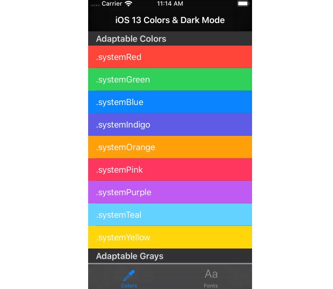
This sample project makes it easy to visualize all of iOS 13’s semantic and adaptable colors, preferred fonts for text styles, and built-in icons.
Semantic colors automatically adapt to system settings, like Dark Mode, to give your app a UI that is always legible.
Semantic fonts are used in Dynamic Type to make sure that your font sizes always scale with to meet the user’s needs.
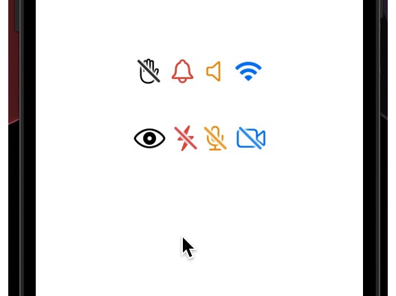
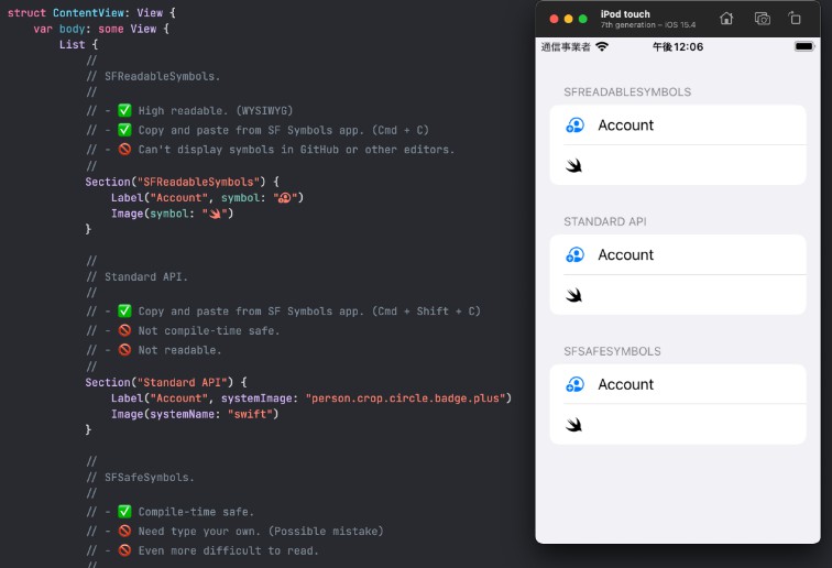
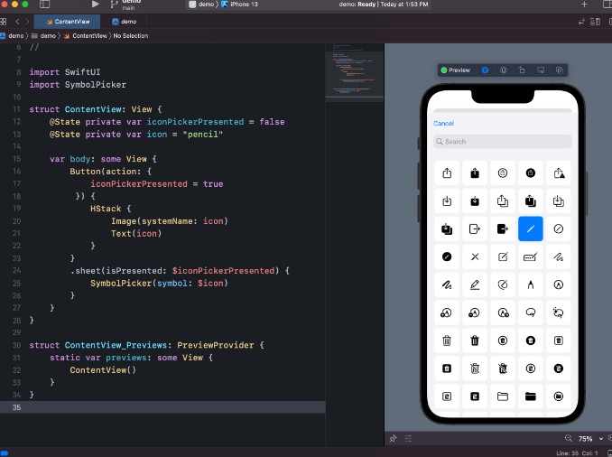
SF Symbols is an icon font that gives you and your apps access to over 1,000 Apple designer-created icons.
Light Mode
Dark Mode
Fonts
SF Symbols
Colors
Adaptable Colors
Some colors are used by system elements and applications. These return named colors whose values may vary between different contexts and releases. Do not make assumptions about the color spaces or actual colors used.
.systemRed.systemGreen.systemBlue.systemIndigo.systemOrange.systemPink.systemPurple.systemTeal.systemYellow
Adaptable Grays
Shades of gray. systemGray is the base gray color. The numbered variations, systemGray2 through systemGray6, are grays which increasingly trend away from systemGray and in the direction of systemBackgroundColor.
In UIUserInterfaceStyleLight: systemGray1 is slightly lighter than systemGray. systemGray2 is lighter than that, and so on.
In UIUserInterfaceStyleDark: systemGray1 is slightly darker than systemGray. systemGray2 is darker than that, and so on.
.systemGray.systemGray2.systemGray3.systemGray4.systemGray5.systemGray6
Label Colors
Foreground colors for static text and related elements.
.label.secondaryLabel.tertiaryLabel.quaternaryLabel
Text Colors
Foreground color for placeholder text in controls or text fields or text views.
.placeholderText
Link Color
Foreground color for standard system links.
.link
Separators
Foreground colors for separators (thin border or divider lines). separatorColor may be partially transparent, so it can go on top of any content. opaqueSeparatorColor is intended to look similar, but is guaranteed to be opaque, so it will completely cover anything behind it. Depending on the situation, you may need one or the other.
.separator.opaqueSeparator
Fill Colors
Fill colors for UI elements. These are meant to be used over the background colors, since their alpha component is less than 1.
systemFillColor is appropriate for filling thin and small shapes. Example: The track of a slider.
secondarySystemFillColor is appropriate for filling medium-size shapes. Example: The background of a switch.
tertiarySystemFillColor is appropriate for filling large shapes. Examples: Input fields, search bars, buttons.
quaternarySystemFillColor is appropriate for filling large areas containing complex content. Example: Expanded table cells.
.systemFill.secondarySystemFill.tertiarySystemFill.quaternarySystemFill
Background Colors
We provide two design systems (also known as “stacks”) for structuring an iOS app’s backgrounds. Each stack has three “levels” of background colors. The first color is intended to be the main background, farthest back. Secondary and tertiary colors are layered on top of the main background, when appropriate.
Inside of a discrete piece of UI, choose a stack, then use colors from that stack. We do not recommend mixing and matching background colors between stacks. The foreground colors above are designed to work in both stacks.
Stack 1: systemBackground – Use this stack for views with standard table views, and designs which have a white primary background in light mode.
.systemBackground.secondarySystemBackground.tertiarySystemBackground
Grouped Background Colors
Stack 2: systemGroupedBackground – Use this stack for views with grouped content, such as grouped tables and platter-based designs. These are like grouped table views, but you may use these colors in places where a table view wouldn’t make sense.
.systemGroupedBackground.secondarySystemGroupedBackground.tertiarySystemGroupedBackground
Non-Adaptable Colors
lightTextColor is always light, and darkTextColor is always dark, regardless of the current UIUserInterfaceStyle. When possible, we recommend using labelColor and its variants, instead.
.lightText.darkText
Fonts
Font text styles, semantic descriptions of the intended use for a font returned by UIFont.preferredFont(forTextStyle:).
.largeTitle.title1.title2.title3.headline.subheadline.body.callout.footnote.caption1.caption2
Icons (SF Symbols)
SF Symbols provides a set of over 1,500 consistent, highly configurable symbols you can use in your app. Apple designed SF Symbols to integrate seamlessly with the San Francisco system font, so the symbols automatically ensure optical vertical alignment with text for all weights and sizes.
