RadioAndCheckboxButton
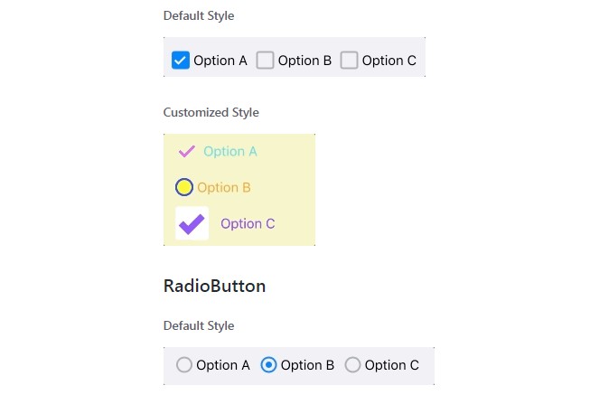
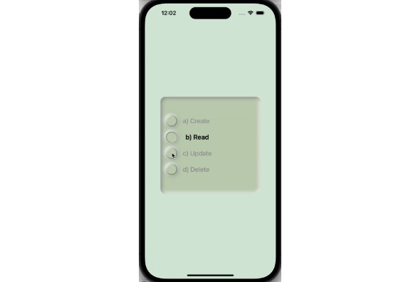
RadioButton and CheckboxButton are subclass of UIButton control. Use can use RadioButton and CheckboxButton same as UIButton. It gives you animation and different styles of a button. You can group buttons to take advantage of more feature. It automatically manages all selections/deselection of RadioButton and CheckboxButton.
CheckboxButton
Default Style
Customized Style
RadioButton
Default Style
Customized Style
Installation
CocoaPods
CocoaPods is a dependency manager for Cocoa projects. You can install it with the following command:
$ gem install cocoapods
To integrate RadioButton and CheckboxButton into your Xcode project using CocoaPods, specify it in your Podfile:
target '<Your Target Name>' do
    pod 'MBRadioCheckboxButton'
end
You can integrate indivisual button control if required.
target '<Your Target Name>' do
    pod 'MBRadioButton'
end
target '<Your Target Name>' do
    pod 'MBCheckboxButton'
end
Then, run the following command:
$ pod install
How to Use
It is simple and easy to use. Just assign RadioButton or CheckboxButton to your button in XIB. You can advantage of grouping button using [RadioButtonContainerView] (Source/RadioButton/RadioButtonContainerView.swift) or CheckboxButtonContainerView. Add all the button in a UIView and assign respective container classes to view For more details please refer to RadioAndCheckboxButtonDemo example. It has CheckboxButtonDelegate and RadioButtonDelegate to get a callback of selection and deselection of a button.
Customization
For more customization please refer to RadioAndCheckboxButtonDemo example.


