RingProgressViewStyle


RingProgressViewStyle is a library that adds a ring style to SwiftUI’s ProgressViewStyle. The default apperance is based on the .linear style of ProgressViewStyle, but you can customize colors and a stroke style.
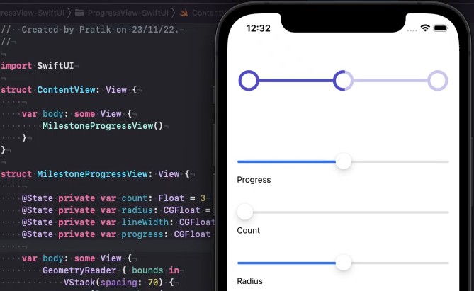
Example
Example.swiftpm can be opened in Swift Playgrounds app or Xcode.

Motivation
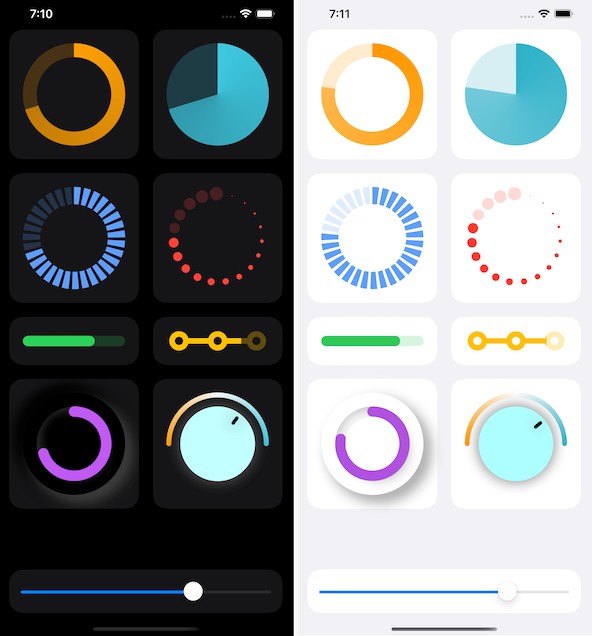
The .circular style already exists in ProgressViewStyle, but it’s just an indicator, not a progress bar. So basically, you have to implement that by yourself.
Fortunately, if you google “SwiftUI progress ring”, you can find a number of code examples. Almost all of them looks like:
Circle()
    .trim(from: 0, to: value)
    .stroke(...)
    .rotationEffect(.degrees(-90))
However, when you try to specify its size by .frame(width: ..., height: ...), its stroke line overflows its frame.
To prevent this, I often use strokeBorder instead of stroke.
Circle()
    .trim(from: 0, to: value)
    .strokeBorder(...)
    .rotationEffect(.degrees(-90))
But it occurs a compilation error because trim returns some Shape that doesn’t conform to InsettableShape but strokeBorder is a method of InsettableShape.
So I created a solution.
How to Use
Add this repository to your package dependencies in your app.
Supported Platforms
- iOS 14+
- iPadOS 14+
- macOS 11+