Flutter Platform Widgets
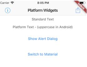
This project is an attempt to see if it is possible to create widgets that are platform aware. Currently in order to render targted Android or iOS device specific styles, you need to either conditionaly check the platform or create a set of widgets to render differently depending on the running platform.
Widgets
These set of widgets allow for rendering based on the target platform using a single cross platform set of widget.
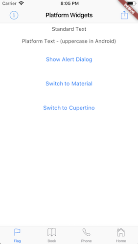
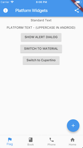
Each PlatformWidget provides common properties directly as constructor arguments. If required further customization can be achieved by using the platform widget builder. See the Enhance section of each widget.
PlatformWidget
A widget that will render either the android widget or cupertino widget based on the target platform. The widgets themselves do not need to be specifically Material or Cupertino.
return PlatformWidget(
  ios: (_) => Icon(CupertinoIcons.flag),
  android: (_) => Icon(Icons.flag),
);
PlatformText
A widget that will render uppercase for Android. iOS will remain unchanged.
return PlatformText('Cancel');
PlatformButton
A button that will render a RaisedButton for android or a CupertinoButton for iOS.
return PlatformButton(
  onPressed: () => print('send'),
  child: PlatformText('Send'),
);
Enhance
Extend with WidgetBuilder for android or iOS.
return PlatformButton(
  onPressed: () => print('send'),
  child: PlatformText('Send'),
  android: (_) => MaterialRaisedButtonData(...),
  ios: (_) => CupertinoButtonData(...)
);
PlatformIconButton
A clickable (tappable) button with an icon. Uses IconButton for android or CupertinoButton for ios.
return PlatformIconButton(
  onPressed: () => print('info pressed'),
  iosIcon: Icon(
    CupertinoIcons.info,
    size: 28.0,
  ),
  androidIcon: Icon(Icons.info)
);
Enhance
Extend with WidgetBuilder for android or iOS.
Widget infoIconButton() {
  return PlatformIconButton(
    onPressed: () => print('info pressed'),
    iosIcon: Icon(CupertinoIcons.info),
    androidIcon: Icon(Icons.info),
    android: (_) => MaterialIconButtonData(...),
    ios: (_) => CupertinoIconButtonData(...),
  );
}
PlatformScaffold
A Scaffold that provides the correctly hosted header (AppBar) and navigation bar (Bottom Bar) for each platform. Uses Scaffold for android or CupertinoTabScaffold for ios with bottom tabs or CupertinoPageScaffold for ios without bottom tabs.
return PlatformScaffold(
  appBar: PlatformAppBar()
  body: _buildContent(),
  bottomNavBar: PlatformNavBar(),
);
Enhance
Extend with WidgetBuilder for android or iOS.
return PlatformScaffold(
  appBar: PlatformAppBar()
  body: _buildContent(),
  bottomNavBar: PlatformNavBar(),
  android: (_) => MaterialScaffoldData(...)
  ios: (_) => CupertinoScaffoldData(...);
);
PlatformAppBar
The AppBar is the top Header bar with a title, leftside or rightside buttons. Uses AppBar for android or CupertinoNavigationBar for ios.
return PlatformAppBar(
    title: new Text('Platform Widgets'),
    leading: PlatformIconButton()),
    trailingActions: <Widget>[
      PlatformIconButton(),
    ],
  );
Enhance
Extend with WidgetBuilder for android or iOS.
return PlatformAppBar(
  title: new Text('Platform Widgets'),
  leading: PlatformIconButton()),
  trailingActions: <Widget>[
    PlatformIconButton(),
  ],
  android: (_) => MaterialAppBarData(...),
  ios: (_)=> CupertinoNavigationBarData(...),
);
PlatformNavBar
The NavBar is placed at the bottom of the page with a set of buttons that typically navigate between screens. Implementing this widget requires the parent widget to manage the currentIndex of the page and to set PlatformNavBar.currrentIndex. Uses BottomAppBar with BottomNavigationBar for android or CupertinoTabBar for ios.
return PlatformNavBar(
  currentIndex: _selectedTabIndex,
  itemChanged: (index) => setState(
        () {
          _selectedTabIndex = index;
        },
      ),
  items: [
    BottomNavigationBarItem(),
    BottomNavigationBarItem(),
  ],
);
Enhance
Extend with WidgetBuilder for android or iOS.
return PlatformNavBar(
  currentIndex: _selectedTabIndex,
  itemChanged: (index) => setState(
        () {
          _selectedTabIndex = index;
        },
      ),
  items: [
    BottomNavigationBarItem(),
    BottomNavigationBarItem(),
  ],
  android: (_) => MaterialNavBarData(...);
  ios: (_) => CupertinoTabBarData(...),
);
PlatformAlertDialog
The AlertDialog will render a caption/title, body/text and a set of action buttons specific for the platform. Uses AlertDialog for android or CupertinoAlertDialog for ios.
Note that
showDialogfrom the material package needs to be used to make it easy to render.


showDialog(
  context: context,
  builder: (_) => PlatformAlertDialog(
    title: Text('Alert'),
    content: Text('Some content'),
    actions: <Widget>[
      PlatformDialogAction(),
      PlatformDialogAction(),
    ],
  ),
);
Enhance
Extend with WidgetBuilder for android or iOS.
showDialog(
  context: context,
  builder: (_) => PlatformAlertDialog(...);
  ios: (_) => CupertinoAlertDialogData(...),
  android: (_) => MaterialAlertDialogData(...),
)
PlatformDialogAction
The DialogAction widget is used to describe the set of buttons on the AlertDialog. Uses FlatButton for android or CupertinoDialogAction for ios.
PlatformDialogAction(
  child: PlatformText('Cancel'),
  onPressed: () => Navigator.pop(context),
),
Enhance
Extend with WidgetBuilder for android or iOS.
PlatformDialogAction(
  child: PlatformText('Cancel'),
  onPressed: () => Navigator.pop(context),
  android: (_) => MaterialDialogActionData(...),
  ios: (_) => CupertinoDialogActionData(...),
),
PlatformCircularProgressIndicator
A circular looking progress indicator. Uses CircularProgressIndicator for android or CupertinoActivityIndicator for ios.
return PlatformCircularProgressIndicator();
Enhance
Extend with WidgetBuilder for android or iOS.
return PlatformCircularProgressIndicator(
  android: (_) => MaterialProgressIndicatorData(...),
  ios: (_)=> CupertinoProgressIndicatorData(...),
);
TODO
- UI / Unit Tests.
- Code documentation
The following are a list more platform aware widgets needing to be added.
Changing / Checking Platform
When importing flutter_platform_widgets you can check isMaterial or isCupertino to determine what style will be used. This is independent to Platform.isAndroid or Platform.isIOS from 'import 'dart:io'
See the example code for how this is used.
Known Limitations
- Setting
BottomNavigationBarType.shiftingwill cause the icon and text to render white: https://github.com/flutter/flutter/issues/15280.
Best to set to fixed if the number of navigation items are 4 or more.
return PlatformNavBar(
   android: (_) => MaterialNavBarData(
      type: BottomNavigationBarType.fixed,
    ),
-
Setting
BottomNavigationBar.fixedColorto anything has no effect. -
If using the Cupertino widgets it may complain that there is no Material parent when using material widgets further doen the widget tree. If this is the case you need to place
Materialas a child widget
return PlatformScaffold(
  body: Material(
    color: Colors.white,
    child: _theBodyOfThePageWithMaterialWidgets(),
  );
);
Note: You may fine without setting the color of the Material widget there will be a slight grey color appear as the background. You may need to explicitly set the color to match the rest of the page
- Cupertino widgets do not pick up the Theme in all cases. In particular the Text() widget needs to have a DefaultTheme set otherwise all Text() widgets need to have their style property set.
return DefaultTextStyle(
  style: Theme.of(context).textTheme.body1,
  child: Center(
     child: Column(
       children: <Widget>[
         PlatformText('Text 1'),
         PlatformText('Text 2'),
         PlatformText('Text 3'),
       ],
     ),
   ),
 );
