SSToastMessage
SSToastMessage is written in SwiftUI. It will add toast, alert, and floating message view over the top of any view. It is intended to be simple, lightweight, and easy to use. It will be a popup with a single line of code.
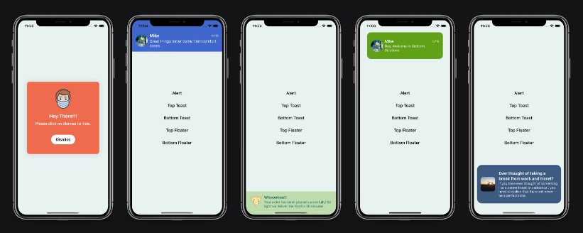
Screenshots

Setup Instructions
CocoaPods
To integrate Toast-Swift into your Xcode project using CocoaPods, specify it in your Podfile:
pod 'SSToastMessage', '~> 1.0.0'
and in your code add import SSToastMessage.
Swift Package Manager
When using Xcode 11 or later, you can install SSToastMessage by going to your Project settings > Swift Packages and add the repository by providing the GitHub URL. Alternatively, you can go to File > Swift Packages > Add Package Dependencies...
Manually
- Add
MessageView.swift,DispatchWorkHolder.swiftandView+Extension.swiftto your project. - Grab yourself a cold ?.
Requirements
- iOS 13+
- Xcode 11+
Usage
- Put all your body code into a ZStack, VStack, or HStack.
- Add a binding bool to control popup presentation state
- Add
.presentmodifier to your stack - If you are using NavigationBar or Custom Navigation view then add
.presentmodifier to NavigationBar or Custom Navigation view.
Basic Examples
struct ContentView: View {
    @State var showToast = false
    var body: some View {
        VStack {
            // your screen main stack
            Button(action: {
                self.showToast.toggle()
            }) {
                Text("Show Toast")
                    .foregroundColor(.black)
            }
        }
        .present(isPresented: self.$showToast, type: .toast, position: .top) {
           /// create your own view for toast
            self.createTopToastView()
        }
    }

    func createTopToastView() -> some View {
        VStack {
            Spacer(minLength: 20)
            HStack() {
                Image("mike")
                    .resizable()
                    .aspectRatio(contentMode: ContentMode.fill)
                    .frame(width: 50, height: 50)
                    .cornerRadius(25)

                VStack(alignment: .leading, spacing: 2) {
                    HStack {
                        Text("Mike")
                            .foregroundColor(.white)
                            .fontWeight(.bold)
                        Spacer()
                        Text("10:10")
                            .font(.system(size: 12))
                            .foregroundColor(Color(red: 0.9, green: 0.9, blue: 0.9))
                    }

                    Text("Hey, Don't miss the WWDC on tonight at 10 AM PST.")
                        .lineLimit(2)
                        .font(.system(size: 14))
                        .foregroundColor(.white)
                }
            }.padding(15)
        }
        .frame(width: UIScreen.main.bounds.width, height: 110)
        .background(Color(red: 0.85, green: 0.65, blue: 0.56))
    }
}

Way easy to customize!
Required parameters
presented - binding to determine if the message view should be seen on-screen or hidden
view - view you want to display on your message view
Available customizations - optional parameters
| Element | Declaration | Description |
|---|---|---|
| type | type: MessageType |
set type of view alert, toast and float. |
| position | position: Position |
top or bottom (for default case it just determines animation direction). |
| animation | animation: Animation |
custom animation for message view sliding onto screen. |
| autohideDuration | autohideDuration: Double? |
time after which message view should disappear. |
| closeOnTap | closeOnTap: Bool |
on message view tap it should disappear. |
| onTap | onTap: () -> Void |
on message view tap perform any action or navigation. |
| closeOnTapOutside | closeOnTapOutside: Bool |
on outside tap message view should disappear. |
See the demo project for more examples.