SwiftEntryKit
SwiftEntryKit is a banner presenter library for iOS. It can be used to easily display pop-ups and notification-like views within your iOS apps.
SwiftEntryKit is a simple and versatile content presenter written in Swift.
Example Project
The example project contains various presets and examples you can use and modify as your like.
Example Project Installation
You can either use the terminal or git client such as Source Tree.
The zip file doesn't contain a necessary dependency (QuickLayout).
Terminal Users
Run git clone with --recurse-submodules, to include QuickLayout as submodule, likewise:
$ git clone --recurse-submodules https://github.com/huri000/SwiftEntryKit.git
Git Client (Source Tree)
Cloning from https://github.com/huri000/SwiftEntryKit.git also setups QuickLayout as submodule.
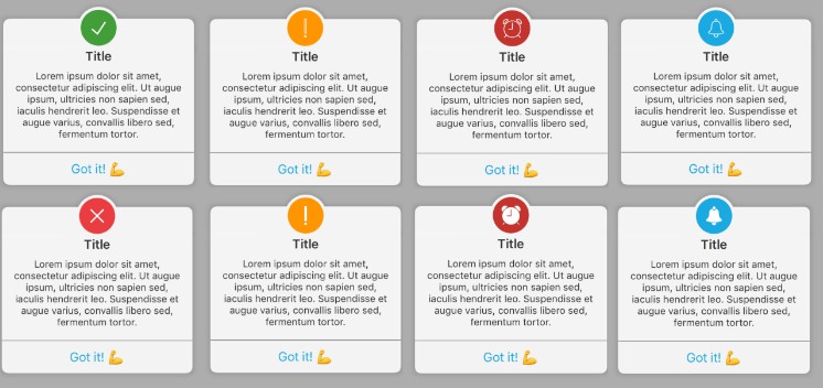
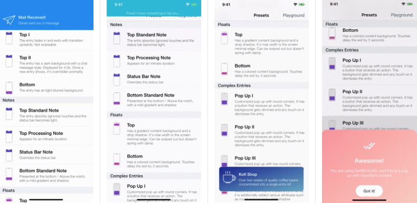
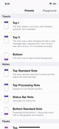
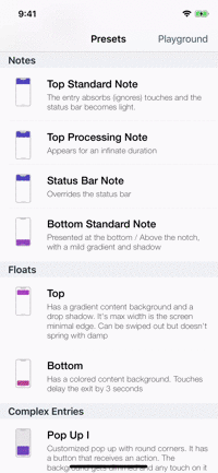
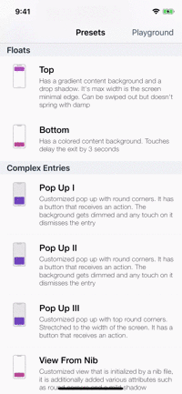
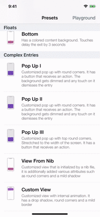
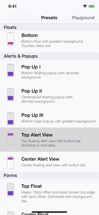
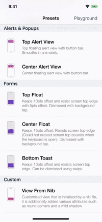
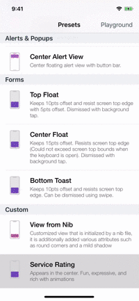
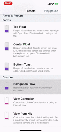
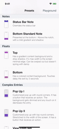
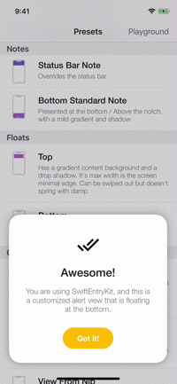
Presets
| Toasts | Notes | Floats | Popups |
|---|---|---|---|
 |
 |
 |
 |
| Alerts | Forms | Rating | More... |
|---|---|---|---|
 |
 |
 |
 |
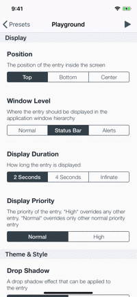
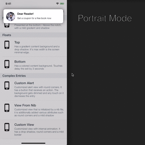
Playground
noun: a place where people can play ?
The example app contains a playground screen, an interface that allows you to customize your preferable entries.
The playground screen has some limitations (allows to select constant values) but you can easily modify the code to suit your needs. Check it out!
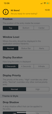
| The Playground Screen | Top Toast Sample |
|---|---|
 |
 |
Requirements
- iOS 9 or any higher version.
- Xcode 9 or any higher version.
- Swift 4.0 or any higher version.
- The library has not been tested with iOS 8.x.y or a lower version.
- SwiftEntryKit leans heavily on QuickLayout - A lightwight library written in Swift that is used to easily layout views programmatically.
Installation
- SwiftEntryKit is compatible with Swift 5 as of release 1.0.0.
- SwiftEntryKit is compatible with Swift 4.2 as of release 0.8.1.
- Developers who use lower Swift version should install release 0.7.2.
CocoaPods
CocoaPods is a dependency manager for Cocoa projects. You can install it with the following command:
$ gem install cocoapods
To integrate SwiftEntryKit into your Xcode project using CocoaPods, specify it in your Podfile:
source 'https://github.com/cocoapods/specs.git'
platform :ios, '9.0'
use_frameworks!

pod 'SwiftEntryKit', '1.0.1'
Then, run the following command:
$ pod install
Carthage
Carthage is a decentralized dependency manager that builds your dependencies and provides you with binary frameworks.
You can install Carthage with Homebrew using the following command:
$ brew update
$ brew install carthage
To integrate SwiftEntryKit into your Xcode project using Carthage, specify the following in your Cartfile:
github "huri000/SwiftEntryKit" == 1.0.1
Usage
Quick Usage
No setup is needed! Each time you wish to display an entry, just create your view and initialize an EKAttributes struct.
See also the preset usage example, and the example project.
likewise:
// Customized view
let customView = SomeCustomView()
/*
Do some customization on customView
*/

// Attributes struct that describes the display, style, user interaction and animations of customView.
var attributes = EKAttributes()
/*
Adjust preferable attributes
*/
And then, just call:
SwiftEntryKit.display(entry: customView, using: attributes)
The kit will replace the application main window with the EKWindow instance and display the entry.
Entry Attributes
EKAttributes is the entry's descriptor. Each time an entry is displayed, an EKAttributes struct is necessary to describe the entry's presentation, position inside the screen, the display duration, its frame constraints (if needed), its styling (corners, border and shadow), the user interaction events, the animations (in / out) and more.
Create a mutable EKAttributes structure likewise:
var attributes = EKAttributes()
Below are the properties that can be modified in the EKAttributes:
Entry Name
Entries can have names.
When an EKAttributes struct is instantiated, it is nameless, meaning, the name property is nil.
It is recommended to set a meaningful name for an entry.
attributes.name = "Top Note"
Entries with names can be specifically referred to later, for example, you can inquire whether a specific entry is currently displayed:
if SwiftEntryKit.isCurrentlyDisplaying(entryNamed: "Top Note") {
    /* Do your things */
}
Window Level
Entries can be displayed above the application main window, above the status bar, above the alerts window or even have a custom level (UIWindowLevel).
For example, set the window level to normal, likewise:
attributes.windowLevel = .normal
This causes the entry to appear above the application key window and below the status bar.
The default value of windowLevel is .statusBar.
Display Position
The entry can be displayed either at the top, center, or the bottom of the screen.
For example, set the display position to bottom, likewise:
attributes.position = .bottom
The default value of position is .top.
Precedence
The precedence attribute of an entry describes the manner in which entries are pushed in. It offers 2 approaches for managing the presentation priority of multiple simultanious entries.
Override
If the display priority is equal or higher than the currently displayed entry, override it.
Example for setting .override precedence with .max display priority while ignoring entries that are already enqueued (leaving them to display after the new entry is dismissed).
attributes.precedence = .override(priority: .max, dropEnqueuedEntries: false)
You can optionally flush the entries that are inside the queue.
In case dropEnqueuedEntries is false, enqueued entries remain in the queue. The first enqueued entry will show right after the new entry pops out.
In case dropEnqueuedEntries is true, the entry-queue is flushed as the new entry is being displayed.
Enqueue
If the queue is empty, display the entry immediately, otherwise, insert the entry into the queue until its turn to show arrives.
Example for setting .enqueue precedence with .normal display priority:
attributes.precedence = .enqueue(priority: .normal)
Heuristics
There are 2 possible heuristics for entries prioritization in the queue:
- Display Priority Queue: The entries are sorted by their display priority, then by chronological order.
- Chronological Queue: The entries are sorted only by their chronological order (standard queue).
Select the heuristic that suits you best by doing the following, only once, before using SwiftEntryKit to display entries.
EKAttributes.Precedence.QueueingHeuristic.value = .priority
Or:
EKAttributes.Precedence.QueueingHeuristic.value = .chronological
The default value of EKAttributes.Precedence.QueueingHeuristic.value is .priority.
The default value of precedence is .override(priority: .normal, dropEnqueuedEntries: false).
Display Priority
The display priority of the entry determines whether it dismisses other entries or is dismissed by them.
An entry can be dismissed only by an entry with an equal or a higher display priority.
let highPriorityAttributes = EKAttributes()
highPriorityAttributes.precedence.priority = .high

let normalPriorityAttributes = EKAttributes()
normalPriorityAttributes.precedence.priority = .normal

// Display high priority entry
SwiftEntryKit.display(entry: view1, using: highPriorityAttributes)

// Display normal priority entry (ignored!)
SwiftEntryKit.display(entry: view2, using: normalPriorityAttributes)
view2 won't be displayed!
Display Duration
The display duration of the entry (Counted from the moment the entry has finished its entrance animation and until the exit animation begins).
Display for 4 seconds:
attributes.displayDuration = 4
Display for an infinite duration
attributes.displayDuration = .infinity
The default value of displayDuration is 2.
Position Constraints
Constraints that tie the entry tightly to the screen context, for example: Height, Width, Max Width, Max Height, Additional Vertical Offset & Safe Area related info.
- Entries that support Auto Layout - Their height is inferred from the constraints that applied to them.
- Entries that don't support Auto Layout - Their exact size must be explicitly set using
positionConstraints'ssizeproperty.
For example:
Ratio edge - signifies that the ratio of the width edge has a ratio of 0.9 of the screen's width.
let widthConstraint = EKAttributes.PositionConstraints.Edge.ratio(value: 0.9)
Intrinsic edge - signifies that the wanted height value is the content height - Decided by the entries vertical constraints
let heightConstraint = EKAttributes.PositionConstraints.Edge.intrinsic
Create the entry size constraints likewise:
attributes.positionConstraints.size = .init(width: widthConstraint, height: heightConstraint)
You can also set attributes.positionConstraints.maxSize in order to make sure the entry does not exceeds predefined limitations. This is useful on device orientation change.
Safe Area - can be used to override the safe area or to color it (More examples are in the example project)
That snippet implies that the safe area insets should be kept and not be a part of the entry.
attributes.positionConstraints.safeArea = .empty(fillSafeArea: false)
Vertical Offset - an additional offset that can be applied to the entry (Other than the safe area).
attributes.positionConstraints.verticalOffset = 10
Autorotation - whether the entry autorotates along with the orientation of the device. Defaults to true.
attributes.positionConstraints.rotation.isEnabled = false
Keyboard Releation - used to bind an entry to the keyboard once the keyboard is displayed.
let offset = EKAttributes.PositionConstraints.KeyboardRelation.Offset(bottom: 10, screenEdgeResistance: 20)
let keyboardRelation = EKAttributes.PositionConstraints.KeyboardRelation.bind(offset: offset)
attributes.positionConstraints.keyboardRelation = keyboardRelation
In the example above the entry's bottom is tuned to have a 10pts offset from the top of the keyboard (while it shows)
Because the entry's frame might exceed the screen bounds, the user might not see all the entry - we wouldn't want that. Therefore, an additional associated value has been added - screenEdgeResistance with value of 20pts. That is, to make sure that the entry remains within the bounds of the screen, and always visible to the user.
The extreme situation might occur as the device orientation is landscape and the keyboard shows up (See example project form presets for more information).
User Interaction
The entry and the screen can be interacted by the user. User interaction be can intercepted in various ways:
An interaction (Any touch whatsoever) with the entry delays its exit by 3s:
attributes.entryInteraction = .delayExit(by: 3)
A tap on the entry / screen dismisses it immediately:
attributes.entryInteraction = .dismiss
attributes.screenInteraction = .dismiss
A tap on the entry is swallowed (ignored):
attributes.entryInteraction = .absorbTouches
A tap on the screen is forwarded to the lower level window, in most cases the receiver will be the application window.
This is very useful when you want to display an unintrusive content like banners and push notification entries.
attributes.screenInteraction = .forward
Pass additional actions that are invoked when the user taps the entry:
let action = {
    // Do something useful
}
attributes.entryInteraction.customTapActions.append(action)
The default value of screenInteraction is .forward.
The default value of entryInteraction is .dismiss.
Scroll Behavior
Describes the entry behavior when it's being scrolled, that is, dismissal by a swipe gesture and a rubber band effect much similar to a UIScrollView.
Disable the pan and swipe gestures on the entry:
attributes.scroll = .disabled
Enable swipe and stretch and pullback with jolt effect:
attributes.scroll = .enabled(swipeable: true, pullbackAnimation: .jolt)
Enable swipe and stretch and pullback with an ease-out effect:
attributes.scroll = .enabled(swipeable: true, pullbackAnimation: .easeOut)
Enable swipe but disable stretch:
attributes.scroll = .edgeCrossingDisabled(swipeable: true)
The default value of scroll is .enabled(swipeable: true, pullbackAnimation: .jolt).
Haptic Feedback
The device can produce a haptic feedback, thus adding an additional sensory depth to each entry.
The default value of hapticFeedbackType is .none.
Lifecycle Events
Events can be injected to the entry so that they are to be called during its lifecycle.
attributes.lifecycleEvents.willAppear = {
    // Executed before the entry animates inside
}

attributes.lifecycleEvents.didAppear = {
    // Executed after the entry animates inside
}

attributes.lifecycleEvents.willDisappear = {
    // Executed before the entry animates outside
}

attributes.lifecycleEvents.didDisappear = {
    // Executed after the entry animates outside
}
Background Style
The entry and the screen can have various background styles, such as blur, color, gradient and even an image.
The following example implies clear background for both the entry and the screen:
attributes.entryBackground = .clear
attributes.screenBackground = .clear
Colored entry background and dimmed screen background:
attributes.entryBackground = .color(color: .white)
attributes.screenBackground = .color(color: UIColor(white: 0.5, alpha: 0.5))
Gradient entry background (diagonal vector):
let colors: [UIColor] = [.red, .green, .blue]
attributes.entryBackground = .gradient(gradient: .init(colors: colors, startPoint: .zero, endPoint: CGPoint(x: 1, y: 1)))
Visual Effect entry background:
attributes.entryBackground = .visualEffect(style: .light)
The default value of entryBackground and screenBackground is .clear.
Shadow
The shadow that surrounds the entry.
Enable shadow around the entry:
attributes.shadow = .active(with: .init(color: .black, opacity: 0.3, radius: 10, offset: .zero))
Disable shadow around the entry:
attributes.shadow = .none
The default value of shadow is .none.
Round Corners
Round corners around the entry.
Only top left and right corners with radius of 10:
attributes.roundCorners = .top(radius: 10)
Only bottom left and right corners with radius of 10:
attributes.roundCorners = .bottom(radius: 10)
All corners with radius of 10:
attributes.roundCorners = .all(radius: 10)
No round corners:
attributes.roundCorners = .none
The default value of roundCorners is .none.
Border
The border around the entry.
Add a black border with thickness of 0.5pts:
attributes.border = .value(color: .black, width: 0.5)
No border:
attributes.border = .none
The default value of border is .none.
Animations
Describes how the entry animates into and out of the screen.
- Each animation descriptor can have up to 3 types of animations at the same time. Those can be combined to a single complex one!
- Translation animation anchor can be explicitly set but it receives a default value according to position of the entry.
Example for translation from top with spring, scale in and even fade in as a single entrance animation:
attributes.entranceAnimation = .init(
                 translate: .init(duration: 0.7, anchorPosition: .top, spring: .init(damping: 1, initialVelocity: 0)),
                 scale: .init(from: 0.6, to: 1, duration: 0.7),
                 fade: .init(from: 0.8, to: 1, duration: 0.3))
The default value of entranceAnimation and exitAnimation is .translation - The entry translates in or out, respectively, with duration of 0.3 seconds.
Pop Behavior
Describes the entry behavior when it's being popped (dismissed by an entry with equal / higher display-priority.
The entry is being popped animatedly:
attributes.popBehavior = .animated(animation: .init(translate: .init(duration: 0.2)))
The entry is being overriden (Disappears promptly):
attributes.popBehavior = .overridden
The default value of popBehavior is .animated(animation: .translation) - It translates out with duration of 0.3 seconds.
Status Bar
The status bar appearance can be modified during the display of the entry.
SwiftEntryKit supports both View controller-based status bar appearance and manual setting.
Setting the status bar style is fairly simple -
Status bar becomes visible and gets a light style:
attributes.statusBar = .light
The status bar becomes hidden:
attributes.statusBar = .hidden
The status bar appearance is inferred from the previous context (won't be changed):
attributes.statusBar = .inferred
In case there is an already presenting entry with lower/equal display priority, the status bar will change its style.
When the entry is removed, the status bar gets its initial style back.
The default value of statusBar is .inferred.
EKAttributes' interface is as follows:
public struct EKAttributes

    // Identification
    public var name: String?

    // Display
    public var windowLevel: WindowLevel
    public var position: Position
    public var precedence: Precedence
    public var displayDuration: DisplayDuration
    public var positionConstraints: PositionConstraints

    // User Interaction
    public var screenInteraction: UserInteraction
    public var entryInteraction: UserInteraction
    public var scroll: Scroll
    public var hapticFeedbackType: NotificationHapticFeedback
    public var lifecycleEvents: LifecycleEvents

    // Theme & Style
    public var entryBackground: BackgroundStyle
    public var screenBackground: BackgroundStyle
    public var shadow: Shadow
    public var roundCorners: RoundCorners
    public var border: Border
    public var statusBar: StatusBar

    // Animations
    public var entranceAnimation: Animation
    public var exitAnimation: Animation
    public var popBehavior: PopBehavior
}
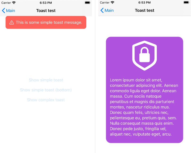
Presets Usage Example:
You can use one of the presets that come with SwiftEntryKit, doing these 4 simple steps:
- Create your EKAttributes struct and set your preferrable properties.
- Create EKNotificationMessage struct (The Content) and set the content.
- Create EKNotificationMessageView (The View) and inject EKNotificationMessage struct to it.
- Display the entry using SwiftEntryKit class method.
EKNotificationMessageView preset example:
// Generate top floating entry and set some properties
var attributes = EKAttributes.topFloat
attributes.entryBackground = .gradient(gradient: .init(colors: [.red, .green], startPoint: .zero, endPoint: CGPoint(x: 1, y: 1)))
attributes.popBehavior = .animated(animation: .init(translate: .init(duration: 0.3), scale: .init(from: 1, to: 0.7, duration: 0.7)))
attributes.shadow = .active(with: .init(color: .black, opacity: 0.5, radius: 10, offset: .zero))
attributes.statusBar = .dark
attributes.scroll = .enabled(swipeable: true, pullbackAnimation: .jolt)
attributes.positionConstraints.maxSize = .init(width: .constant(value: UIScreen.main.minEdge), height: .intrinsic)

let title = EKProperty.LabelContent(text: titleText, style: .init(font: titleFont, color: textColor))
let description = EKProperty.LabelContent(text: descText, style: .init(font: descFont, color: textColor))
let image = EKProperty.ImageContent(image: UIImage(named: imageName)!, size: CGSize(width: 35, height: 35))
let simpleMessage = EKSimpleMessage(image: image, title: title, description: description)
let notificationMessage = EKNotificationMessage(simpleMessage: simpleMessage)

let contentView = EKNotificationMessageView(with: notificationMessage)
SwiftEntryKit.display(entry: contentView, using: attributes)
Custom View Usage Example:
// Create a basic toast that appears at the top
var attributes = EKAttributes.topToast

// Set its background to white
attributes.entryBackground = .color(color: .white)

// Animate in and out using default translation
attributes.entranceAnimation = .translation
attributes.exitAnimation = .translation

let customView = UIView()
/*
... Customize the view as you like ...
*/

// Display the view with the configuration
SwiftEntryKit.display(entry: customView, using: attributes)
Displaying a View Controller
As from version 0.4.0, view controllers are supported as well.
SwiftEntryKit.display(entry: customViewController, using: attributes)
Alternative Rollback Window
By default, the window held by the application delegate becomes the key again right after SwiftEntryKit has finished displaying the entry.
This behavior can be changed using rollbackWindow parameter.
SwiftEntryKit.display(entry: view, using: attributes, rollbackWindow: .custom(window: alternativeWindow))
After the entry has been dismissed, the given window alternativeWindow would become the key instead of the window that is held by the application delegate.
Dismissing an Entry
You can dismiss the currently displayed entry by simply invoke dismiss in the SwiftEntryKit class, likewise:
SwiftEntryKit.dismiss()
Or:
SwiftEntryKit.dismiss(.displayed)
This dismisses the entry animatedly using its exitAnimation attribute and on completion, the window would be removed as well.
You can dismiss the currently displayed entry and flush the queue as well, likewise:
SwiftEntryKit.dismiss(.all)
Only flush the queue, leaving any currently displayed entry to its natural lifecycle:
SwiftEntryKit.dismiss(.queue)
Dismiss a specific entry by name - either currently displayed or enqueued. All the entries with the given name are dismissed.
SwiftEntryKit.dismiss(.specific(entryName: "Entry Name"))
Dismiss any entry with a lower or equal display priority of .normal.
SwiftEntryKit.dismiss(.prioritizedLowerOrEqualTo(priority: .normal))
Using a completion handler
Inject a trailing closure to be executed after the entry dismissal.
SwiftEntryKit.dismiss {
    // Executed right after the entry has been dismissed
}
Is Currently Displaying
Inquire whether an entry is currently displayed:
if SwiftEntryKit.isCurrentlyDisplaying {
    /* Do your things */
}
Inquire whether a specific entry is currently displayed using the name property inside EKAttributes.
if SwiftEntryKit.isCurrentlyDisplaying(entryNamed: "Top Note") {
/* Do your things */
}
Queue Contains
Inquire whether the queue of entries is not empty:
if SwiftEntryKit.isQueueEmpty {
    /* Do your things */
}
Inquire whether the queue of entries contains an entry with name:
if SwiftEntryKit.queueContains(entryNamed: "Custom-Name") {
    /* Do your things */
}
Swiping and Rubber Banding
Entries can be panned vertically (This ability can be enabled using the scroll attributes).
Thefore it's only natural that an entry can be dismissed using a swipe-like gesture.
Enable swipe gesture. When the swipe gesture fails (doesn't pass the velocity threshold) ease it back.
attributes.scroll = .enabled(swipeable: true, pullbackAnimation: .easeOut)
Enable swipe gesture. When the swipe gesture fails throw it back out with a jolt.
attributes.scroll = .enabled(swipeable: true, pullbackAnimation: .jolt)
The PullbackAnimation values (duration, damping & initialSpringVelocity) can be customized as well.
| Swipe | Jolt |
|---|---|
 |
 |
Dealing with safe area:
EKAttributes.PositionConstraints.SafeArea may be used to override the safe area with the entry's content, or to fill the safe area with a background color (like Toasts do), or even leave the safe area empty (Like Floats do).
SwiftEntryKit supports iOS 11.x.y and is backward compatible to iOS 9.x.y, so the status bar area is treated as same as the safe area in earlier iOS versions.
Dealing with orientation change:
SwiftEntryKit identifies orientation changes and adjust the entry's layout to those changes.
Therefore, if you wish to limit the entries's width, you are able to do so by giving it a maximum value, likewise:
var attributes = EKAttributes.topFloat

// Give the entry the width of the screen minus 20pts from each side, the height is decided by the content's contraint's
attributes.positionConstraints.size = .init(width: .offset(value: 20), height: .intrinsic)

// Give the entry maximum width of the screen minimum edge - thus the entry won't grow much when the device orientation changes from portrait to landscape mode.
let edgeWidth = min(UIScreen.main.bounds.width, UIScreen.main.bounds.height)
attributes.positionConstraints.maxSize = .init(width: .constant(value: edgeWidth), height: .intrinsic)

let customView = UIView()
/*
... Customize the view as you like ...
*/

// Use class method of SwiftEntryKit to display the view using the desired attributes
SwiftEntryKit.display(entry: customView, using: attributes)
| Orientation Change Demonstration |
|---|
Swift and Objective-C Interoperability
SwiftEntryKit's APIs use the Swift language exclusive syntax (enums, associated values, and more).
Therefore, SwiftEntryKit cannot be referenced directly from an Objective-C file (.m, .h or .mm).
Yet, it is pretty easy to integrate SwiftEntryKit into an Objective-C project using a simple .swift class that is a sort of adapter between SwiftEntryKit and your Objective-C code.
This project demonstrates that using Carthage and CocoaPods.