SizeClassesSwiftUI
This is a basic overview of using size classes to build adaptive layout in SwiftUI.
SwiftUI provides us @Environament property wrapper for both horizontalSizeClass and verticalSizeClass. Firstly we need to store value in like below
   @Environment(\.horizontalSizeClass) var horizontalSizeClass
   @Environment(\.verticalSizeClass) var verticalSizeClass
Then we can check for the value
  if horizontalSizeClass == .compact {
     print("compact")
  }

  if horizontalSizeClass == .regular {
     print("regular")
  }
If you want to know more about Device size classes based on orientation then check out Layout section in Human Interface Guidelines here:
https://developer.apple.com/design/human-interface-guidelines/foundations/layout/
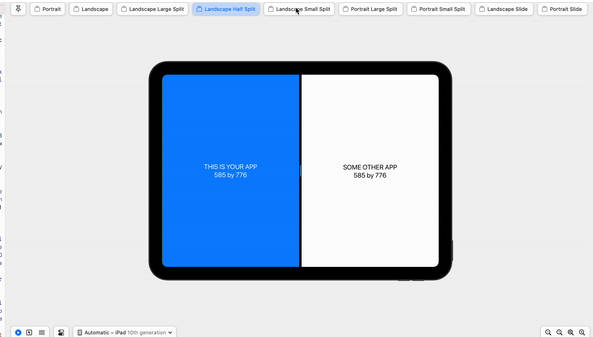
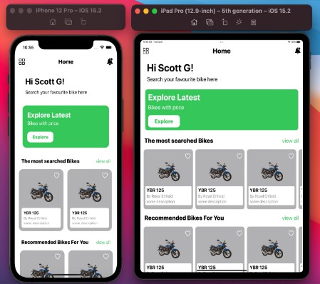
Size Classes are super useful to create adaptive design along differnt screen sizes and orientations. Here is an example of dummy UI on IPhone12 pro and IPad pro 12.9 inches.

Contact
Follow on Twitter – Naqeeb Ahmed
Connect on LinkedIn – Naqeeb Ahmed
Leave a message – [email protected]
Acknowledgments
Following resources i found helpful. please do check out to learn more.
- Hacking With Swift
- Size Classes – SwiftUI – Adopt Landscape Example
- Changing a view’s layout in response to size classes