KDCircularProgress
KDCircularProgress is a circular progress view written in Swift. It makes it possible to have gradients in the progress view, along with glows and animations.
KDCircularProgress also has IBInspectable and IBDesignable support, so you can configure and preview inside the Interface Builder.
Requirements
KDCircularProgress requires iOS 8+, although iOS 8 support hasn't been tested in a while.
Installation
- It's on CocoaPods under the name (you guessed it!) KDCircularProgress
- Just drag
KDCircularProgress.swiftinto your project.Carthagesupport is on To-do list.
CocoaPods
KDCircularProgress is available through CocoaPods. To install
it, simply add the following line to your Podfile:
pod 'KDCircularProgress'
then run
$ pod install
Carthage
Add the line github "kaandedeoglu/KDCircularProgress" to your Cartfile and then run the command:
carthage update
Manually
Just drag KDCircularProgress.swift into your project.
Sample Code
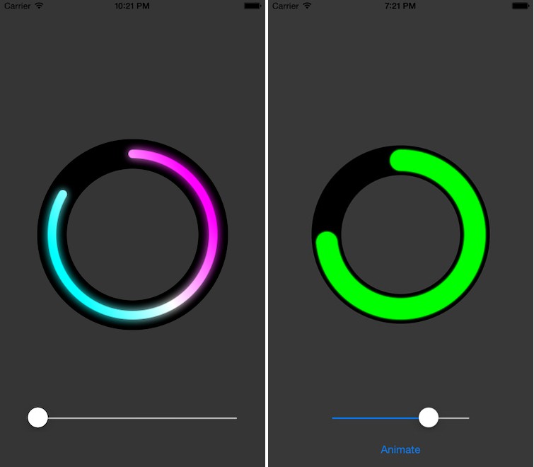
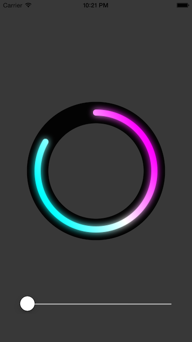
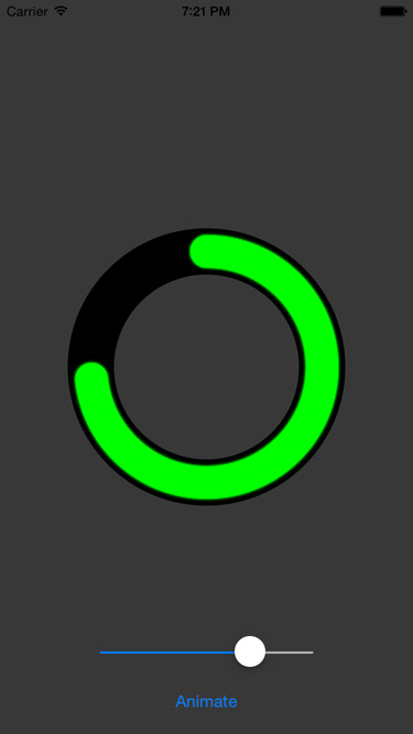
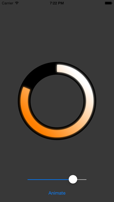
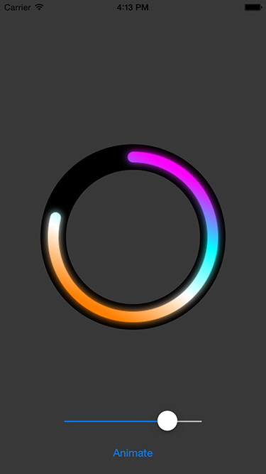
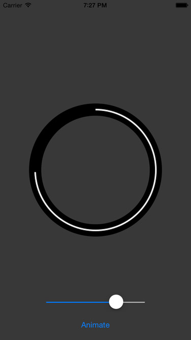
Below you can see code that creates and sets up a KCircularProgress instance. Which gives you a configuration that looks similar to the progress in the example images.
progress = KDCircularProgress(frame: CGRect(x: 0, y: 0, width: 300, height: 300))
progress.startAngle = -90
progress.progressThickness = 0.2
progress.trackThickness = 0.6
progress.clockwise = true
progress.gradientRotateSpeed = 2
progress.roundedCorners = false
progress.glowMode = .forward
progress.glowAmount = 0.9
progress.set(colors: UIColor.cyan ,UIColor.white, UIColor.magenta, UIColor.white, UIColor.orange)
progress.center = CGPoint(x: view.center.x, y: view.center.y + 25)
view.addSubview(progress)
Properties
progressColors: [UIColor]
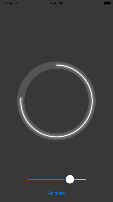
The colors used to generate the gradient of the progress. You can also set this using the variadic setColors(UIColor...) method. A gradient is used only if there is more than one color. A fill is used otherwise. The default is a white fill.
angle: Int
The angle of the progress. Between 0 and 360 (inclusive). Simply change its value in order to change the visual progress of the component. Default is 0.
startAngle: Int
The angle at which the progress will begin. Between 0 and 360 (inclusive), however you can pass any negative or positive values and the component will mod them automatically to the required range. Default is 0.
clockwise: Bool
Clockwise if true, Counter-clockwise if false. Default is true.
roundedCorners: Bool
When true, the ends of the progress track will be drawn with a half circle radius. Default is false.
gradientRotateSpeed: CGFloat
Describes how many times the underlying gradient will perform a 2π rotation for each full cycle of the progress. Integer values recommended. Default is 0.
glowAmount: CGFloat
The intensity of the glow. Between 0 and 1.0. Default is 1.0.
glowMode: KDCircularProgressGlowMode
-
.forward - The glow increases proportionaly to the angle. No glow at 0 degrees and full glow at 360 degrees.
-
.reverse - The glow increases inversely proportional to the angle. Full glow at 0 degrees and no glow at 360 degrees.
-
.constant - Constant glow.
-
.noGlow - No glow
The default is .forward
progressThickness: CGFloat
The thickness of the progress. Between 0 and 1. Default is 0.4
trackThickness: CGFloat
The thickness of the background track. Between 0 and 1. Default is 0.5
trackColor: UIColor
The color of the background track. Default is UIColor.blackColor().
progressInsideFillColor: UIColor
The color of the center of the circle. Default is UIColor.clearColor().
Methods
override public init(frame: CGRect)
Initialize with a frame. Please only use square frames.
convenience public init(frame:CGRect, colors: UIColor...)
Initialize with a frame and the gradient colors.
public func set(colors: UIColor...)
public func set(colors: [UIColor])
Set the colors for the progress gradient.
public func animateFromAngle(fromAngle: Int, toAngle: Int, duration: NSTimeInterval, relativeDuration: Bool = true, completion: ((Bool) -> Void)?)
Animate the progress from an initial value to a final value, with a completion block that fires after the animation is done.
relativeDuration - specify if the duration is for the specific animation or is the duration that would make a full turn.
public func animateToAngle(toAngle: Int, duration: NSTimeInterval, completion: ((Bool) -> Void)?)
Animate the progress from the current state to a target value.
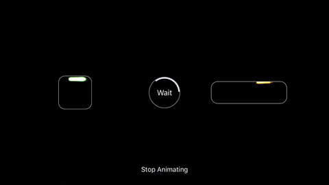
public func pauseAnimation()
Pause the animation, if any.
public func isAnimating() -> Bool
Check if there's an active animation.
Misc
Prefering light colors in the gradients gives better results. As mentioned before, use square frames. Rectangular frames are not tested and might produce unexpected results.
Contact
Drop me an email if you want discuss anything further.