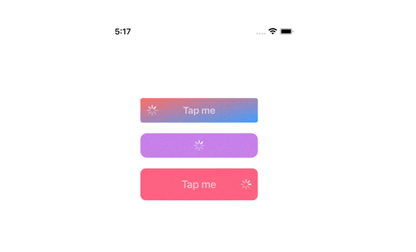
Loading Buttons
A collection of loading buttons and their styling written in Swift.
Key Features
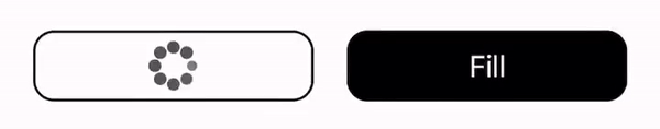
- The example gives you 8 choices of loading indicators with the loading button.
- The IndicatorProtocol clearly defines the functions and properties. You can refer to it and customize your own.
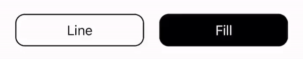
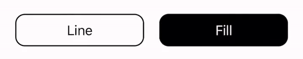
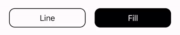
- The LoadingButton class is made to be open, from which you can easily inherit and create your own.
Requirements
- Swift 5.0
- iOS 11.0+
Installation
LoadingButtons project is available via CocoaPods. To install it, simply add the following line to your Podfile:
$ pod 'MHLoadingButton'
If you don't use CocoaPods, you can download the entire project then import all the source files and use them in your project.
Usage
Declaration
// You may set the frame to zero if you use AutoLayout to handle the frame.
// Otherwise, specify the frame in initializer.
btnLoading = LoadingButton(frame: .zero, text: "Button", textColor: .black, bgColor: .white)
System Default
btnLoading.indicator = UIActivityIndicatorView()
Material Design
btnLoading.indicator = MaterialLoadingIndicator(color: .gray)
Ball Pulse
btnLoading.indicator = BallPulseSyncIndicator(color: .gray)
Ball Pulse Sync
btnLoading.indicator = BallSpinFadeIndicator(color: .gray)

Ball Spin
btnLoading.indicator = LineScalePulseIndicator(color: .gray)
Line Scale
btnLoading.indicator = LineScaleIndicator(color: .gray)
Line Scale Pulse
btnLoading.indicator = BallPulseIndicator(color: .gray)
Ball Beat
btnLoading.indicator = BallBeatIndicator(color: .gray)