BigUIPaging
A collection of SwiftUI views for handling pages of content.
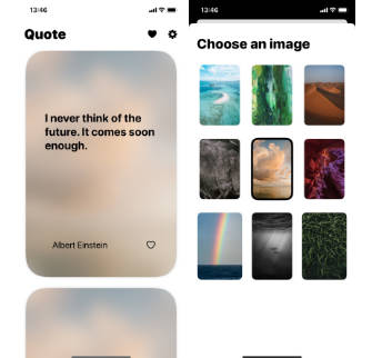
PageView
A container view that manages navigation between related views.
Pages are navigated directly by the user with a gesture, or programmatically through either the selection binding or the environment’s navigation action.
iOS
ScrollPageViewStyle.mp4
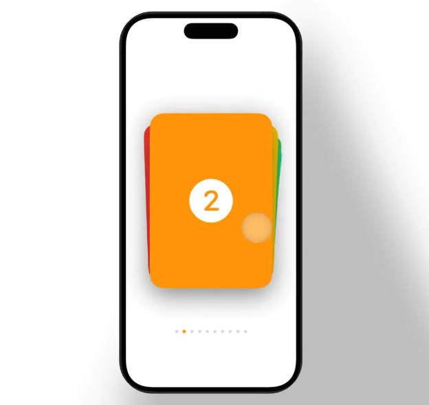
CardDeckPageViewStyle.mp4
macOS
ScrollPageViewStyle-mac.mp4
Creating a PageView
There are two ways to initialise a PageView. The simplest is with a ForEach
data source:
@State private var selection: Int = 1

var body: some View {
    PageView(selection: $selection) {
        ForEach(1...10, id: \.self) { id in
            Text("Page \(value)")
        }
    }
    .pageViewStyle(.scroll)
}
Alternatively you can you can use the next and previous closure to return a value relative to another value:
@State private var selection: Int = 1

var body: some View {
    PageView(selection: $selection) { value in
        value + 1
    } previous: { value in
        value > 1 ? value - 1 : nil
    } content: { value in
        Text("Page \(value)")
    }
}
Important A page view has no gestures or interactions by default. You must add a style before you can interact with it.
Styles and Transitions
The exact navigation gesture or transition depends on the chosen style. By default a page view has no transitions or gestures.
| Style | iOS | macOS |
|---|---|---|
.plain |
✅ | ✅ |
.scroll |
✅ | ✅ |
.book |
✅ | |
.historyStack |
✅ | |
.bookStack |
✅ | |
.cardDeck |
✅ |
You set a style with the view modifier:
PageView(selection: $selection) {
    ...
}
.pageViewStyle(.bookStack)
Page Orientation
Styles that support support vertical and horizontal navigation (scroll and book)
can be configured with the orientation view modifier:
.pageViewOrientation(.vertical)
Controls such as PageViewNavigationButton also respond to this modifier adapting
the chevron direction as appropriate.
Custom Styles
You can create your own completely custom page view transitions and interactions.
To create a custom style declare a type that conforms to the PageViewStyle
protocol and implement the required makeBody(configuration:) method. For example,
here’s how the plain style is implemented:
public struct PlainPageViewStyle: PageViewStyle {

   public init() { }

   public func makeBody(configuration: Configuration) -> some View {
       ZStack {
           configuration.content(configuration.selection.wrappedValue)
       }
   }
}
You use the PageViewStyleConfiguration structure to get access to content,
next, previous and currently selected page.
Navigation
In addition to controlling the current page with the selection binding, you can
also use the environment’s PageViewNavigateAction action to navigate the page
view backwards and forwards.
@Environment(\.navigatePageView) private var navigate
@Environment(\.canNavigatePageView) private var canNavigate

var body: some View {
    Button {
        navigate(.forwards)
    } label: {
        Text("Next")
    }
    .disabled(!canNavigate.contains(.forwards))
}
Included is also PageViewNavigationButton which provides standardised
forwards and backwards controls:
PageView {
    ...
}
.toolbar {
    ToolbarItem {
        PageViewNavigationButton()
            .pageViewOrientation(.vertical)
    }
}
.pageViewEnvironment()
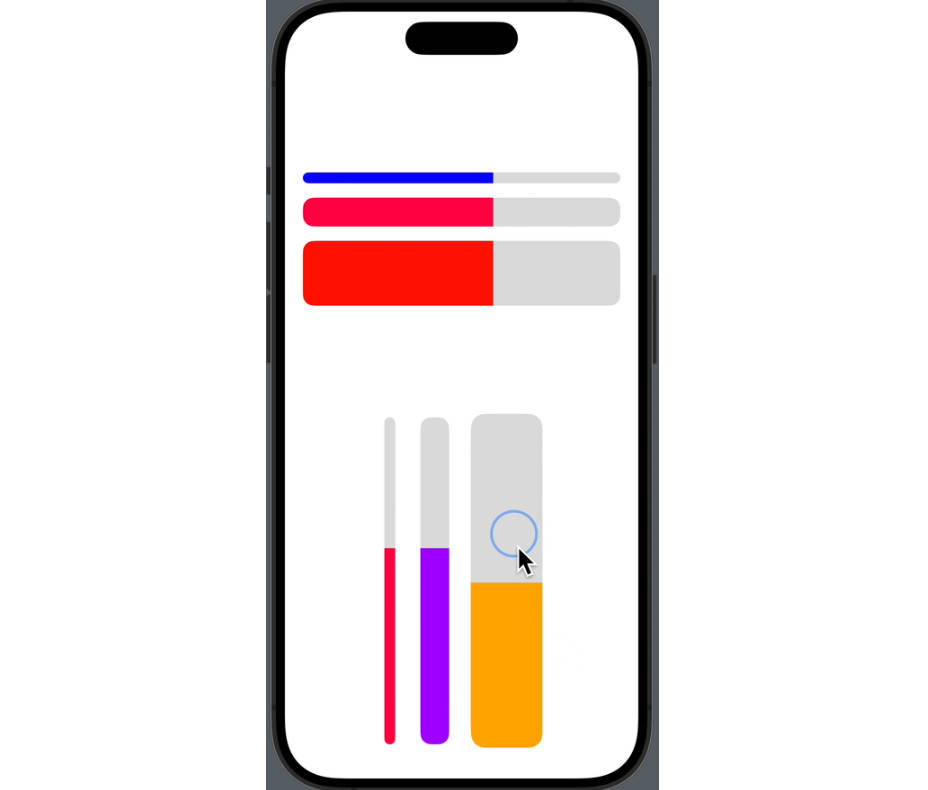
PageIndicator
A control that displays a horizontal series of dots, each of which corresponds to a page.
You create a page indicator by setting the total number of pages and passing a binding to some selection state:
@State private var selection = 1

var body: some View {
    PageIndicator(selection: $selection, total: 5)
}
This control bridges directly to UIPageControl on iOS.
Indicator Appearance
You can control the indicator’s appearance with a number of style modifiers:
/// The tint color to apply to the page indicator.
.pageIndicatorColor(.purple)

/// The tint color to apply to the current page indicator.
.pageIndicatorCurrentColor(.pink)

/// A Boolean value that determines whether the page control allows continuous interaction.
.allowsContinuousInteraction(true)

/// The preferred background style.
.pageIndicatorBackgroundStyle(.prominent)

/// Controls whether the page indicator is hidden when there is only one page.
.singlePageVisibility(.hidden)
Page Progress
A page indicator can automatically advance to the next page after a set duration.
PageIndicator...
    .pageIndicatorDuration(3.0)
This can also be used to drive a PageView if the selection binding is shared
between the two views.
Indicator Icons
You can customise an indicator’s icon to denote special pages, such as how the Weather app uses the first page to represent the user’s current location:
Icon customisations are provided in the form of a view builder. The first parameter represents the page index and the second the selected state.
// Vary icons depending on page
PageIndicator(selection: $selection, total: total) { (page, selected) in
    if page == 0 {
        Image(systemName: "location.fill")
    }
}

// Vary icons depending on selection state
PageIndicator(selection: $selection, total: total) { (page, selected) in
    if selected {
        Image(systemName: "folder.fill")
    } else {
        Image(systemName: "folder")
    }
}
Note Only the systemName initialiser is currently supported.
Installation
BigUIPaging is available as a Swift Package. Just add this repository to your
Package.swift file:
.package(url: "https://github.com/notsobigcompany/BigUIPaging.git", from: "0.0.1")
If you’re adding to an Xcode project go to File -> Add Packages, then link the package to your required target.
Requirements
- iOS 16.0
- macOS 13.0
Sample Code
Take a look at the Examples folder inside the package and open the Xcode Preview Canvas.
You can also find sample code in the documentation.
FAQ
Why use PageView over TabView?
PageView is intended for navigating a large number of views where all the pages may not be known on initial load. The next and previous closures allow for pages to be decided ‘in flight’.
PageView also handles more complex layouts correctly, such as if your app makes
use of a NavigationStack or NavigationSplitView. Scroll events are correctly
forwarded to the view hierarchy and toolbar items aren’t interfered with.
And by adopting PageViewStyle there are infinite transition and interaction
possibilities.
Finally PageView has consistent behaviour across all platforms whereas TabView only supports paging on iOS.
Does PageView use UIPageViewController/NSPageController?
Under the hood some styles such as scroll and history bridge directly to
UIPageViewController and NSPageController respectively.
License
Copyright 2023 NOT SO BIG TECH LIMITED
Permission is hereby granted, free of charge, to any person obtaining a copy of this software and associated documentation files (the “Software”), to deal in the Software without restriction, including without limitation the rights to use, copy, modify, merge, publish, distribute, sublicense, and/or sell copies of the Software, and to permit persons to whom the Software is furnished to do so, subject to the following conditions:
The above copyright notice and this permission notice shall be included in all copies or substantial portions of the Software.
THE SOFTWARE IS PROVIDED “AS IS”, WITHOUT WARRANTY OF ANY KIND, EXPRESS OR IMPLIED, INCLUDING BUT NOT LIMITED TO THE WARRANTIES OF MERCHANTABILITY, FITNESS FOR A PARTICULAR PURPOSE AND NONINFRINGEMENT. IN NO EVENT SHALL THE AUTHORS OR COPYRIGHT HOLDERS BE LIABLE FOR ANY CLAIM, DAMAGES OR OTHER LIABILITY, WHETHER IN AN ACTION OF CONTRACT, TORT OR OTHERWISE, ARISING FROM, OUT OF OR IN CONNECTION WITH THE SOFTWARE OR THE USE OR OTHER DEALINGS IN THE SOFTWARE.