ColorPickerRing
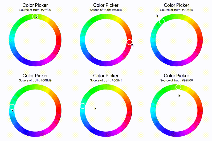
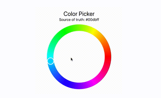
A color picker implementation with color wheel appearance written in plain SwiftUI. It is compatible with UIColor and NSColor.

Usage
Add this repository as a Swift Package Dependency to your project. You find the option in Xcode unter "File > Swift Packages > Add Package Dependency...". Paste the HTTPS reference to this repo and you're done!
After importing the module: Simply use the ColorPickerRing structure which is a regular SwiftUI View.
This project uses the DynamicColor dependency which lets you write plattform independant color classes. No matter if iOS or macOS. Internally it uses UIColor and NSColor.
import SwiftUI
import ColorPickerRing

struct ContentView: View {
    @State var color = UIColor.red

    var body: some View {
        ColorPickerRing(color: $color, strokeWidth: 30)
            .frame(width: 300, height: 300, alignment: .center)
    }
}
The color wheel will take all the space it can get unless you frame it to a custom size. You are also able to specify the strokeWidth of the color wheel over the given property.
Usage with SwiftUI Color
As the native SwiftUI Color is implemented as a view rather than a model data structure it won't be used as data structure in the future. This is conforming with the indices provided by Apple: They implemented a @frozen property for their Color class which could be interpreted that they won't provide any further interfaces for data extraction to their Color view class.


