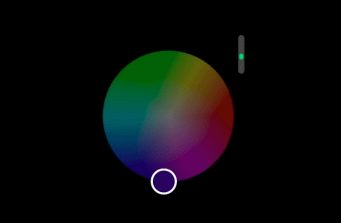
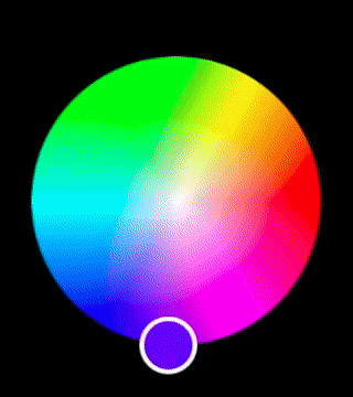
TSColorWheel
A color wheel/picker for watchOS based on Colorful that uses the Digital Crown as a brightness slider.
Usage
You can use TSColorWheelController in your storyboard (recommended), or alternatively, use TSColorWheel in a SwiftUI view structure.
Usage in the Storyboard
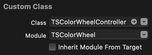
To use TSColorWheel in the storyboard, add a new Hosting Controller and change its Custom Class as follows:
Class: TSColorWheelController
Module: TSColorWheel
Make sure to uncheck Inherit Module From Target.
Usage in a SwiftUI view structure
Just use TSColorWheel as a normal SwiftUI view.
var body: some View {
    VStack {
        Text("Select a Color")
        TSColorWheel()
    }
}
Attributes
To get all the different attributes and modify the selected color from SwiftUI, initialize TSColorWheelSettings.shared as an ObservedObject:
@ObservedObject var colorWheelSettings = TSColorWheelSettings.shared
You can get/set the currently selected color with colorWheelSettings.color.
To get the border color TSColorWheel is currently using for the thumb view, use colorWheelSettings.borderColor.
To get whether a color is light or dark, use colorWheelSettings.isLightColor.
Example
To run the example project, clone the repo, and run pod install from the Example directory first.
Requirements
watchOS 6.0
Installation
TSColorWheel is available through CocoaPods. To install it, simply add the following line to your Podfile:
pod 'TSColorWheel'
Author
Tamás Sengel