PopMenu
PopMenu is designed as a quick popup action menu, much like an action sheet in iOS. If you want an action sheet that looks great, you're in the right place!
PopMenu has the abilities of:
-
Automatically position menu on screen if you specify the source view, like a popup. (edge detection)
-
Full customization (icons, fonts, colors, background, styles, corners, height, status bar... you name it).
-
Pan gesture control. (like 3D touch shortcuts on apps in home screen)
-
Haptics enabled for selection or pan gesture.
? Demo / Example
Download or fork the repo and open the given Example Xcode project to try it out yourself!
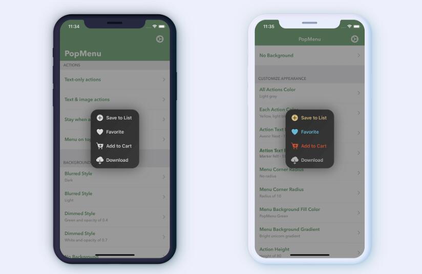
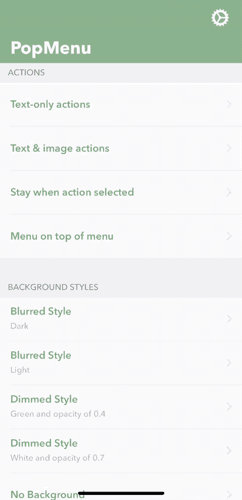
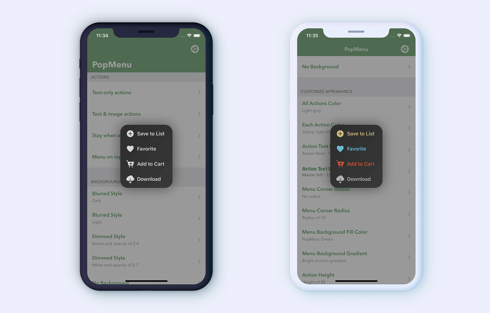
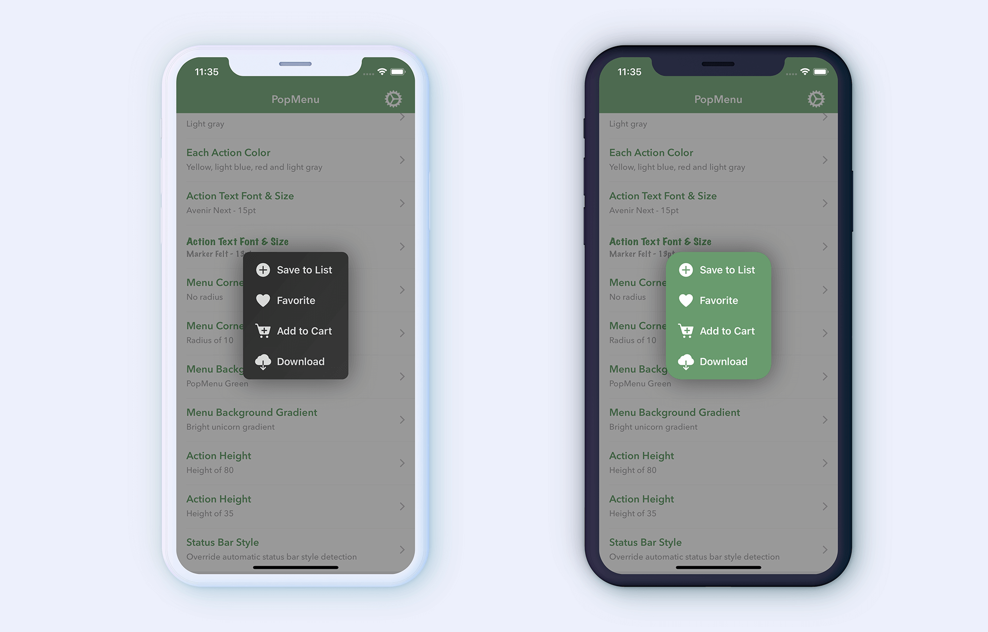
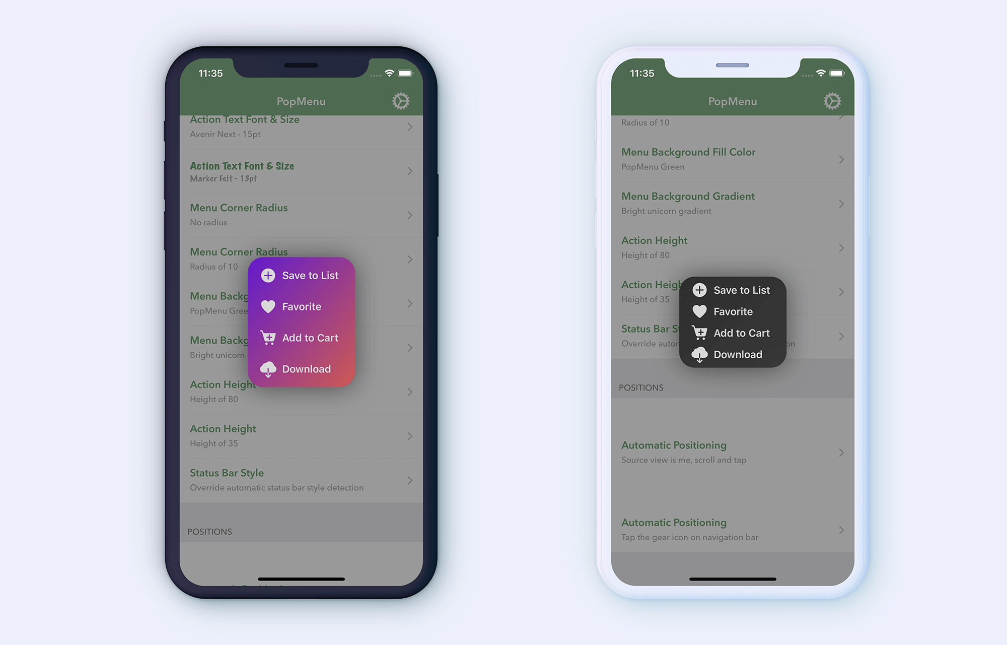
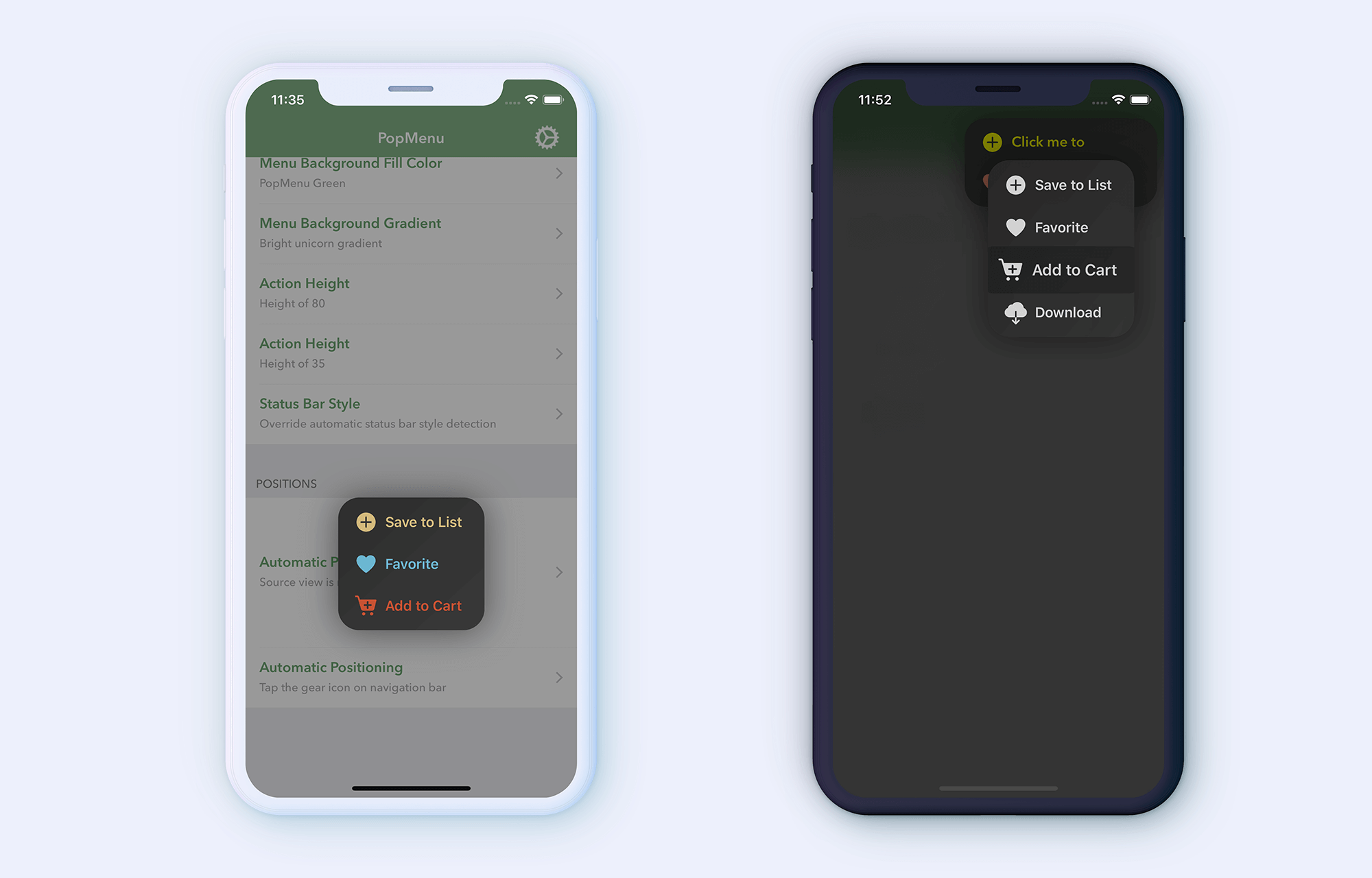
What's a better way to know what PopMenu offers than some screenshots? Here's some to show you what you can do with PopMenu:
⚙️ Installation
For CocoaPods
Install PopMenu using CocoaPods, add it to your Podfile:
‼️
PopMenuwas actually taken so let's call itNewPopMenu'cause why not?
pod 'NewPopMenu'
For Carthage
Install PopMenu using Carthage, add it to your Cartfile:
github "CaliCastle/PopMenu"
⚠️ Requirements
- Xcode 8.0 +
- iOS 9.0 +
- Swift 4.0 +
??? How to Use
Integrating PopMenu is extremely easy with a familiar workflow like presenting UIAlertController with UIAlertAction
Import Library
import PopMenu
Basic Usage
There are 2 ways to present the menu in your view controller:
-
Use the default manager
-
Use the
PopMenuViewControllerclass directly
You can, however, choose either way to have the same result, whichever works best for you.
Which Should I Use?
-
Use the default manager if you want quick setup and present menu seamlessly.
-
Use the
PopMenuViewControllerclass directly if you want to have more control.
If you don't want to scroll, click the link to jump forward:
Basic Usage - Using Controller
Basic Usage - Using Manager
The quickest way would be to use PopMenuManager's default singleton with no additional setup required:
let manager = PopMenuManager.default
Add actions if you're using the manager:
manager.actions = [
    PopMenuDefaultAction(title: "Action Title 1"), // Text only action
    PopMenuDefaultAction(title: "Action Title 2", image: UIImage(named: "icon") // Text and image action
]
Or if you prefer the good ol' way similar to presenting a UIAlertController with UIAlertAction, you can add each action like that:
let action1 = PopMenuDefaultAction(title: "Action Title 1", image: UIImage(named: "icon"))
let action2 = PopMenuDefaultAction(title: "Action Title 2", image: UIImage(named: "icon"))

manager.addAction(action1)
manager.addAction(action2)
That's how you set the actions for the menu.
Now all you have to do is to simply call present() on the manager, either pass the view controller in the on argument or PopMenuManager will automatically fetch the current top view controller to present the menu on top:
// Show menu without specifying which controller
manager.present()

// Or you can specify the controller to present on
manager.present(on: self)
Both should work just fine, but still, using manager.present(on: ...) manually would be a safer way to go for presenting.
Basic Usage - Using Controller
If you are using PopMenuManager to handle PopMenu, you can skip this section.
Manually initialize the controller:
let menuViewController = PopMenuViewController()
Add actions inside the initializer:
let menuViewController = PopMenuViewController(actions: [
    PopMenuDefaultAction(title: "Action Title 1", image: UIImage(named: "icon"),
    PopMenuDefaultAction(title: "Action Title 2", image: UIImage(named: "icon")
])
Finally, to present the menu all you have to do is call present method in your ViewController like a normal view controller:
class ViewController: UIViewController {

...
    func presentMenu() {
        let menuViewController = PopMenuViewController(actions: [
            PopMenuDefaultAction(title: "Action Title 1", image: UIImage(named: "icon"),
            PopMenuDefaultAction(title: "Action Title 2", image: UIImage(named: "icon")
        ])

        present(menuViewController, animated: true, completion: nil)
    }
...

}
Source View
By default, PopMenu will present in the center of your screen. If you want it to display on the relative position of a view that the user tapped, you can pass the source view in like this:
class ViewController: UIViewController {

    @IBOutlet var aButton: UIButton!

    override func viewDidLoad() {
        super.viewDidLoad()

        aButton.addTarget()
    }

    @objc private func presentMenu() {
        // The manager way
        let manager = PopMenuManager.default
        manager.actions = [...]

        // Pass the UIView in present method
        manager.present(sourceView: aButton)


        // ===== or =====


        // The manual way
        let actions = [...]

        // Pass the UIView in init
        let menu = PopMenuViewController(sourceView: aButton, actions: actions)
        present(menu, animated: true, completion: nil)
    }

}
Selection Callback
In order to know which action button is tapped, there are two ways of doing that:
- Action Handler
- Delegate
Action Handler
Simply pass the handler when instanstiating the action:
let action1 = PopMenuDefaultAction(title: "Action 1", didSelect: { action in
    // action is a `PopMenuAction`, in this case it's a `PopMenuDefaultAction`

    // Print out: 'Action 1 is tapped'
    print("\(action.title) is tapped")
})
Delegate Method
You'll need to comform to PopMenuViewControllerDelegate protocol and then implement the method popMenuDidSelectItem(at index: Int) in your view controller:
class ViewController: UIViewController {

    // Use manager to present menu.
    func presentMenuUsingManager() {
        let manager = PopMenuManager.default

        // Set delegate for callback
        manager.popMenuDelegate = self

        manager.present(on: self)
    }

    // Or manually init:
    func presentMenuManually() {
        let menu = PopMenuViewController(actions: [...])

        // Set delegate for callback
        menu.delegate = self

        present(menu, animated: true, completion: nil)
    }

}

extension ViewController: PopMenuViewControllerDelegate {

    func popMenuDidSelectItem(_ popMenuViewController: PopMenuViewController, at index: Int) {
        // Do stuff here...
    }

}
Dismissal Callback
If you'd want more control to do additional steps when the menu is dismssed, you can do it like this:
// The manager way
manager.popMenuDidDismiss = { selected in
    // `selected` is a bool indicating if a selection has been made

    if !selected {
        // When the user tapped outside of the menu
    }
}
Configurations
By default, PopMenu has pan gesture enabled, you can toggle it here:
// The manager way
manager.popMenuShouldEnablePanGesture = false
// The manual way
menu.shouldEnablePanGesture = false
By default, PopMenu has haptics enabled, you can toggle it here:
// The manager way
manager.popMenuShouldEnableHaptics = false
// The manual way
menu.shouldEnableHaptics = false
That's basically it! Congrats!
If you're a customization lover like me, then read along:
?? Customization
Before moving on, customization should be applied before presenting the menu, and assume that you already have a:
variable of PopMenuManager.default called -> manager.
----- or -----
variable of PopMenuViewController called -> menu.
Action Dismissal // Default: true
If you don't want the menu to auto-dismiss once a selection has been performed, you can change the property:
// The manager way
manager.popMenuShouldDismissOnSelection = false

// The manual way
menu.shouldDismissOnSelection = false
Background styles // Default: .dimmed(color: .black, opacity: 0.4)
There are mainly 3 types of background styles:
- Blurred (dark, light & extra Light)
- Dimmed (color & opacity)
- None
Simply set the popMenuBackgroundStyle on the appearance property using . notation:
// The manager way
manager.popMenuAppearance.popMenuBackgroundStyle = .blurred(.dark)
manager.popMenuAppearance.popMenuBackgroundStyle = .blurred(.light)
manager.popMenuAppearance.popMenuBackgroundStyle = .blurred(.extralight)
manager.popMenuAppearance.popMenuBackgroundStyle = .dimmed(color: .white, opacity: 0.6)
manager.popMenuAppearance.popMenuBackgroundStyle = .none()

// The manual way, same to the code above
menu.appearance.popMenuBackgroundStyle = .blurred(.dark)
Action Color // Default: white
To bulk set action colors is simple and straightforward:
// The manager way
manager.popMenuAppearance.popMenuColor.actionColor = UIColor.green // or use Color Literals if you're using Xcode 9

// The manual way
menu.appearance.popMenuColor.actionColor = UIColor.green
To set each action with different color, you'll have to specify in the color parameter initializer of action PopMenuDefaultAction:
let actions = [
    PopMenuDefaultAction(title: "Some Title", image: UIImage(named: "blah"), color: .gray),
    PopMenuDefaultAction(title: "Another Title", image: UIImage(named: "icon"), color: .yellow)
]
Background Color(s) // Default: flat black gradient
There are 2 types of background colors:
- Solid fill (one color)
- Gradient fill (two colors)
To set the background color(s) of the menu:
// The manager way
manager.popMenuAppearance.popMenuColor.backgroundColor = .solid(fill: .gray) // A solid gray background color
manager.popMenuAppearance.popMenuColor.backgroundColor = .gradient(fill: .yellow, .pink) // A gradient from yellow to pink

// The manual way
menu.appearance.popMenuColor.backgroundColor = ...
Action Font // Default: .systemFont(ofSize: 16, weight: .semiBold)
To set the font of all actions:
// The manager way
manager.popMenuAppearance.popMenuFont = UIFont(name: "AvenirNext-DemiBold", size: 14)!
manager.popMenuAppearance.popMenuFont = .systemFont(ofSize: 15, weight: .bold)

// The manual way
menu.appearance.popMenuFont = UIFont(name: "AvenirNext-DemiBold", size: 14)!
Corner Radius // Default: 24
To set corner radius of the menu container:
// The manager way
manager.popMenuAppearance.popMenuCornerRadius = 10

// The manual way
menu.appearance.popMenuCornerRadius = 10
Action Height // Default: 50
To set height of each action:
// The manager way
manager.popMenuAppearance.popMenuActionHeight = 65

// The manual way
menu.appearance.popMenuActionHeight = 65
Action Item Separator // Default: none
To set the action item separator:
// The manager way
manager.popMenuAppearance.popMenuItemSeparator = .none()
manager.popMenuAppearance.popMenuItemSeparator = .fill() // Default height of 0.5, white color with 0.5 opacity
manager.popMenuAppearance.popMenuItemSeparator = .fill(.yellow, height: 1) // Or set it yourself

// The manual way
menu.appearance.popMenuItemSeparator = ...
Status Bar Style // Default: automatic detection based on background color
If you don't want PopMenu to use automatic detection to set status bar style, you can override it:
manager.popMenuAppearance.popMenuStatusBarStyle = .default

// The manual way
menu.appearance.popMenuStatusBarStyle = .default
More customization coming, stay tuned...