SwiftUI Custom TabBar
A custom iOS TabBar implementation using SwiftUI.
Implementation
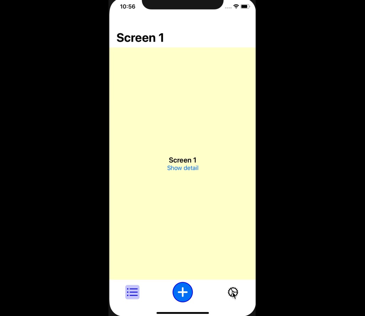
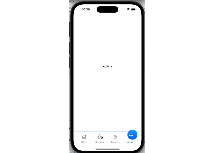
Let’s start by defining and enum that will identify our tabs in a more expressive way. In the custom tab bar there will be three element, but only two are real tabs (as you see from the video above the one in the middle is modal).
enum Tab {
    case Tab1
    case Tab2
}
The main view MainView contains 2 variable fields:
currentView, a@Statevariable that keeps the current tab selectedshowModal, a@Statevariable that is used to manage the presentation of the modal from the central button of the TabBar
The body of the view is composed by a NavigationView that contains a VStack with main components of the custom tab bar implementation:
CurrentScreen, that contains and show the current screen selectedTabBar, that contains custom tab bar with all its logic
There are also some style customization like forcing the navigationViewStyle to StackNavigationViewStyle, in order to avoid to see a blank screen on iPad (because the NavigationView on iPad is a split view by default ). Last but not least, there is a sheet defined to show a ScreenModal view as a modal whenever the state variable showModal changes and the property .edgesIgnoringSafeArea(.all) on the VStack to avoid movement of the tabbar when the current screen needs to show the keyboard.
struct MainView: View {
    @State private var currentView: Tab = .Tab1
    @State private var showModal: Bool = false

    var body: some View {
        NavigationView {
            VStack {
                CurrentScreen(currentView: self.$currentView)
                TabBar(currentView: self.$currentView, showModal: self.$showModal)
            }
            .edgesIgnoringSafeArea(.all)
        }
        .background(Color(.white))
        .navigationViewStyle(StackNavigationViewStyle())
        .sheet(isPresented: self.$showModal) { ScreenModal() }
    }
}
Let’s see first the implementation of the CurrentView. This view is really simple: it shows a specific screen based on the value of its currentView. As you may already noticed, currentView is a not a state variable. It is annotated with the property wrapper @Binding. What does it mean? The @Binding property wrapper lets us declare that one value actually comes from elsewhere, and should be shared in both places. This basically means that this variable will be updated as soon as the variable passed at construction time for this view will be update, and the view will be update consequently by changing the screen shown.
struct CurrentScreen: View {
    @Binding var currentView: Tab

    var body: some View {
        VStack {
            if self.currentView == .Tab1 {
                Screen1()
            } else {
                Screen2()
            }
        }
    }
}
Let’s see the TabBar implementation. Also this view contains two @Binding variables:
-
The first one is again
currentView, that will be updated by its childrenTabBaItemviews whenever the user will tap on them. -
The other one is
showModal, that is a boolean modified by theShowModalTabBarItemwith the methodtoggle(), that invert the current value of the boolean. As you remember we defined a state variableshowModalin theMainView. So as soon as the user taps onShowModalTabBarItemtheshowModalstate is modified and theMainViewwill show a modal screenScreenModal.
Beautiful!! struct TabBar: View {
@Binding var currentView: Tab
@Binding var showModal: Boolvar body: some View { HStack { TabBarItem(currentView: self.$currentView, imageName: "list.bullet", paddingEdges: .leading, tab: .Tab1) Spacer() ShowModalTabBarItem(radius: 55) { self.showModal.toggle() } Spacer() TabBarItem(currentView: self.$currentView, imageName: "gear", paddingEdges: .trailing, tab: .Tab2) } .frame(minHeight: 70) }}
The implementation of TabBarItem is simple. It contains the styling for the tab bar item. The important thing to notice is here is the onTapGesture modifier. Whenever a user taps on it the @Binding currentView variable will be updated and so also the @State variable currentView in the MainView and consequently also the CurrentScreen view will be update.
struct TabBarItem: View {
    @Binding var currentView: Tab
    let imageName: String
    let paddingEdges: Edge.Set
    let tab: Tab

    var body: some View {
        VStack(spacing:0) {
            Image(systemName: imageName)
                .resizable()
                .aspectRatio(contentMode: .fit)
                .padding(5)
                .frame(width: 40, height: 40, alignment: .center)
                .background(Color(self.currentView == tab ? .blue : .white).opacity(0.2))
                .foregroundColor(Color(self.currentView == tab ? .blue : .black))
                .cornerRadius(6)
        }
        .frame(width: 100, height: 50)
        .onTapGesture { self.currentView = self.tab }
        .padding(paddingEdges, 15)
    }
}
The ShowModalTabBarItem is also simple. It contains the style for the custom TabBar item and it attach the action to show the modal to the view with the onTapGestureModifier.
public struct ShowModalTabBarItem: View {
    let radius: CGFloat
    let action: () -> Void

    public init(radius: CGFloat, action: @escaping () -> Void) {
        self.radius = radius
        self.action = action
    }

    public var body: some View {
        VStack(spacing:0) {
            Image(systemName: "plus.circle.fill")
                .resizable()
                .aspectRatio(contentMode: .fit)
                .frame(width: radius, height: radius, alignment: .center)
                .foregroundColor(Color(.systemBlue))
                .background(Color(.white))
                .cornerRadius(radius/2)
                .overlay(RoundedRectangle(cornerRadius: radius/2).stroke(Color(.blue), lineWidth: 2))

        }
        .frame(width: radius, height: radius)
        .onTapGesture(perform: action)
    }
}
Screen1, Screen2 and ScreenModal are full screen VStack view that defined the content for each screen. The important part is the definition of the title on Screen1 and Screen2 to modify the navigation bar using the navigationBarTitle modifier. In the Screen1 view there’s also a NavigationLink that let us navigate to a detail/second level screen. As you remember in the MainView we defined a NavigationView as container of the custom TabBar with the current content. This let us keep the TabBar only on the first level of navigation and it when the user enters in the details screen.
struct Screen1: View {
    var body: some View {
        VStack {
            Spacer()
            HStack {
                Spacer()
                Text("Screen 1")
                    .font(.system(size: 20))
                    .bold()
                Spacer()
            }
            HStack {
                NavigationLink(destination: ScreenDetail()) { Text("Show detail") }
            }
            Spacer()
        }
        .frame(minWidth: 0, maxWidth: .infinity, minHeight: 0, maxHeight: .infinity, alignment: .topLeading)
        .background(Color(.yellow).opacity(0.2))
        .navigationBarTitle("Screen 1")
    }
}

//...

struct Screen2: View {
    var body: some View {
        VStack {
            Spacer()
            HStack {
                Spacer()
                Text("Screen 2")
                    .font(.system(size: 20))
                    .bold()
                Spacer()
            }
            Spacer()
        }
        .frame(minWidth: 0, maxWidth: .infinity, minHeight: 0, maxHeight: .infinity, alignment: .topLeading)
        .background(Color(.purple).opacity(0.2))
        .navigationBarTitle("Screen 2")
    }
}

//...

struct ScreenModal: View {
    var body: some View {
        VStack {
            Spacer()
            HStack {
                Spacer()
                Text("Screen 2")
                Spacer()
            }
            Spacer()
        }
        .frame(minWidth: 0, maxWidth: .infinity, minHeight: 0, maxHeight: .infinity, alignment: .topLeading)
        .background(Color(.red).opacity(0.2))
        .edgesIgnoringSafeArea(.all)
    }
}
