MTCircularSlider
A feature-rich circular slider control written in Swift.
Usage
To run the example project, clone the repo, and run pod install from the Example directory first.
Requirements
- iOS 10.0+
Installation
CocoaPods (iOS 10.0+)
MTCircularSlider is available through CocoaPods. To install
it, simply add the following line to your Podfile:
pod "MTCircularSlider"
Manual Installation
The class file required for MTCircularSlider can be found in the following path:
MTCircularSlider/Classes/MTCircularSlider.swift
Usage
To run the example project, clone the repo and run pod install from the Example directory first.
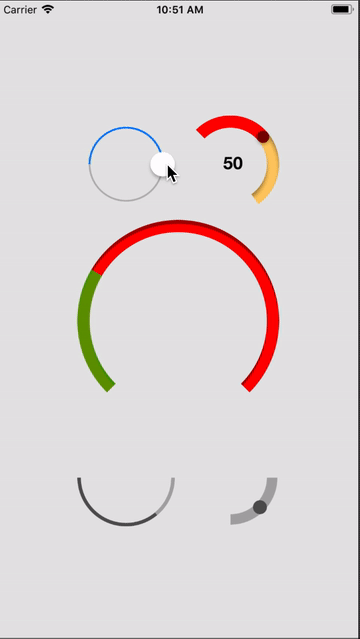
MTCircularSlider implements IBDesignable and IBInspectable, and so can be configure directly from Interface Builder.
Usage in Code - Simple
To add a default circular slider, add the following code to your controller:
self.slider = MTCircularSlider(frame: self.sliderArea.bounds, options: nil)
self.slider?.addTarget(self, action: Selector("valueChange:"), forControlEvents: .ValueChanged)
self.sliderArea.addSubview(self.slider)
Usage in Code - Advanced
To add a custom circular slider, add the following code to your controller:
let attributes = [
/* Track */
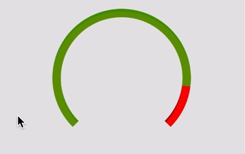
Attributes.minTrackTint(.lightGray),
Attributes.maxTrackTint(.lightGray),
Attributes.trackWidth(12),
Attributes.trackShadowRadius(0),
Attributes.trackShadowDepth(0),
Attributes.trackMinAngle(180),
Attributes.trackMaxAngle(270),
/* Thumb */
Attributes.hasThumb(true),
Attributes.thumbTint(UIColor.darkGrayColor()),
Attributes.thumbRadius(8),
Attributes.thumbShadowRadius(0),
Attributes.thumbShadowDepth(0)
]
self.slider = MTCircularSlider(frame: self.sliderArea.bounds, options: nil)
self.slider.configure(attributes)
self.slider?.addTarget(self, action: Selector("valueChange:"), forControlEvents: .ValueChanged)
self.sliderArea.addSubview(self.slider)
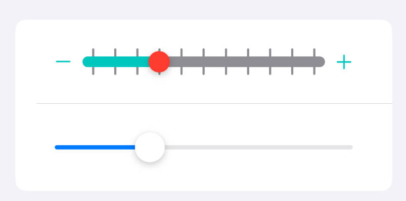
Attributes
minTrackTint(UIColor)
Sets the color of the track up to the thumb.
maxTrackTint(UIColor)
Sets the color of the track from the thumb to the end of the track.
trackWidth(CGFloat)
Sets the width of the track in points.
Default value: 2
trackShadowRadius(CGFloat)
Sets the radius for the inner shadow on the track.
trackShadowDepth(CGFloat)
Sets the distance of the inner shadow on the track from the track edge.
trackMinAngle(Double)
Sets the minimum angle of the track in degrees.
Default value: 0
trackMaxAngle(Double)
Sets the maximum angle of the track in degrees.
Default value: 360
maxWinds(Float)
Sets the maximum number of times a user can wind the control. If set to a value
other than 1, the difference between the minimum and maximum angles must be
exactly 360 degrees.
Default value: 1
hasThumb(Bool)
Toggles the control between progress and slider modes. Setting hasThumb to true
set the control to slider mode.
thumbTint(UIColor)
Sets the color of the thumb.
thumbRadius(CGFloat)
Sets the radius of the thumb in points.
thumbShadowRadius(CGFloat)
Sets the radius of the shadow the thumb drops.
thumbShadowDepth(CGFloat)
Sets the distance of the shadow the thumb from the thumb.
Functions
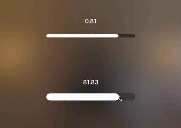
getThumbAngle() -> CGFloat
Returns the current angle of the thumb in radians.