NKButton
A fully customizable UIButton
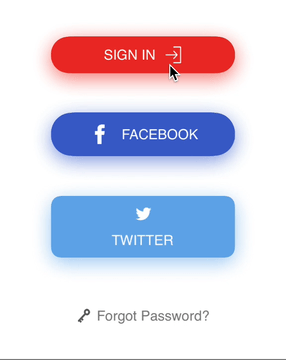
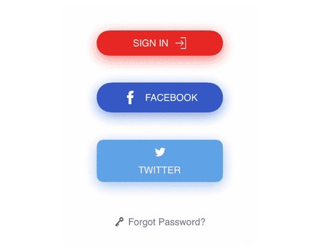
Example
To run the example project, clone the repo, and run pod install from the Example directory first.
Installation
NKButton is available through CocoaPods. To install
it, simply add the following line to your Podfile:
pod 'NKButton'
Usage
Creation and basic customization:
let button = NKButton()
button.title = "Button"
button.setTitleColor(.black, for: .normal) // set title color for normal state
button.setTitleColor(.white, for: .highlighted) // set title color for highlight state
button.setBackgroundColor(.blue, for: .normal) // set background color for normal state
button.setBackgroundColor(.green, for: .highlighted) // set background color for highlight state
button.spacing = 10.0 // space between icon and title
button.imageAlignment = .top // icon alignment
button.underlineTitleDisabled = true // no underline text when `Settings > Accessibility > Button Shapes` is ON
button.isRoundedButton = false
button.cornerRadius = 10.0
button.extendSize = CGSize(width: 50, height: 20) // size that will be included in sizeThatFits
Add border:
button.setBorderColor(.black, for: .normal) // set border color for normal state
button.setBorderColor(.white, for: .highlighted) // set border color for highlight state
button.borderSize = 2.0 // border stroke size
Add shadow:
button.setShadowColor(.blue, for: .normal) // set shadow color for normal state
button.setShadowColor(.green, for: .highlighted) // set shadow color for highlight state
button.shadowOffset = CGSize(width: 0, height: 5)
button.shadowOpacity = 0.6
button.shadowRadius = 10
Add gradient color:
button.setGradientColor([UIColor(white: 1.0, alpha: 0.5), UIColor(white: 1.0, alpha: 0.0)], for: .normal) // set gradient color for normal state
button.setGradientColor([UIColor(white: 1.0, alpha: 0.0), UIColor(white: 1.0, alpha: 0.5)], for: .highlighted) // set gradient color for highlight state
Set loading state:
button.hideImageWhileLoading = true
button.hideTitleWhileLoading = false
button.loadingIndicatorStyle = .ballBeat // loading indicator style
button.loadingIndicatorAlignment = .atImage // loading indicator alignment, apply when transitionToCircleWhenLoading = false
button.transitionToCircleWhenLoading = true // animate to circle shape while in loading state

button.isLoading = true // show loading indicator in the button, and button will be disabled automatically until setting isLoading = false
Flashing:
button.startFlashing()
button.startFlashing(flashDuration: 0.25, intensity: 0.9, repeatCount: 10)
NKButton uses NVActivityIndicatorView for loading indicator, so it currently has 32 animation types
NKButton uses FrameLayoutKit for content layout so you can customize the layout easily
Extension
NKSparkleButton subclasses NKButton to have sparkle effect on tap
Author
Nam Kennic, [email protected]