
Helm is a declarative, graph-based routing library for SwiftUI. It fully describes all the navigation flows and can handle complex overlapping UI, modals, deeplinking, and much more.
Index
Features
- lightweight, ~1K lines of code
- declarative
- deeplinking-ready, it takes a single call to navigate anywhere
- snapshot testing ready, iterate through all screens, capture and compare them
- fully documented interface
- expressive errors
- tested, 90%+ coverage
- zero 3rd party dependencies
Concepts
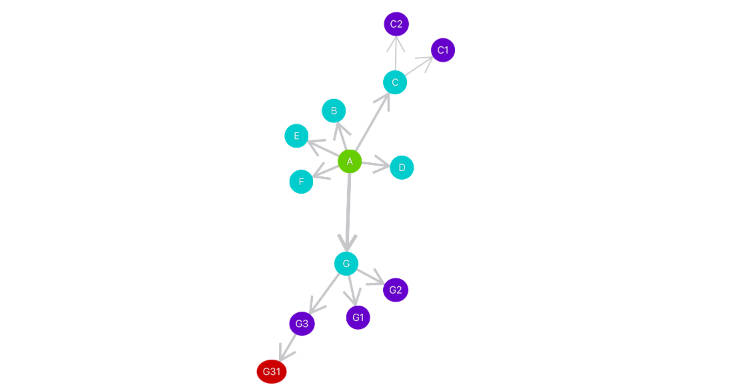
The navigation graph
In Helm, navigation rules are defined in a graph structure using fragments and segues. Fragments are dynamic sections of an app, some are screens, others overlapping views (like a sliding player in a music listening app).
Segues are directed edges used to specify rules between two fragments, such as the presentation style or the auto flag (more about these below).
The presented path
Unlike traditional routers, Helm uses an ordered set of edges to represent the path. This allows querying the presented fragments and the steps needed to reach them while enabling multilayered UIs.
Transitions
Transitions encapsulate the navigation command from a fragment to another. In Helm there are 3 types of transitions:
- presenting a new fragment
- dismissing an already presented fragment
- fully replacing the presented path
Helm
Helm, the main class, navigates between fragments, returns their presentation state and all possible transition and so on. It conforms to ObservableObject, ready to work as an injected @EnvironmentObject.
Segues
Segues are directed edges between fragments with navigation rules:
style:.holdor.pass, when presenting a new fragment from an already presented one, should the original hold its status or pass it to the destination. In simpler terms, if we want both fragments to be visible after the transition (e.g. when you present a modal or an overlapping view in general), we should use.hold.dismissable: trying to dismiss a fragment that’s not marked as such will lead to an error (e.g. once user onboarding is done, you can’t dismiss the dashboard and return to the onboarding screens).auto: some container fragments (like tabs) automatically present a child. Marking a segue as auto will present itsoutfragment as soon as itsinfragment is reached.tag: sometimes is convenient to present or dismiss a segue by its tag.
Usage
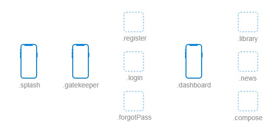
We first define all the fragments in the app.
enum Section: Fragment {
    // the first screen right after the app starts
    case splash

    // the screen that contains the login, register or forgot password fragments
    case gatekeeper
    // the three fragments of the gatekeeper screen
    case login
    case register
    case forgotPass

    // and so on ...
}
We now have:

Next, the navigation graph. Normally we’d have to write down each segue.
let segues: Set<Segue<Section>> = [
    Segue(from: .splash, to: .gatekeeper),
    Segue(from: .splash, to: .dashboard),
    Segue(from: .gatekeeper, to: .login, auto: true)
    Segue(from: .gatekeeper, to: .register)
    //...
]
But this can get extra verbose, so, instead, we can use the directed edge operator => to define all the edges, then turn them into segues. Since => supports one-to-many, many-to-one and many-to-many connections, we can create all edges in fewer lines of code.
let edges = Set<DirectedEdge<Section>>()
    .union(.splash => [.gatekeeper, .dashboard])
    .union([.gatekeeper => .login])
    .union(.login => .register => .forgotPass => .login)
    .union(.login => .forgotPass => .register => .login)
    .union([.login, .register] => .dashboard)
    .union(.dashboard => [.news, .compose])
    .union(.library => .news => .library)

let segues = Set(edges.map { (edge: DirectedEdge<Section>) -> Segue<Section> in
    switch edge {
    case .gatekeeper => .login:
        return Segue(edge, style: .hold, auto: true)
    case .dashboard => .news:
        return Segue(edge, style: .hold, auto: true)
    case .dashboard => .compose:
        return Segue(edge, style: .hold, dismissable: true)
    case .dashboard => .library:
        return Segue(edge, style: .hold)
    default:
        // the default is style: .pass, auto: false, dismissable: false
        return Segue(edge)
    }
})
Now we have:

Once we have the segues, the next step is to create our Helm instance. Optionally, we can also pass a path to start the app at a certain fragment other than the entry. Note that the entry fragment (in this case .splash) is always presented.
try Helm(nav: segues)
// or
try Helm(nav: segues,
         path: [
             .splash => .gatekeeper,
             .gatekeeper => .register
         ])
Then, we inject Helm into the top-most view:
struct RootView: View {
    @StateObject private var _helm: Helm = ...

    var body: some View {
        ZStack {
            //...
        }
        .environmentObject(_helm)
    }
}
Finally, we can use Helm. Be sure to check the interface documentation for each of the presenting/dismissing methods to find out how they differ.
struct DashboardView: View {
    @EnvironmentObject private var _helm: Helm<KeyScreen>

    var body: some View {
        VStack {
            HStack {
                Spacer()
                LargeButton(action: { _helm.present(fragment: .compose) }) {
                    Image(systemName: "plus.square.on.square")
                }
            }
            TabView(selection: _helm.pickPresented([.library, .news, .settings])) {
                LibraryView()
                    .tabItem {
                        Label("Library", systemImage: "book.closed")
                    }
                    .tag(Optional.some(KeyScreen.library))
                NewsView()
                    .tabItem {
                        Label("News", systemImage: "newspaper")
                    }
                    .tag(Optional.some(KeyScreen.news))
                SettingsView()
                    .tabItem {
                        Label("Settings", systemImage: "gearshape.fill")
                    }
                    .tag(Optional.some(KeyScreen.settings))
            }
        }
        .sheet(isPresented: _helm.isPresented(.compose)) {
            ComposeView()
        }
    }
}
Error handling
Most of Helm’s methods don’t throw, instead, they report errors using the errors published property. This allows seamless integration with SwiftUI handlers (e.g. Button‘s action) while also making things easy to debug and assert.
_helm.$errors
    .sink {
        assertionFailure($0.description)
    }
    .store(in: &cancellables)
Deeplinking
The presented path (OrderedSet<DirectedEdge<N>>) is already conforming to Encodable and Decodable protocols so it can easily be saved and restored as a JSON object. Alternatively, one could translate a simpler string path to the graph-based presentation path and use the former to link sections in the app.
Snapshot Testing
Being able to walk the navigation graph is one of the greatest advantages of Helm. This can have multiple uses, snapshot testing being the most important. Walk, take snapshots after each step and compare the result with previously saved snapshots. All done in a couple of lines of code:
let transitions = _helm.transitions()
for transition in transitions {
    try helm.navigate(transition: transition)
    // mutate state if needed, take a snapshot, compare it
}
Also, by using a custom transition set, one can make arbitrary steps between fragments. This can be used to automatically record videos (and snapshots) for a specific flow (really helpful with App Store promotional material).
Examples
The package contains an extra project called Playground. It’s integrating Helm with SwiftUI, including using NavigationViews, sheet modals, TabView, etc.