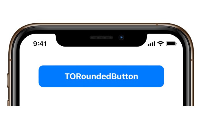
TORoundedButton
TORoundedButton is an open source UI control of a standard user button. Its design consists of displaying text on top of a solid rectangle with rounded corners. This UI style has started becoming more and more common in iOS 11 and above, but while Apple has an official one they use internally, it is not possible to achieve this effect without heavily modifying UIButton.
TORoundedButton has been crafted to be as graphically performant as possible, with specific codepaths created for whether the button is opaque (eg, it is displayed over a solid color that never changes), or if it is transparent (Displayed over dynamic content that changes)
TORoundedButton is not simply a subclass of UIButton. Instead, it is a subclass of UIControl with all button graphics and behaviors re-engineered from scratch.
Features
- A completely custom implementation; no
UIButtonhacking. - Extremely flexible with many options for configuring the look and feel of the button.
- Integrates with Interface Builder for visual configuration.
- Wherever possible, the rounded rectangle effect is created dynamically in Core Graphics to produce a flat bitmap for ultimate efficiency.
- When necessary for dynamic background content, it uses Core Animation's
cornerRadiusfeature to still allow a performant, dynamically clipped button. - Elegantly cancels and resumes animations when the user slides their finger on and off the button.
- Piggy-backs off most standard
UIViewproperties in order to minimize the learning curve. - Includes dynamic color code to generate a 'tapped' shade of the normal color, saving you extra effort.
- Fully compatible with Swift, with the class name
RoundedButton.
Examples
TORoundedButton features a complete default configuration useful for most app instances, but can be easily modified beyond that.
// Create a new instance of `RoundedButton`
let button = RoundedButton(text: "Continue")

// Set the background color to match the super view for best performance
button.backgroundColor = .white

// Set the background color to clear only when it the
// background content behind the button dynamically changes
button.backgroundColor = .clear

// The button color itself is controlled via tintColor
button.tintColor = .red

// If desired a brightness offset that will be used to
// dynamically calculate the 'tapped' color from the default one.
button.tappedTintColorBrightnessOffset = -0.15

// A closure is used to detect when tapped
button.tappedHandler = {
	print("Button tapped!")
}
The important thing to remember when using this library is to correctly set backgroundColor.
Requirements
TORoundedButton will work with iOS 10 and above. While written in Objective-C, it will easily import into Swift.
Manual Installation
Copy the contents of the TORoundedButton folder to your app project.
CocoaPods
pod 'TORoundedButton'
Carthage
github "TimOliver/TORoundedButton"
Why build this?
This sort of button style is more or less the bread and butter of a lot of iOS apps. But even that being the case, it is not offered as an officially supported style of UIButton.
Because of this, most developers will achieve this look by simply giving a UIButton a solid background, and then using the Core Animation cornerRadius API to round the corners.
As simple as this is, this is gross overkill for a lot of circumstances in which you'd use a button. The Texture Group wrote a very impressive article discussing the best way to produce rounded corners.
I wanted to make this control because I wanted something better. 95% of the time, instead of doing complex GPU clipping, simply generating a one-off graphic of the rounded corners is far more efficient.
That being said, for instances where actual dynamic clipping is needed, this library does use cornerRadius to produce that clipping result. I found out at WWDC 2018 that Core Animation was refined thanks to Metal, so while there is still a performance cost for cornerRadius, in cases where true dynamic clipping is needed, then it is fine.