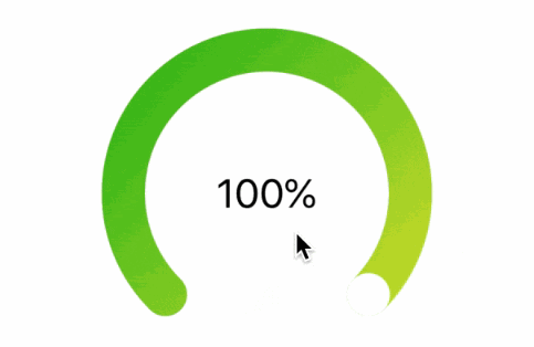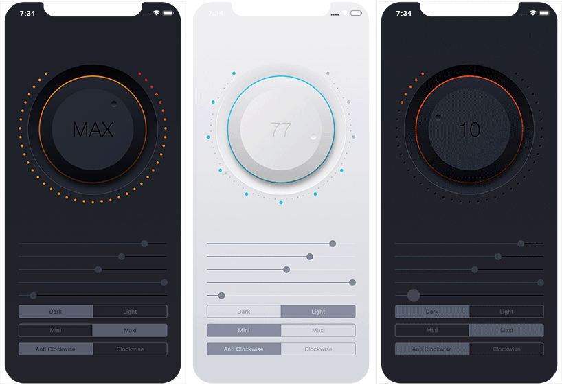
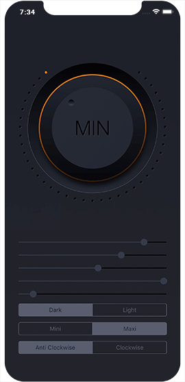
JOCircularSlider
JOCircularSlider is a highly customisable and reusable iOS circular slider that mimics the behaviour of a knob control. It uses no preset images and every one of its components is drawn completely in code making it extremely adaptable to every design and theme.
Example
To run the example project, clone the repo, and run pod install from the Example directory first.
Requirements
- iOS 10.0+
- Xcode 10.0
Installation
JOCircularSlider is available through CocoaPods. To install
it, simply add the following line to your Podfile:
pod 'JOCircularSlider'
JOCircularSlider is also available through Carthage. To install it, simply add the following line to your Cartfile:
github "ouraigua/JOCircularSlider"
Usage
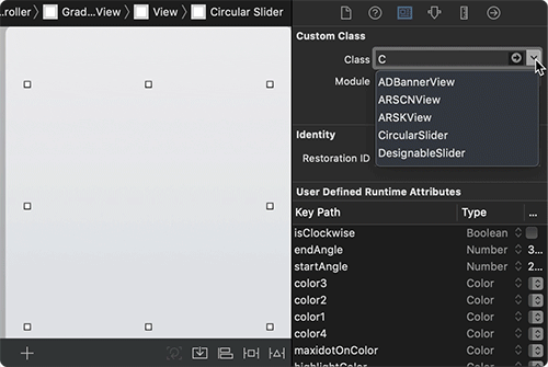
- Visually:
Drag a UIView to your storyboard, change its class of to CircularSlider and start visually customising the design to your liking.
All the parameters are IBInspectable, so you can configure the slider straight from the attribute inspector tab, without having to write a single line of code.
- Programatically:
import JOCircularSlider

let circularSlider = CircularSlider(frame: aFrame)
circularSlider.startAngle = 230
circularSlider.endAngle = 310
circularSlider.minimumValue = 0
circularSlider.maximumValue = 60
circularSlider.isClockwise = false
These are just few of the many params you can configure for the slider.
The slider's min/max values are IBInspectable and default to 0.0 and 100.0 respectively.
They also support negative and positive values or a mixture of them.
@IBInspectable open var minimumValue: CGFloat = 0
@IBInspectable open var maximumValue: CGFloat = 100
The slider's value property is both { get set } and it is designed to work similarly to the familiar value property of UIKit's generic UISlider.
/**
    This value will be pinned to minimumValue/maximumValue
    The default value of this property is 0.0.
*/
@IBInspectable open var value: CGFloat  // { get set }
In order to get value change notifications, use the Target-Action pattern which is an inherent part of UIControl, like so:
/**
    Add target/action for particular event.
    - parameter target:     The object whose action method is called
    - parameter action:     A selector identifying the action method to be called
    - parameter Event:      The control-specific events for which the action method is called
                            So far I've only implemented the following:

                            UIControl.Event.valueChanged
                            UIControl.Event.editingDidBegin
                            UIControl.Event.editingDidEnd
*/
circularSlider.addTarget(target: Any?, action: Selector, for: UIControl.Event)
To Control the appearance of the label displaying the value, use these:
open func setLabelFont(named: String, textColor: UIColor, multiplier: CGFloat)
open func setLabelShadow(color: UIColor, opacity: Float = 1, offset: CGSize = CGSize(width: 1, height: 1), radius: CGFloat = 0)
You can also specify the number of decimal places this label should show.
The default is 0.0 unless for example the value is within [0.0, 1.0]
@IBInspectable open var labelDecimalPlaces: Int = 0
If you need to override the text in the label, then just implement the following function inside the selector of the Target-Action
method for the event UIControl.Event.valueChanged
open func setLabelText(_ text: String?)
Author
Jalal Ouraigua, [email protected]