Annular ProgressView
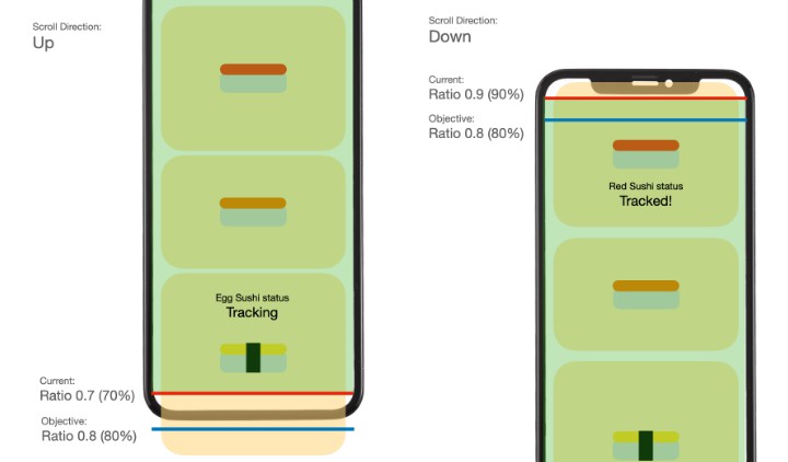
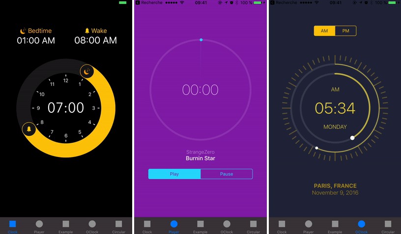
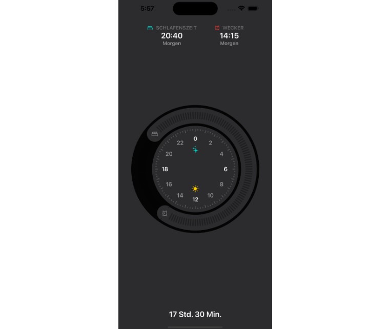
Preview
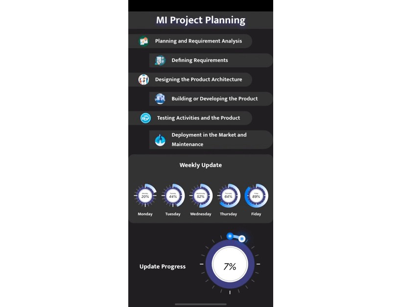
Keeping a regular check on the progress of project completion is a bit difficult, but not anymore, We have created our own custom progress view to measure the progress of the individual project on an individual day based on the task completion. That helps us to generate daily reports with specific numbers.
Using Annular progress view now it’s no longer difficult to measure the bang on results!

A powerful Circular Slider which has been written in SwiftUI
To run the example project, clone the repo, and run pod install from the Example directory.
Requirements
- iOS 13.0+
- Xcode 12.5+
Installation
Circular Slider is available through CocoaPods. To install it, simply add the following line to your Podfile:
To install it, simply add the following line to your Podfile:
pod 'CircularSlider', git: 'https://github.com/PiyushSelarka/CircularSlider.git', branch: 'main'
Usage
Added import CircularSlider
import CircularSlider
Config
Configration for Circular Slider with completion
CircularSlider(config: Config(minimumValue: 0.0,
                              maximumValue: 100,
                              totalValue: 100,
                              knobRadius: 10,
                              radius: 125,TotalProgressView: 20.0,
                              outercircleColor: Color.init(red: 64/255, green: 66/255, blue: 131/255),
                              innercircleColor: RadialGradient(gradient: Gradient(colors: [.white, .gray]), center: .center, startRadius: 50, endRadius: 100),
                              lineColor: Color(UIColor.lightGray),
                              lineWidth: 1.0,
                              tickColor: Color.gray,
                              tickhighlightedColor: Color.white,
                              sliderColor: LinearGradient(gradient: Gradient(colors: [.blue, .white]),startPoint: .topLeading, endPoint: .bottomLeading),
                              startPointCircleColor: RadialGradient(gradient: Gradient(colors: [.white, .blue,]), center: .center, startRadius: 0, endRadius: 7),
                              pointCircleColor: RadialGradient(gradient: Gradient(colors: [.blue, .white]), center: .center, startRadius: 0, endRadius: 7),
                              titleText: "Monday"
                             ),
                             completion: { (value) in
                                  print(value) // Getting slider value
                             }
)
minimumValue
Minimum Value of the slider or you can say start value for the slider. It will set in CGFloat.init
maximumValue
Maximum value for the slider which is set in CGFloat.init
totalValue
TotalValue will help to measure progress of the circle while moving which should be equal to maximum value
knobRadius
The Radius of the know that how large you want to show
radius
Size or area of Progress view which can be define by radius
outercircleColor
The color of back circle set in Color.init
innercircleColor
The color of inner side circle set in RadialGradient.init
lineColor
The color of line in inner circle set in Color.init
lineWidth
The width of line in inner circle set in CGFloat.init
tickColor
The color of tick in 360 degree circle set in Color.init
tickhighlightedColor
The color of tick highlighted in 360 degree circle set in Color.init
sliderColor
The color of slider set in LinearGradient.init
startPointCircleColor
The slider start circle color set in RadialGradient.init
pointCircleColor
The slider drag circle color set in RadialGradient.init
titleText
set Title text in circle
TotalProgressView
When you want to put a static number to show the progress only then you can pass the number in this property which will help you to show the circular bar based on the value you pass
CallBack
completion: { (value) in
    print(value) // Getting slider value
}
? Check out other lists of our Mobile UI libraries
? Check out other lists of Web libraries
? Get FREE Industry WhitePapers →
Check out our Work
? License
MI-Circular Slider is MIT-licensed.
If you use our open-source libraries in your project, please make sure to credit us and Give a star to www.mindinventory.com