NMessenger
NMessenger is a fast, lightweight messenger component built on AsyncDisplaykit and written in Swift. Developers can inherently achieve 60FPS scrolling and smooth transitions with rich content components.
Version Information
- 1.0.0
Requirements
- iOS 8.2+
Installation for Cocoapods
# For latest release in cocoapods - 1.0.80 (Swift 3, ASDK 2.X)
pod 'NMessenger'

# For ASDK 1.9
pod 'NMessenger', '1.0.79'

# For Swift 2.3 support
pod 'NMessenger', '1.0.76'
Notes
For iOS 10 Support
Add NSPhotoLibraryUsageDescription and NSCameraUsageDescription to your App Info.plist to specify the reason for accessing photo library and camera. See Cocoa Keys for more details.
Landscape Mode
- Landscape mode is not currently supported. While it may be supported in a future release, we have disabled device rotation for
NMessengerViewControllerto prevent issues.
Getting Started
NMessengerViewController
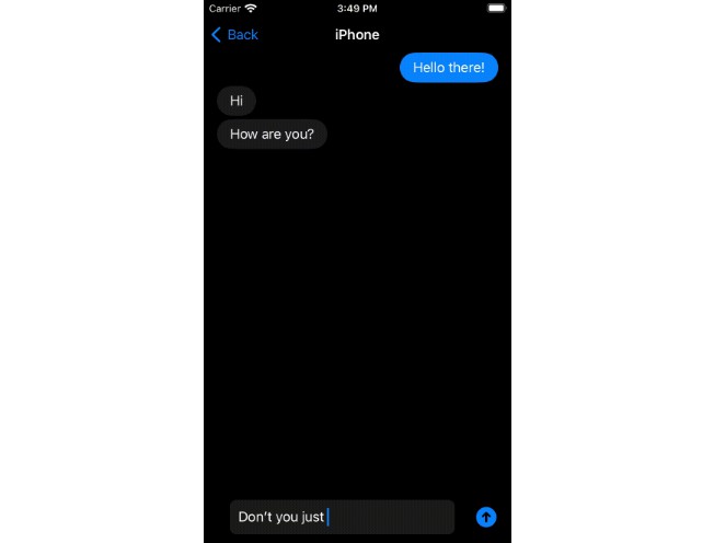
NMessenger comes with a prebuilt NMessengerViewController that has a few supported features.
- Posting messages
- Input bar with a custom placeholder
- Camera and photo library access
- Typing indicator support
Posting Messages
Send a text message.
func sendText(text: String, isIncomingMessage:Bool) -> GeneralMessengerCell

Send a message with an image.
func sendImage(image: UIImage, isIncomingMessage:Bool) -> GeneralMessengerCell
Send a message with a network image. (Uses AsyncDisplayKit with PINCache to lazyload and cache network images)
func sendNetworkImage(imageURL: String, isIncomingMessage:Bool) -> GeneralMessengerCell
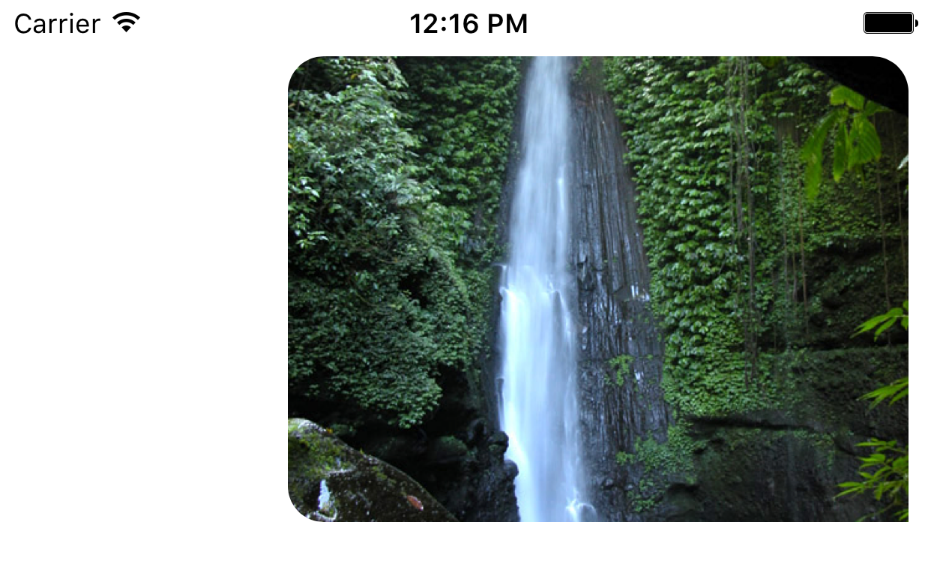
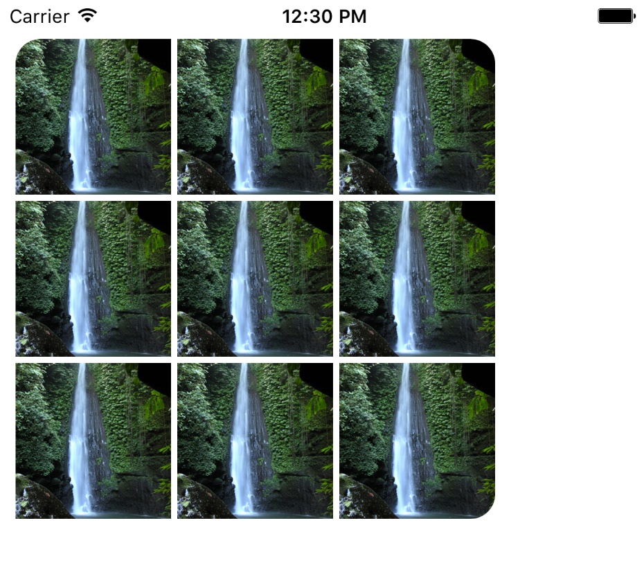
A message with a collection view can be created directly from an array of views or nodes. Note: Nodes take advantage of ASDK's async rendering capabilities and will make this component scroll more smoothly.
func sendCollectionViewWithViews(views: [UIView], numberOfRows:CGFloat, isIncomingMessage:Bool) -> GeneralMessengerCell
func sendCollectionViewWithNodes(nodes: [ASDisplayNode], numberOfRows:CGFloat, isIncomingMessage:Bool) -> GeneralMessengerCell
One line CollectionView
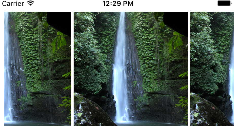
Multi line CollectionView
Send a message with a custom view or node. Note: Nodes take advantage of ASDK's async rendering capabilities and will make this component scroll more smoothly.
func sendCustomView(view: UIView, isIncomingMessage:Bool) -> GeneralMessengerCell
func sendCustomNode(node: ASDisplayNode, isIncomingMessage:Bool) -> GeneralMessengerCell

These functions are meant to be overridden for network calls and other controller logic.
Typing Indicators
Typing indicators signify that incoming messages are being typed. This will be the last message in the messenger by default.
/** Adds an incoming typing indicator to the messenger */
func showTypingIndicator(avatar: ASDisplayNode) -> GeneralMessengerCell

/** Removes a typing indicator from the messenger */
func removeTypingIndicator(indicator: GeneralMessengerCell)

Custom InputBar
To use a custom input bar, you must subclass InputBarView. InputBarView conforms to InputBarViewProtocol:
@objc public protocol InputBarViewProtocol
{
    /* Superview of textInputView - can hold send button and/or attachment button*/
    var textInputAreaView: UIView! {get set}
    /* UITextView where the user will input the text*/
    var textInputView: UITextView! {get set}
    //NMessengerViewController where to input is sent to
    var controller:NMessengerViewController! {get set}
}
Both textInputAreaView and textInputView must be created in order for NMessengerViewController to have the correct behavior. controller is set by the initializer in InputBarView base class.
In order to use your custom InputBar, override func getInputBar()->InputBarView in NMessengerViewController.
NMessenger
NMessenger can be added to any view.
self.messengerView = NMessenger(frame: CGRectMake(0, 0, self.view.frame.size.width, self.view.frame.size.height))
messengerView.delegate = self
self.view.addSubview(self.messengerView)
With NMessenger, there is no need to manage a data source. Simply add a message and forget about it.
Changing and updating a message relies on a reference. These references can be passed through a delegate method or stored locally in a class.
self.delegate.deleteMessageBtnClick(self)
.
.
.
func deleteMessageBtnClick(message: GeneralMessageCell) {
  self.messengerView.removeMessage(message, .None)
}
Message Bubbles
NMessenger comes with a few prebuilt bubble types. bubble can also easily be subclassed to create a new bubble component.
SimpleBubble

DefaultBubble

StackedBubble

ImageBubble - Can be used with any 9 Patch Image
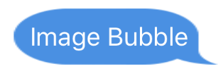
By setting hasLayerMask = true, bubbles will mask their content. This is relevant for images and other rich content components.
Bubble Configuration
In order to configure custom bubbles for the messenger, you must create a new class that implements BubbleConfigurationProtocol.
/** Configures a bubble for a ContentNode. Implement this to create your own bubble configuration */
protocol BubbleConfigurationProtocol {
    var isMasked: Bool {get set}

    /** Create and return a UI color representing an incoming message */
    func getIncomingColor() -> UIColor

    /** Create and return a UI color representing an outgoing message */
    func getOutgoingColor() -> UIColor

    /** Create and return a bubble for the ContentNode */
    func getBubble() -> Bubble

    /** Create and return a bubble that is used by the Message group for Message nodes after the first. This is typically used to "stack" messages */
    func getSecondaryBubble() -> Bubble
}
This protocol is meant to provide a new instance of the bubble class for primary (messageNode) and secondary (messageGroup) bubble types. By changing var sharedBubbleConfiguration: BubbleConfigurationProtocol in NMessengerViewController, you can set the configuration for all newly added messages.
Content Nodes and Custom Components
Content Nodes
A Content Node holds message content in a MessageNode (everything inside of the bubble).

Subclassing ContentNode gives you the ability to define your own content. This is particularly useful for creating rich content components that are not in our stock message kit. Alternatively, you can initialize a 'CustomContentNode' with your own view or node.
Content Nodes can also be given a BubbleConfigurationProtocol to customize their bubble.
GeneralMessengerCell
GeneralMessengerCell can be subclassed to make any type of component. All messenger cells extend this object.
Timestamps
Timestamps can be easily added with the MessageSentIndicator class.
let messageTimestamp = MessageSentIndicator()
messageTimestamp.messageSentText = "NOW"

//NMessengerViewController
self.addMessageToMessenger(messageTimestamp)

//NMessenger
messengerView.addMessage(messageTimestamp, scrollsToMessage: false)
Avatars
Custom avatars can be set with an AsyncDisplayKit ASImageNode.
let nAvatar = ASImageNode()
nAvatar.image = UIImage(named: "nAvatar")
.
.
.
messageNode.avatarNode = nAvatar
Head Prefetching
Many messengers prefetch at the head. This is not trivial with a UITableView or AysncDisplayKit features. NMessenger supports head prefetching out of the box.
To use the head prefetch feature, set var doesBatchFetch: Bool = true on NMessenger. NMessengerDelegate will also need to be implemented and set by your controller.
@objc protocol NMessengerDelegate {
    /**
     Triggered when a load batch content should be called. This method is called on a background thread.
     Make sure to add prefetched content with *endBatchFetchWithMessages(messages: [GeneralMessengerCell])**/
    optional func batchFetchContent()
    /** Returns a newly created loading Indicator that should be used at the top of the messenger */
    optional func batchFetchLoadingIndicator()->GeneralMessengerCell
}
All batch fetch network calls should be done in batchFetchContent. Make sure to add your message cells with endBatchFetchWithMessages(messages: [GeneralMessengerCell]) to end the batch fetch. Calling this function will remove the loading indicator and batch fetch lock.
Message Groups
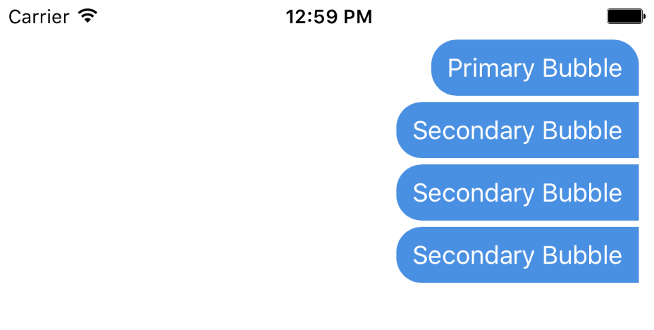
Message Groups can be used to stack messages and animate avatars. Like MessageNode, MessageGroup extends GeneralMessageCell. The difference, however is that MessageGroup holds a table of MessageNodes rather than a ContentNode.
================
| MessageGroup | -> ===============    ===============
================    | MessageNode | -> | ContentNode | (Primary Bubble)
                    ---------------    ===============
                    | MessageNode | -> | ContentNode | (Secondary Bubble)
                    ---------------    ===============
                    | MessageNode | -> | ContentNode | (Secondary Bubble)
                    ---------------    ===============
                    | MessageNode | -> | ContentNode | (Secondary Bubble)
                    ===============    ===============
Additionally, MessageGroup determines the bubble type of the MessageNode's content based on the position in the table. The first message's content will have a primary bubble, the rest will have a secondary bubble. Typically, the avatar will be disabled on any MessagesNode in the group, but kept for the MessageGroup.
Adding, Removing, and Updating
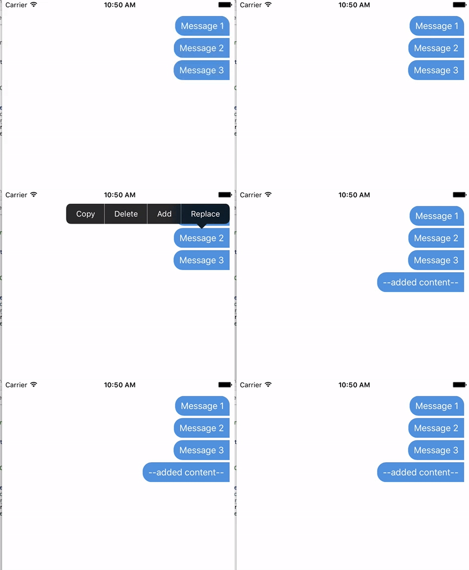
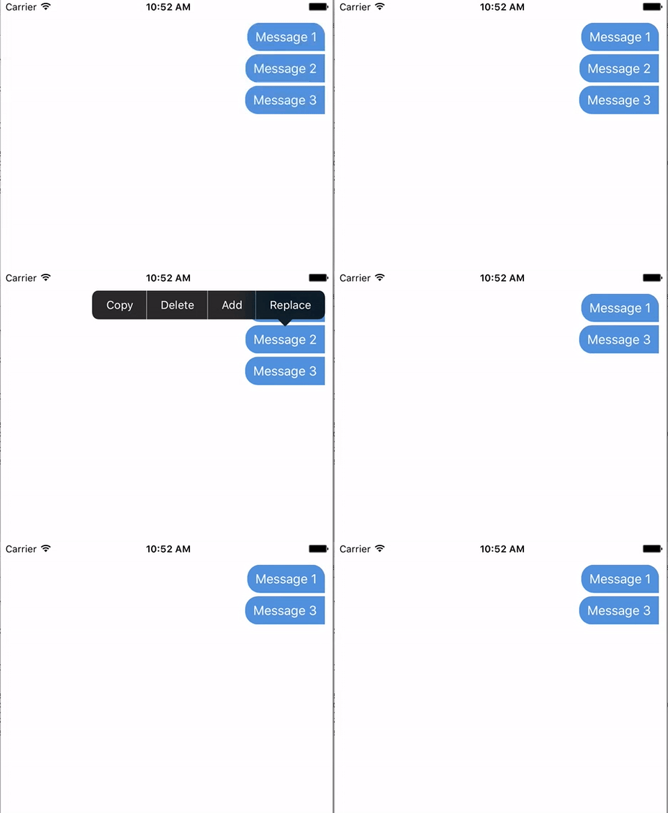
Message Groups include a few slick animations for Adding, Removing, and Updating MessageNodes in the group. These can be called directly from MessageGroup or Added and Removed from NMessenger. Note: These are not surfaced in the NMessengerViewController yet
It is recommended that they are removed from NMessenger because of the possibility that the MessageNode removed was the last message in the group. If this happens, the MessageGroup will remain after the MessageGroup was removed. NMessenger makes sure that in this case the MessageGroup is removed from the messenger.
Adding
To add a MessageNode.
messageGroup.addMessageToGroup(message: GeneralMessengerCell, completion: (()->Void)?)
Removing
To remove a MessageNode.
messageGroup.removeMessageFromGroup(message: GeneralMessengerCell, completion: (()->Void)?)
Updating
To update an existing MessageNode with a new MessageNode.
messageGroup.replaceMessage(message: GeneralMessengerCell, withMessage newMessage: GeneralMessengerCell, completion: (()->Void)?)

Authors
- Aaron Tainter
- David Schechter
