Material
An animation and graphics framework for Material Design in Swift.
Welcome to Material, a Material Design library used to create beautiful applications. Material's animation system has been completely reworked to take advantage of Motion, a library dedicated to animations and transitions.

Language: Swift
License: BSD-3
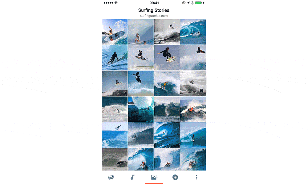
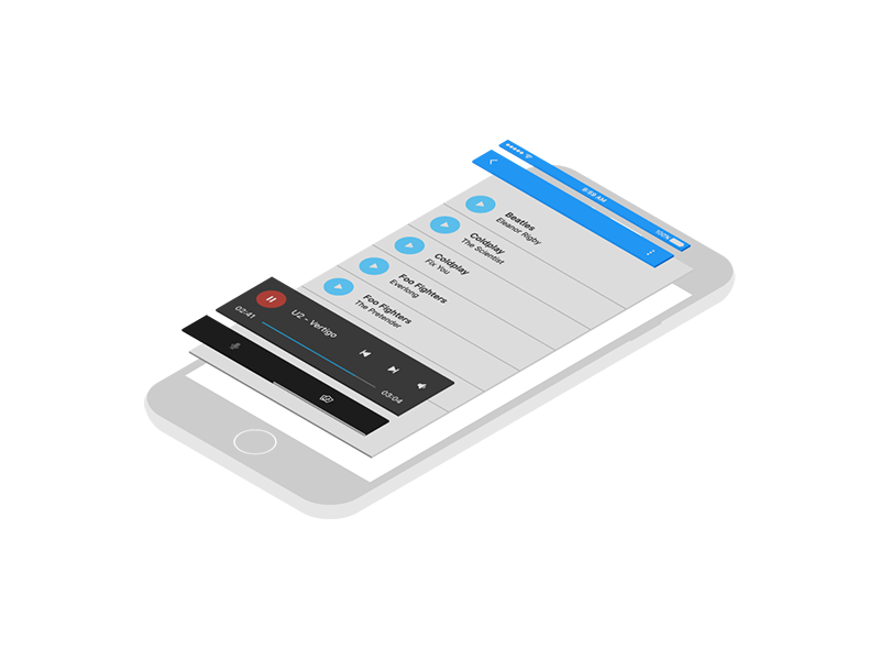
Photos Sample
Take a look at a sample Photos project to get started.
Sample Projects
Take a look at Sample Projects to get your projects started.
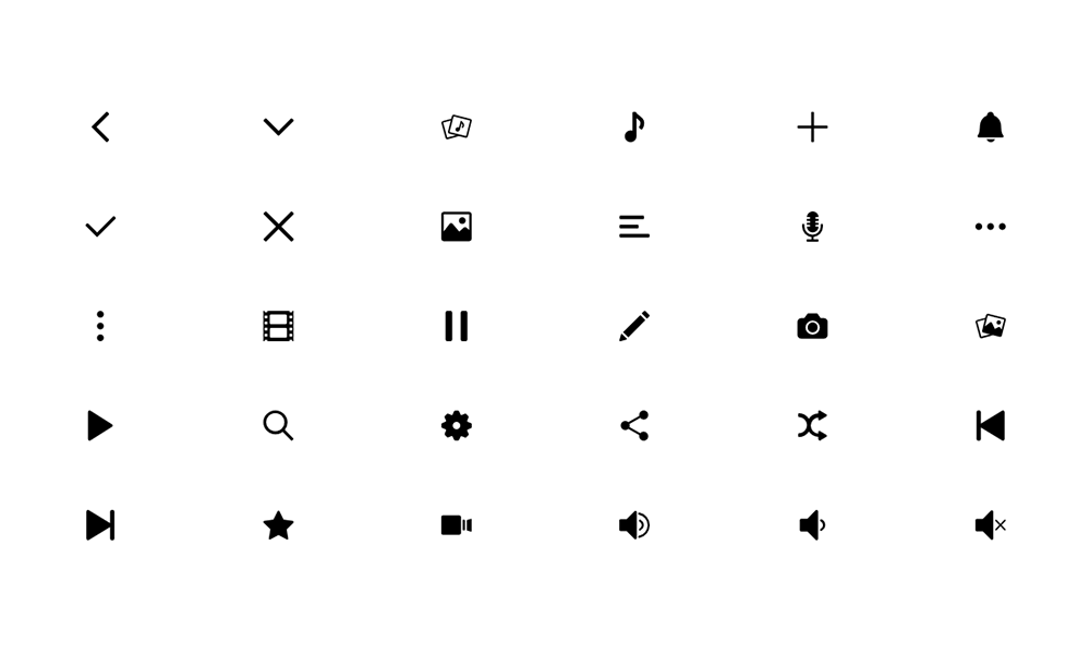
Icons
Icons is a library of Google and CosmicMind icons that are available for use within your iOS applications.
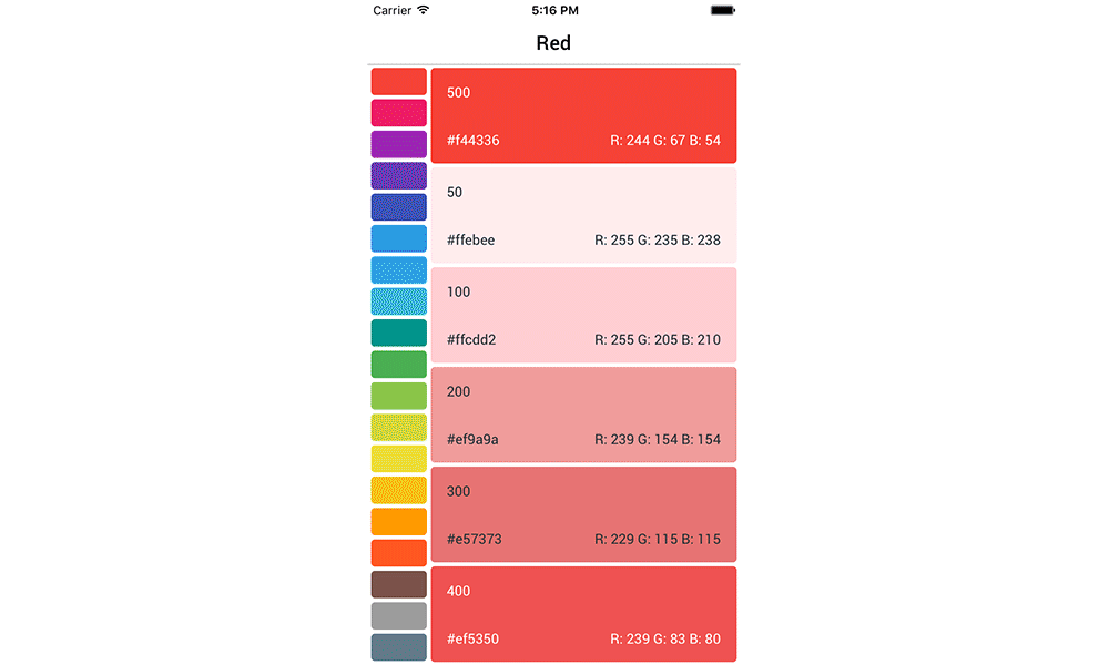
Colors
Try the Material Colors app to see the wonderful colors available in Material, or use the online version at MaterialColor.com.
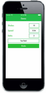
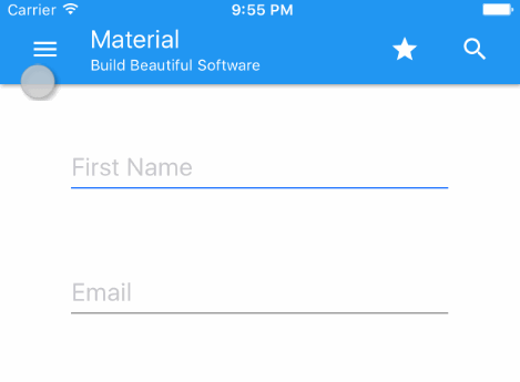
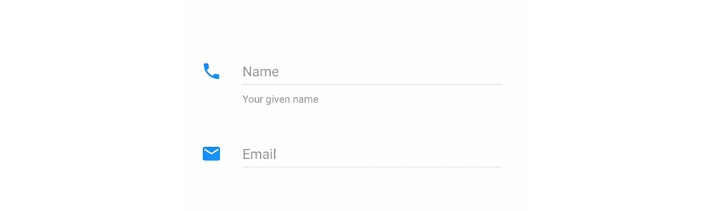
TextField
A TextField is an excellent way to improve UX. It allows for a placeholder and additional hint details.
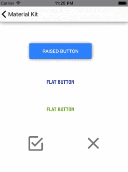
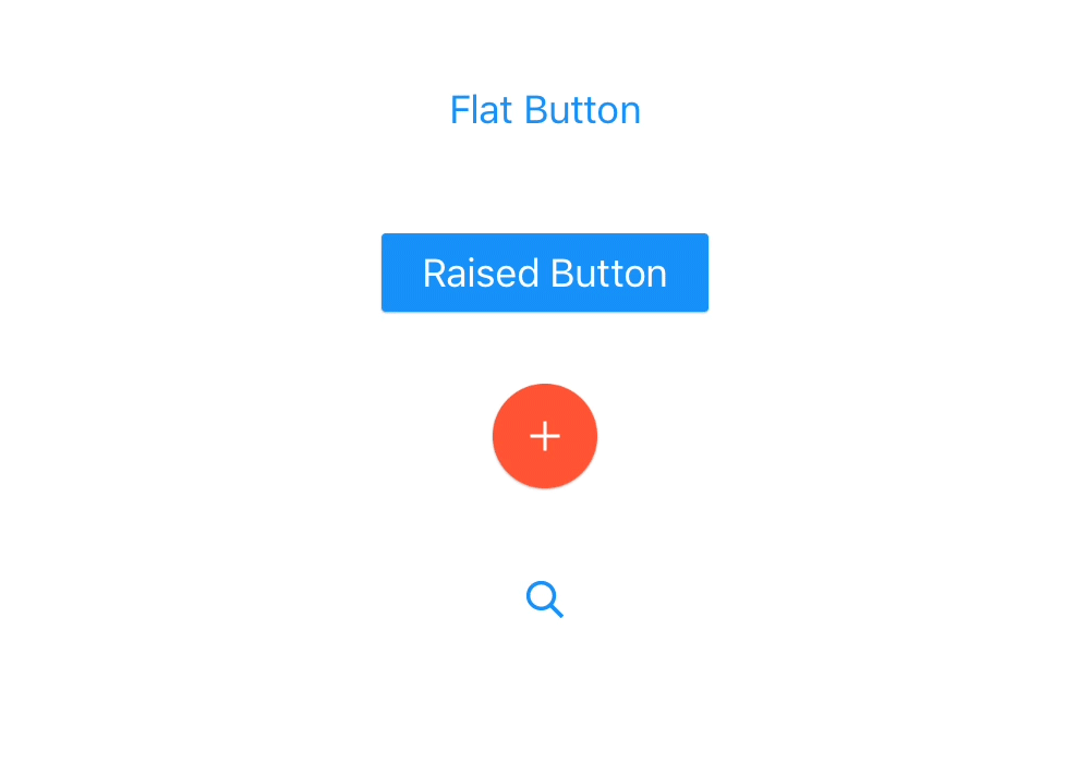
Button
A button is used to trigger an action through a touch event. Material comes with a foundational button, and 4 specialized buttons that can be stylized in any way.
Switch
A switch is a control component that toggles between on and off states.

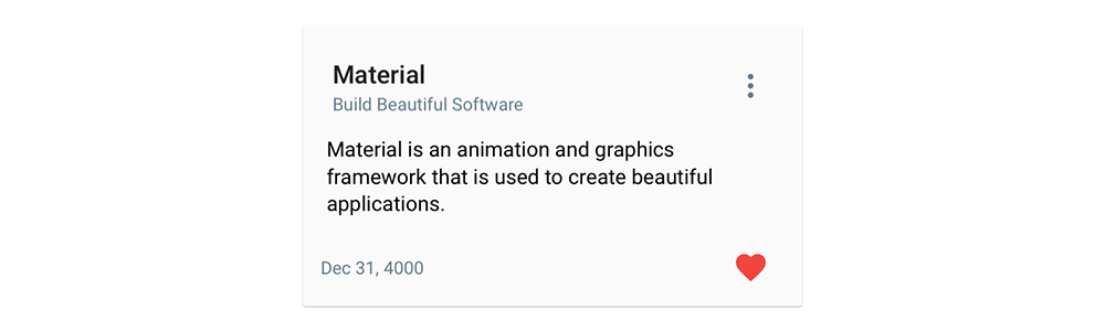
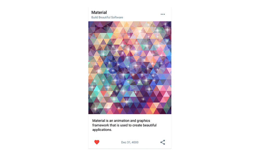
Card
A Card is a flexible component that may be configured in any way you like. It has a Toolbar, Bar, and content area that may utilize any UIView type.
Material Image
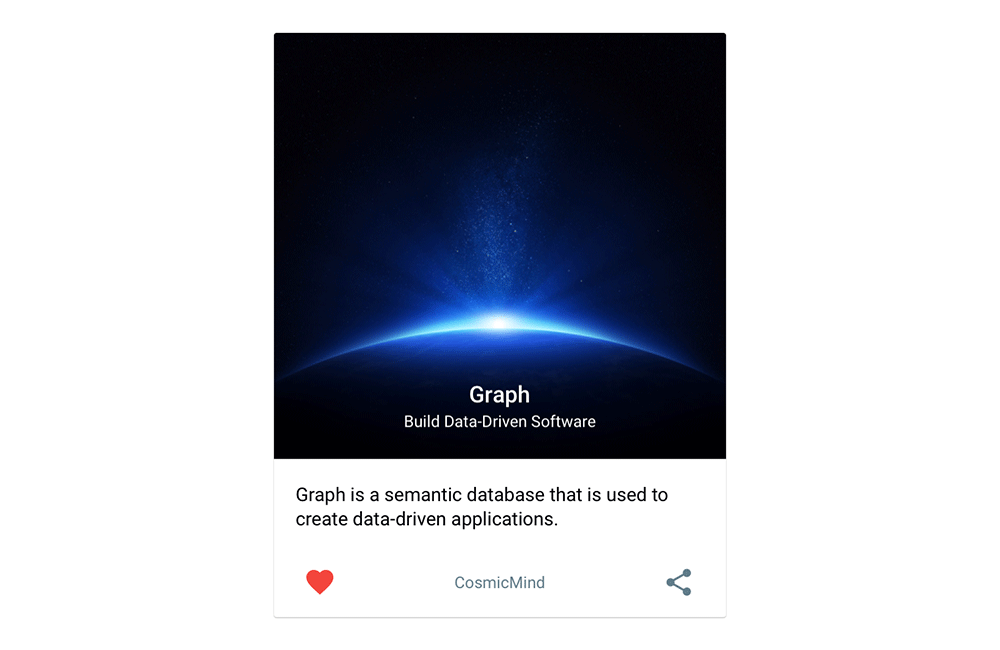
ImageCard
An ImageCard is an expansion of the base Card. The Toolbar overlays an image area that sits above the dynamic content area.
PresenterCard
The PresenterCard is a completely new card style. It allows for a primary presentation area that may be any UIView type in addition to the content area, Toolbar, and Bar components. The options for this card are endless.
FABMenu
A FABMenu manages a collection of views. A new MenuItem type has been added that manages a title and button to improve UX and visual beauty.

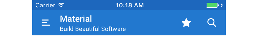
Toolbar
Toolbars are super flexible and add excellent control to your navigation flow. They manage a set of left and right views with auto aligning title and detail labels.
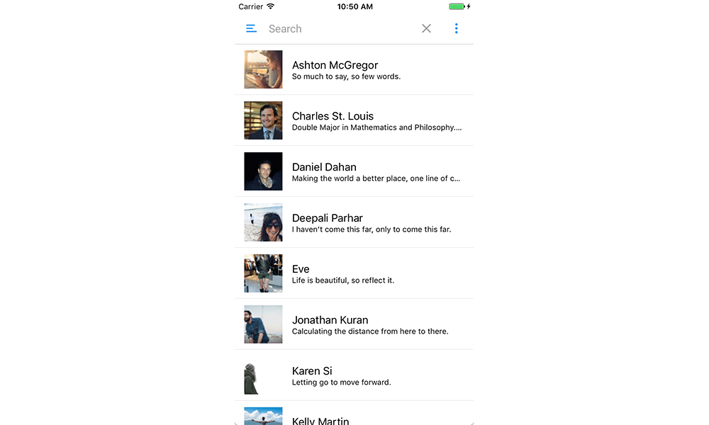
SearchBar
A SearchBar is a powerful navigation tool that allows for user's input with an instant visual response. A set of left and right views may be added to expand functionality.
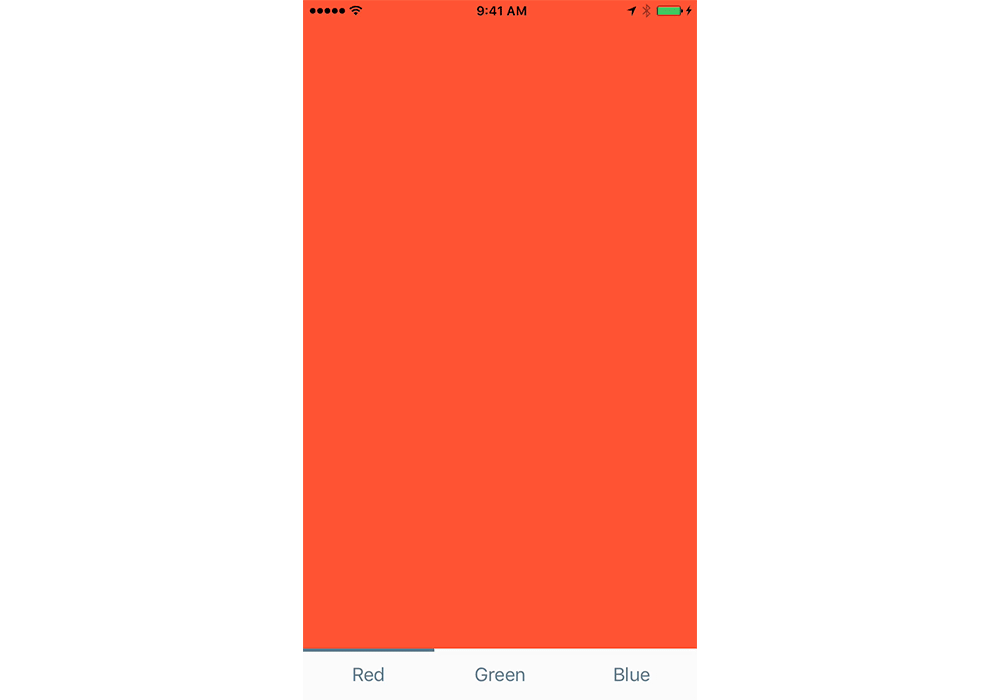
Tabs
Tabs is a new component that links a customizable TabBar to a stack of view controllers making a powerful and visually pleasing component to have in any application.
NavigationController
A NavigationController is a specialized view controller that manages a hierarchy of content efficiently, making it easier for users to move within an application.
NavigationDrawer
A NavigationDrawer slides in from the left or right and contains the navigation destinations for your application.
Snackbar
A Snackbar is a new component that is very simple in its behavior and very powerful in its message. It can be used application wide, or isolated to specific view controllers.

Sticker Sheet
To help template your project, checkout Material Sticker Sheet.
Features
- Completely Customizable
- Motion Animations & Transitions
- Layout Tools for AutoLayout & Grid Systems
- Color Library
- Cards
- FABMenu
- Icons
- TextField
- Snackbar
- Tabs
- Chips
- SearchBar
- NavigationController
- NavigationDrawer
- BottomNavigationBar
- Sample Projects
- And More...