HalfModal
A reusable modal component for SwiftUI that can be half/full height and support necessarily properties from the UISheetPresentationController.
Features
- Customise modal height (support multiple detents).
- Customise modal corner radius.
- Customise dimmed area.
- Default detent from array of detents.
Currently supported properties from UISheetPresentationController
To avoid confusion, most of the naming of the property variables will be the same with the properties in UISheetPresentationController, unless there is a better naming to replace it.
- detents
- selectedDetentIdentifier
- largestUndimmedDetentIdentifier
- preferredCornerRadius (cornerRadius in HalfModal)
- prefersGrabberVisible
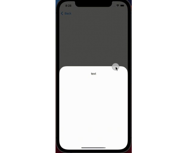
Demo
Half height modal only
HalfModal(
    content: { DetailView() },
    isPresented: $show,
    detents: [.medium()],
    )
Half + Full height modal only
HalfModal(
    content: { DetailView() },
    isPresented: $show,
    detents: [.medium(), .large()],
    )
Half + Full height modal and other features from UISheetPresentationController.
HalfModal(
    content: { ... },
    isPresented: $presented,
    detents: [.medium(), .large()],
    selectedDetentIdentifier: .large, // default detent for the modal
    cornerRadius: 50.0,
    showGrabber: true)
Usage with modifiers
    NavigationView {
        VStack {
            Button("Tap") { presented = true }
        }
    }
    .sheet(
        isPresented: $presented,
        detents: [.medium(),.large()],
        selectedDetentIdentifier: .large
        ,
        cornerRadius: 50.0,
        showGrabber: true,
        content: {
            Text("Detail")
        }
    )