NSideMenu
Description
A simple customizable side menu written in SwiftUI.
Give a Star! ⭐
Feel free to request an issue on github if you find bugs or request a new feature.
If you find this useful, please give it a star to show your support for this project.
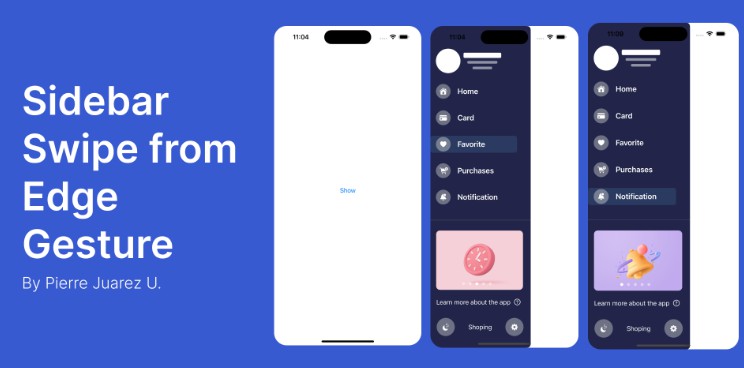
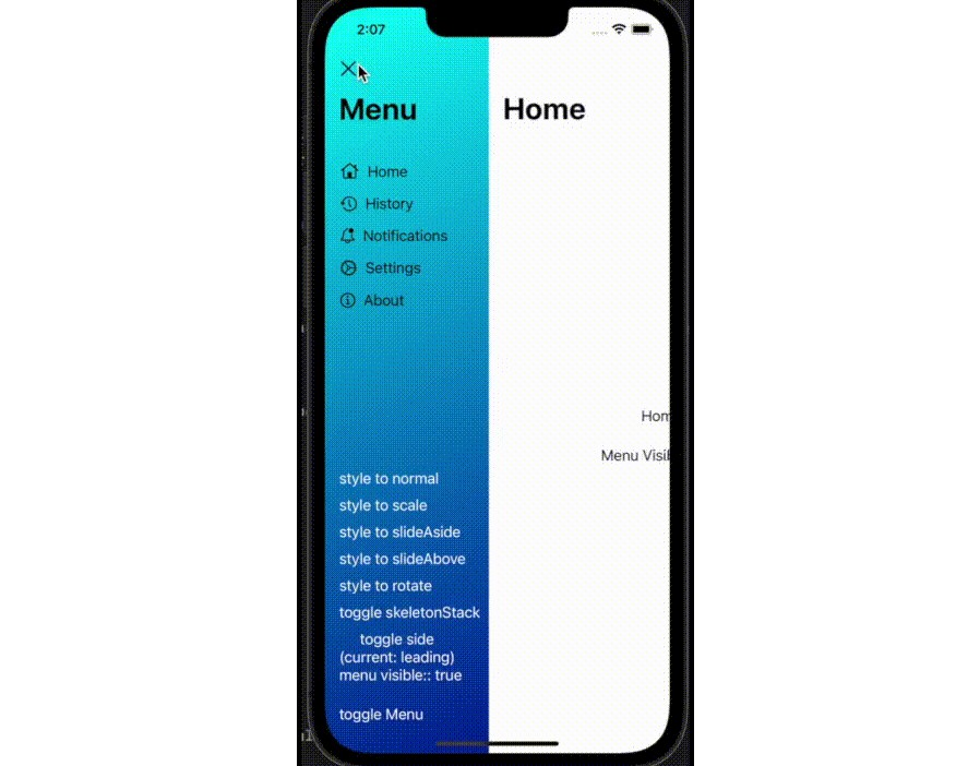
Example

Installation
Copy this url:
https://github.com/itisnajim/NSideMenu.git
then in Xcode project, select File > Add Packages… and past it in the input with the placeholder ‘Search or Enter package URL’
Usage
In your content view body add NSideMenuView like the code below:
    @StateObject var options = NSideMenuOptions()
    var body: some View {
        NSideMenuView(options: options){
            Menu{
                YourMenuView()
            }
            Main{
                YourMainView()
            }
        }
    }
Customization
You can Customize NSideMenuView via NSideMenuOptions initializer or through the object
    options = NSideMenuOptions(style: .normal, side: .leading, width: 220, showSkeletonStack: false, skeletonStackColor: .white, cornerRaduisIfNeeded: 16, rotaionDegree: 8,
    onWillClose: {
        print("menu:onWillClose!")
    }, onWillOpen: {
        print("menu:onWillOpen!")
    }, onDidClose: {
        print("menu:onDidClose!")
    }, onDidOpen: {
        print("menu:onDidOpen!")
    })
    // or
    options.style = .slideAbove
    ...
NSideMenuOptions Properties
- style: Presentation Style, of type enum with cases: normal, scale, slideAbove, slideAside and rotate, default: normal.
- side: Menu side, of type enum with cases: leading and trailing, default: leading.
- width: Menu content container width, of type CGFloat, default: 186.
- showSkeletonStack: Main view content Skeleton Stack visiblity, of type Bool, default: false.
- skeletonStackColor: Main view content Skeleton Stack color, of type Color, default: Color(UIColor.systemBackground).
- cornerRaduisIfNeeded: when style is scale and Menu is visible this property will be applied on the Main view container corners, of type CGFloat, default: 16.
- rotaionDegree: when style is rotate and Menu is visible this property will be applied on the Main view container rotation degree, of type Double, default: 6.
- show: Menu view visiblity, of type Bool, default: false.
NSideMenuOptions Methods and Events
- onWillClose: fired when ‘show’ property asigned to false or when calling toggleMenu Method.
- onWillOpen: fired when ‘show’ property asigned to true or when calling toggleMenu Method.
- onDidClose: fired when the side menu close animation did finish.
- onDidOpen: fired when the side menu open animation did finish.
- toggleMenu(animation: Animation? = .default): this method to toggle the side menu visiblity from open to close or from close to open.
- showMenu(animation: Animation? = .default): this method to open the side menu
- hideMenu(animation: Animation? = .default): this method to close the side menu
Author
itisnajim, [email protected]
License
NSideMenu is available under the MIT license. See the LICENSE file for more info.