SHSliderSwitch
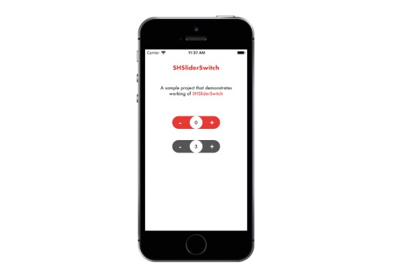
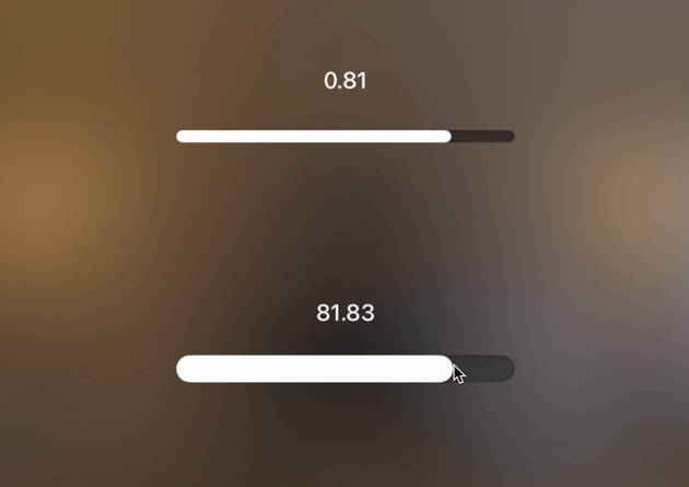
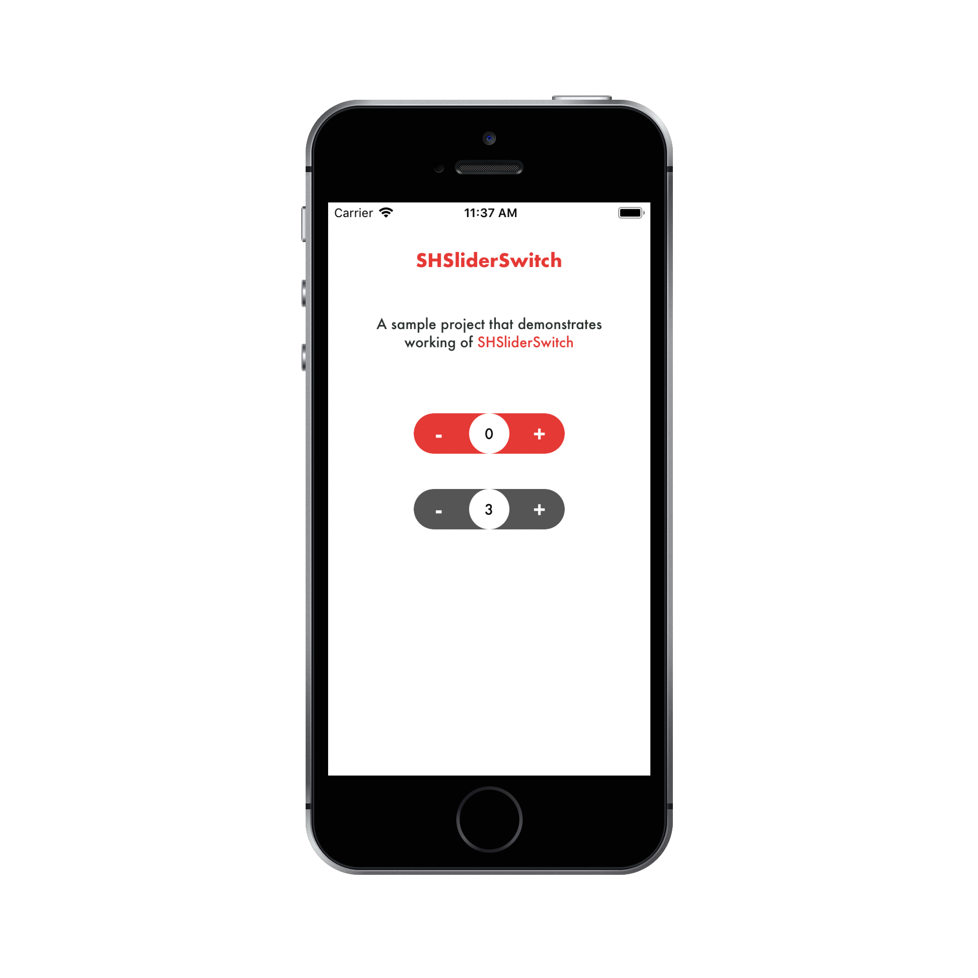
SHSliderSwitch is a simple lightweight library to implement an animated slider switch.
Installation
Just drag and drop the SHSliderSWitch.swift file from SHSliderSWitch folder to your project.
Cocoapods
pod 'SHSliderSwitch'
Usage
- Just drag and drop an view in storyboard and set view class to SHSliderSWitch.

- How to configure:
-- can configure using IBInspectable.

-- configure manually.
  //Current value of the switch. Defaults to 0.
  sliderSwitch.value = 0.0

  /// Minimum value. Must be less than maximumValue. Defaults to 0.
  sliderSwitch.minimumValue = 0.0

  /// Maximum value. Must be more than minimumValue. Defaults to 100.
  sliderSwitch.maximumValue = 100.0

  /// Increment value  in switch. Defaults to 1.
  sliderSwitch.stepValue = 1

  /// Text color of the circular label. Defaults to white.
  sliderSwitch.labelTextColor = UIColor.white

  /// Background color of the circular label. Defaults to lighter white.
  sliderSwitch.labelBackgroundColor = UIColor.blue

  /// Font of the circular label. Defaults to Futura-Medium, 14.0 points in size.
  sliderSwitch.labelFont = UIFont(name: "Futura-Medium", size: 14.0)

  /// Border width of the switch and circular label's layer. Defaults to 0.0.
  sliderSwitch.borderColor = 0.0

  /// Color of the border of the switch and circular label's layer. Defaults to clear color.
  sliderSwitch.borderColor = UIColor.clear

  /// Font of the buttons. Defaults to Futura-Bold, 20.0 points in size.
  sliderSwitch.buttonsFont = UIFont(name: "Futura-Bold", size: 20.0)

  /// Text color of the buttons. Defaults to white.
  sliderSwitch.buttonsTextColor = UIColor.white
Requirements
- iOS 11.0+
