NavigationProgress
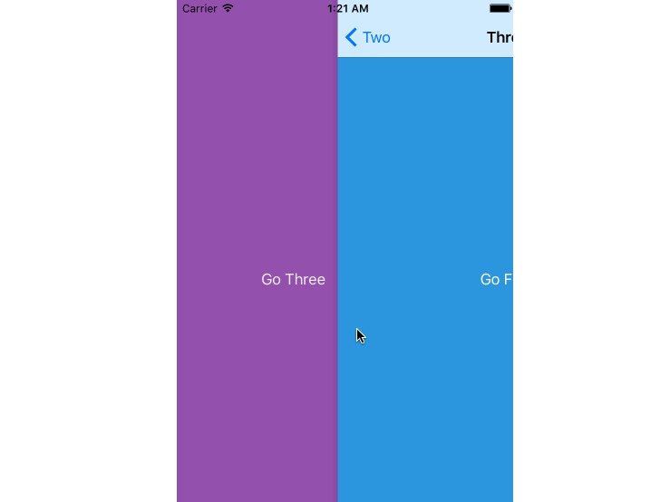
A simple UIProgressView attachs to top of UINavigationController
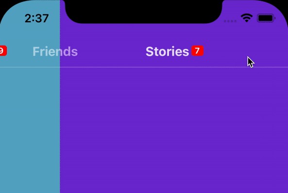
.oneTime in navigationController
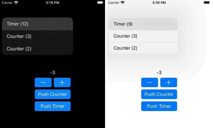
.always in navigationController from modal view
Requirements
- iOS 10+
- Swift 5.0+
Installation
Swift Package Manager
The Swift Package Manager is a tool for automating the distribution of Swift code and is integrated into the swift compiler. It is in early development, but Gradient Progress Bar does support its use on supported platforms.
Once you have your Swift package set up, adding Gradient Progress Bar as a dependency is as easy as adding it to the dependencies value of your Package.swift.
dependencies: [
    .package(url: "https://github.com/chrisnyw/NavigationProgress", from: "0.1")
]
How to use
– Import NavigationProgress
Import NavigationProgress when you need.
import NavigationProgress
– NavigationProgress setup
Call setup() once your app start to enable the swizzleHelper to make NavigationProgress work properly
NavigationProgress.setup()
– start NavigationProgress in your UIViewController
Ensure your UIViewController is under UINavigationController, and calls startNavigationProgress(with:) in your current viewController class.
Once your call startNavigationProgress(), it treats your current page is first page and NavigationProgress will be shown. Meanwhile, when your back to your previous page, NavigationProgress will be remove from your navigationController.
startNavigationProgress(with: NavigationProgress(totalPages: 3))
– force remove NavigationProgres
Force remove the existing NavigationProgress from your navigationController
removeNavigationProgress()
Configuration
– Object NavigationProgress
totalPages is the only compulsory property for object NavigationProgress
NavigationProgress(totalPages: 3)
Or you may configure NavigationProgress by passing all values
NavigationProgress(totalPages: 3,
                   progressType: .oneTime, // default .oneTime
                   progressTintColor: .orange, // default .orange
                   trackTintColor: .gray, // default .gray
                   animationDuration: 0.3) // default 0.3
– Property totalPages
Adjusts the total number of pages, used for calculate the total value for progressBarView.
navigationProgress.totalPages = 3
– Property progressType
Set NavigationProgress progress type for only display for oneTime or always
– .oneTime
NavigationProgress will be removed after passed the totalPages
– .oneTime
NavigationProgress will not be removed after passed the totalPages. Thus, when you back to page before totalPages NavigationProgress will be shown again.
public enum ProgressType {
  case oneTime
  case always
}
– Property progressTintColor
Adjusts the color shown for the portion of the progress bar that is filled.
navigationProgress.progressTintColor = .orange
– Property trackTintColor
Adjusts the color shown for the portion of the progress bar that is not filled.
navigationProgress.trackTintColor = .gray
– Property animationDuration
Adjusts animation duration for show / hide NavigationProgress once it is added or removed
navigationProgress.animationDuration = 0.3
Author
Chris Ng (chrisnyw(@)gmail.com)
License
NavigationProgress is available under the MIT license. See the LICENSE file for more info.


