QuickTableViewController
A simple way to create a table view for settings, including:
- Table view cells with
UISwitch - Table view cells with center aligned text for tap actions
- A section that provides mutually exclusive options
- Actions performed when the row reacts to the user interaction
- Easy to specify table view cell image, cell style and accessory type
Usage
Set up tableContents in viewDidLoad:
import QuickTableViewController
final class ViewController: QuickTableViewController {
override func viewDidLoad() {
super.viewDidLoad()
tableContents = [
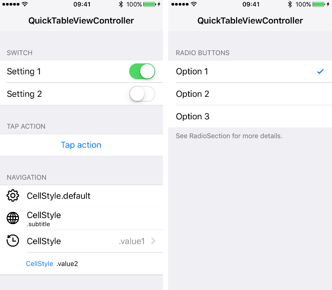
Section(title: "Switch", rows: [
SwitchRow(text: "Setting 1", switchValue: true, action: { _ in }),
SwitchRow(text: "Setting 2", switchValue: false, action: { _ in })
]),
Section(title: "Tap Action", rows: [
TapActionRow(text: "Tap action", action: { [weak self] in self?.showAlert($0) })
]),
Section(title: "Navigation", rows: [
NavigationRow(text: "CellStyle.default", detailText: .none, icon: .named("gear")),
NavigationRow(text: "CellStyle", detailText: .subtitle(".subtitle"), icon: .named("globe")),
NavigationRow(text: "CellStyle", detailText: .value1(".value1"), icon: .named("time"), action: { _ in }),
NavigationRow(text: "CellStyle", detailText: .value2(".value2"))
], footer: "UITableViewCellStyle.Value2 hides the image view."),
RadioSection(title: "Radio Buttons", options: [
OptionRow(text: "Option 1", isSelected: true, action: didToggleSelection()),
OptionRow(text: "Option 2", isSelected: false, action: didToggleSelection()),
OptionRow(text: "Option 3", isSelected: false, action: didToggleSelection())
], footer: "See RadioSection for more details.")
]
}
// MARK: - Actions
private func showAlert(_ sender: Row) {
// ...
}
private func didToggleSelection() -> (Row) -> Void {
return { [weak self] row in
// ...
}
}
}
NavigationRow
Detail Text Styles
NavigationRow(text: "UITableViewCellStyle.default", detailText: .none)
NavigationRow(text: "UITableViewCellStyle", detailText: .subtitle(".subtitle")
NavigationRow(text: "UITableViewCellStyle", detailText: .value1(".value1")
NavigationRow(text: "UITableViewCellStyle", detailText: .value2(".value2"))
Subtitle and the initializers with title/subtitle are deprecated and will be removed in v2.0.0.
Accessory Type
- The
NavigationRowshows with different accessory types based on theactionandaccessoryButtonActionclosures:
var accessoryType: UITableViewCell.AccessoryType {
  switch (action, accessoryButtonAction) {
  case (nil, nil):      return .none
  case (.some, nil):    return .disclosureIndicator
  case (nil, .some):    return .detailButton
  case (.some, .some):  return .detailDisclosureButton
  }
}
- The
actionwill be invoked when the table view cell is selected. - The
accessoryButtonActionwill be invoked when the accessory button is selected.
Images
enum Icon {
  case named(String)
  case image(UIImage)
  case images(normal: UIImage, highlighted: UIImage)
}
- Images in table view cells can be set by specifying the
iconof each row. - Table view cells in
UITableViewCellStyle.value2will not show the image view.
SwitchRow
- A
SwitchRowis representing a table view cell with aUISwitchas itsaccessoryView. - The
actionwill be invoked when the switch value changes.
TapActionRow
- A
TapActionRowis representing a button-like table view cell. - The
actionwill be invoked when the table view cell is selected. - The icon, detail text, and accessory type are disabled in
TapActionRow.
OptionRow
- An
OptionRowis representing a table view cell with.checkmark. - The
actionwill be invoked when the selected state is toggled.
let didToggleSelection: (Row) -> Void = { [weak self] in
  if let option = $0 as? OptionRowCompatible, option.isSelected {
    // to exclude the event where the option is toggled off
  }
}
RadioSection
RadioSectionallows only one selected option at a time.- Setting
alwaysSelectsOneOptionto true will keep one of the options selected. OptionRowcan also be used withSectionfor multiple selections.
Customization
Rows
All rows must conform to Row and RowStyle. Additional interface to work with specific types of rows are represented as different protocols:
NavigationRowCompatibleOptionRowCompatibleSwitchRowCompatibleTapActionRowCompatible
Cell Classes
A customized table view cell type can be specified to rows during initialization.
// Default is UITableViewCell.
NavigationRow<CustomCell>(text: "Navigation", detailText: .none)

// Default is SwitchCell.
SwitchRow<CustomSwitchCell>(text: "Switch", switchValue: true, action: { _ in })

// Default is TapActionCell.
TapActionRow<CustomTapActionCell>(text: "Tap", action: { _ in })

// Default is UITableViewCell.
OptionRow<CustomOptionCell>(text: "Option", isSelected: true, action: { _ in })
Since the rows carry different cell types, they can be matched using either the concrete types or the related protocol:
let action: (Row) -> Void = {
  switch $0 {
  case let option as OptionRow<CustomOptionCell>:
    // only matches the option rows with a specific cell type
  case let option as OptionRowCompatible:
    // matches all option rows
  default:
    break
  }
}
Overwrite Default Configuration
You can use register(_:forCellReuseIdentifier:) to specify custom cell types for the table view to use. See CustomizationViewController for the cell reuse identifiers of different rows.
Table view cell classes that conform to Configurable can take the customization during tableView(_:cellForRowAt:):
protocol Configurable {
  func configure(with row: Row & RowStyle)
}
Additional setups can also be added to each row using the customize closure:
protocol RowStyle {
  var customize: ((UITableViewCell, Row & RowStyle) -> Void)? { get }
}
The customize closure overwrites the Configurable setup.
UIAppearance
As discussed in issue #12, UIAppearance customization works when the cell is dequeued from the storyboard. One way to work around this is to register nib objects to the table view. Check out AppearanceViewController for the setup.
tvOS Differences
UISwitchis replaced by a checkmark inSwitchCell.TapActionCelldoes not use center aligned text.NavigationRow.accessoryButtonActionis not available.- Cell image view's left margin is 0.
Limitation
When to use QuickTableViewController?
QuickTableViewController is good for presenting static table contents, where the sections and rows don't change dynamically after viewDidLoad.
It's possible to update the table contents by replacing a specific section or row. Using different styles on each row requires additional configuration as described in the Customization section.
When not to use it?
QuickTableViewController is not designed for inserting and deleting rows. It doesn't handle table view reload animation either. If your table view needs to update dynamically, you might want to consider other solutions such as IGListKit.
Documentation
Requirements
| QuickTableViewController | iOS | tvOS | Xcode | Swift |
|---|---|---|---|---|
~> 0.1.0 |
8.0+ | - | 6.4 | 1.2 |
~> 0.2.0 |
8.0+ | - | 7.0 | 2.0 |
~> 0.3.0 |
8.0+ | - | 7.3 | 2.2 |
~> 0.4.0 |
8.0+ | - | 8.0 | 2.3 |
~> 0.5.0 |
8.0+ | - | 8.0 | 3.0 |
~> 0.6.0 |
8.0+ | - | 8.3 | 3.1 |
~> 0.7.0 |
8.0+ | - | 9.0 | 3.2 |
~> 0.8.0 |
8.0+ | - | 9.1 | 4.0 |
~> 0.9.0 |
8.0+ | - | 9.3 | 4.1 |
~> 1.0.0 |
8.0+ | 9.0+ | 9.4 | 4.1 |
~> 1.1.0 |
8.0+ | 9.0+ | 10.1 | 4.2 |
~> 1.2.0 |
8.0+ | 9.0+ | 10.2 | 5.0 |
Installation
Use Swift Package Manager
Follow the instructions at Adding Package Dependencies to Your App and use version v1.2.1 or later. (requires Xcode 11)
Use CocoaPods
Create a Podfile with the following specification and run pod install.
platform :ios, '8.0'
use_frameworks!

pod 'QuickTableViewController'
Use Carthage
Create a Cartfile with the following specification and run carthage update QuickTableViewController.
Follow the instructions to add the framework to your project.
github "bcylin/QuickTableViewController"
Use Git Submodule
git submodule add -b master [email protected]:bcylin/QuickTableViewController.git Dependencies/QuickTableViewController
- Drag QuickTableViewController.xcodeproj to your app project as a subproject.
- On your application target's Build Phases settings tab, add QuickTableViewController-iOS to Target Dependencies.