SlidingRuler
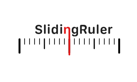
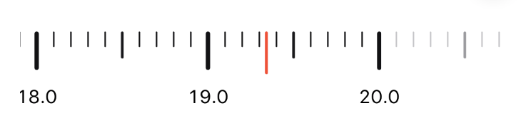
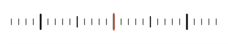
SlidingRuler is a Swift package containing a SwiftUI control that acts like an linear infinite slider or a finite, more precise one. The notable difference is that the user can evaluate the value more precisely on a sliding ruler rather than on a slider. By default it shows a ruler you can slide around and a beautiful red cursor pointing toward the current value :
These features are the supported features :
- [x] Dynamic type
- [x] Haptic feedback (on compatible devices)
- [x] Light & dark color schemes
- [x] Scroll inertia & rubber banding
- [x] Custom styling
- [x] Animations
- [x] Pointer interactions
- [ ] Layout direction
- [ ] Accessibility
It's been made to feel native and to integrate nicely in iOS and iPadOS.
Installation
dependencies: [
    // Dependencies declare other packages that this package depends on.
    .package(url: "https://github.com/Pyroh/SlidingRuler", .upToNextMajor(from: "0.1.0")),
],
Usage
Before using anything be sure to
import SlidingRulerin the target swift file.
Like any SwiftUI control you can create a SlidingRuler with an unique parameter: the value.
Like any SwiftUI input control the value is a Binding<...> :
@State private var value: Double = 0

var body: some View {
    ...
    SlidingRuler(value: $value)
    ...
}
Note that value must conform to BinaryFloatingPoint.
✅ When to use ?
It's good to use a sliding ruler in these cases:
- To input a numeric value that belongs to an unlimited range or a particularly large one.
- To input measurable values like masses or lenghts.
- To pick a precise value in a tiny range —for this use a small
stepvalue. - You're already using multiple sliding rulers in your form and using a slider for this value will break the continuity. —Ok, but read the next section first.
- You just feel like to and you're confident it'll be ok. —Ok, but read the next section first.
Additionaly a disabled slinding ruler can be used as a meter.
⛔️ When not to use
It's bad to use a sliding ruler in these cases:
- To make the user chose between a small to medium set of discrete values. → Use a
Pickeror aStepper. - To pick an unprecise value in a small closed range. → Use a
Slider. - To change a device audio volume. → Use a
Slider. - To let the user input an arbitrary value like its age. → Use a
TextField. Perhaps UI/UX design is not for you after all... - To input a date component. → Use a
DatePicker. Are you out of your mind ?
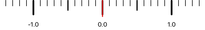
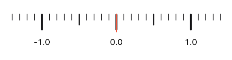
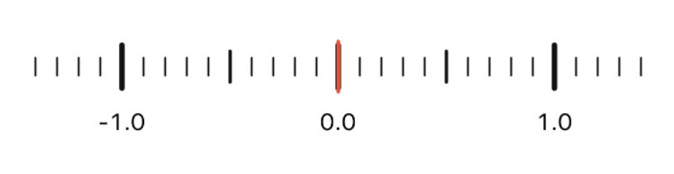
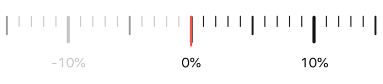
Using finite or semi-finite ranges
In some cases you may want to use such ranges when it makes sense —particularly when inputing strictly positive or negative values.
A slinding ruler will show these boundaries clearly to the user :
The user is not allowed to drag the ruler above these boudaries. Trying so will result in an haptic feedback (on compatible devices) and the over drag will feel like a rubber band, like a scroll view.
Methods added to View
SlidingRuler don't have no direct method but like many SwiftUI controls it adds some methods to View. They work in the same fashion as other View methods that impact a component and all its descendent in a view tree.
slidingRulerStyle
func slidingRulerStyle<S>(_ style: S) -> some View where S: SlidingRulerStyle
Sets the style for all sliding rulers within the view tree. See the Custom Styling Guide (once it's been written).
slidingRulerCellOverflow
func slidingRulerCellOverflow(_ overflow: Int) -> some View
Sets the cell overflow for all sliding rulers within the view tree. See the Custom Styling Guide (once it's been written).
You may get retired without even using this method, ever.
Parameter list
The complete init method signature is :
init(value: Binding<V>,
    in bounds: ClosedRange<V> = -V.infinity...V.infinity,
    step: V.Stride = 1,
    snap: Mark = .none,
    tick: Mark = .none,
    onEditingChanged: @escaping (Bool) -> () = { _ in },
    formatter: NumberFormatter? = nil)
bounds : ClosedRange<V>
The closed range of possible values.
By default it is -V.infinity...V.infinity. Meaning that the sliding ruler is virtualy infinite.
step : V.Stride
The stride of the SlidingRuler.
By default it is 1.0.
snap : Mark
Possible values : .none, .unit, .half, .fraction.
Describes the ruler's marks stickyness: when the ruler stops and the cursor is near a graduation it will snap to it.
.none: no snap..unit: snaps on every whole unit graduations..half: snaps on every whle unit and half unit graduations..fraction: snaps on every graduations.
By default it is .none.
Note: to trigger a snap the cursor must be near the graduation. Here near means that the delta between the cursor and the graduation is strictly less than a fraction of the ruler unit.
The value of a fraction is driven by the style's fractions property. The default styles have a fractions property equal to 10 so a fraction equals to 1/10 of a unit or 0.1 with the default step (1.0).
tick : Mark
Possible values : .none, .unit, .half, .fraction.
Defines what kind of graduation produces an haptic feedback when reached.
.none: no haptic feedback..unit: haptic feedbak on every whole unit graduations..half: haptic feedbak on every whole unit and half unit graduations. (If the style's fraction count allows an half).fraction: haptic feedbak on every graduations.
By default it is .none.
onEditingChanged : (Bool) -> Void
A closure executed when a drag session happens. It receives a boolean value set to true when the drag session starts and false when the value stops changing.
By default it is an empty closure that produces no action.
formatter : NumberFormatter
A NumberFormatter instance the ruler uses to format the ruler's marks.
By default it is nil.
Slinding ruler styles
For a comprehensive custom styling documentation See the Custom Styling Guide (once it's been written).
Custom styling is still a work in progress. As it is tied to accessibility some work on this topic is still required to determine how a style should adapt to it.
By default SlindingRuler ships with four styles. Two of them don't show any mark on the ruler
PrimarySlidingRulerStyle
This is the default style.
CenteredSlindingRulerStyle
BlankSlidingRulerStyle
BlankCenteredSlidingRulerStyle
Example
Percentage value
A SlindingRuler that goes from 0 to 100%, that snaps and gives haptic feedback on any graduation.
struct PercentSlidingRuler: View {
    @State private var value: Double = .zero

    private var formatter: NumberFormatter {
        let f = NumberFormatter()
        f.numberStyle = .percent
        f.maximumFractionDigits = 0
        return f
    }

    var body: some View {
        SlidingRuler(value: $value,
                     in: 0...1,
                     step: 0.1,
                     snap: .fraction,
                     tick: .fraction,
                     formatter: formatter)
    }
}