CustomToastView-swift
A fully customizable library to easily display Animated Toast Messages in iOS using Swift!
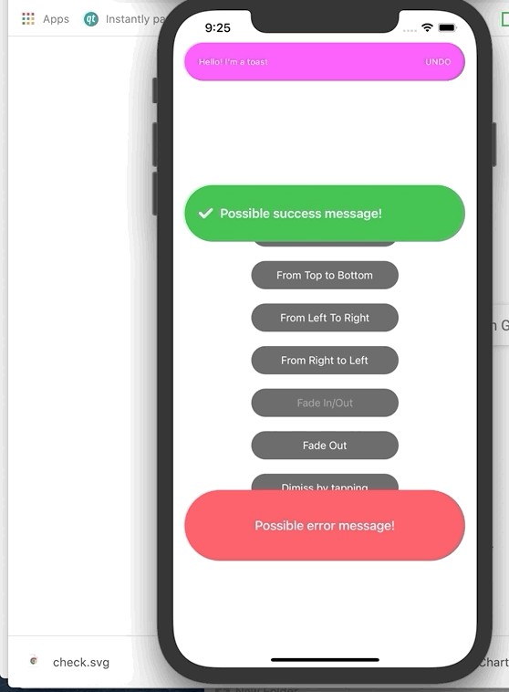
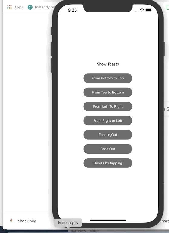
Preview - All the custom toasts you can build!
Requirements
Installation
CustomToastView-swift is available through CocoaPods. To install
it, simply add the following line to your Podfile:
pod 'CustomToastView-swift'
Usage
In order to build your custom toast you need to use the Toast builder class.
The following example shows a Custom Toast on a View Controller class with the default style and a default animation from bottom to top.
Toast.Builder()
     .build()
     .show(on: self)
Here's an example with a completion from when the user taps the toast:
Toast.Builder()
     .build()
     .show(on: self) { toast in
          toast.hide()
     }
Also Toast.Builder() could be stored as a constant class for later usage:
let toastBuilder = Toast.Builder()
Animation Types
You can present your Toast messages in different ways:
- from bottom to top (
.bottomToTop) - from top to bottom (
.topToBottom) - from left to right (
.leftToRight) - from right to left (
.rightToLeft) - fading in (
.fadeIn) - fading out (
.fadeOut)
The only thing you need to do is to specify the orientation (Animation type) when building your toast, as follows:
Toast.Builder()
     .orientation(.leftToRight)
     .build()
     .show(on: self)
Specifying Vertical position
In order to set the y position in which the Toast should display we use the .verticalPosition property and set the Int value you want, as follows:
Toast.Builder()
     .verticalPosition(150)
     .build()
     .show(on: self)
Toast Height
You might want to change the defautl Toast Height. In case you'd need to that you can do it as follows:
Toast.Builder()
     .toastHeight(100)
     .build()
     .show(on: self)
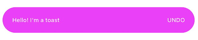
Toast - BackgroundColor, TextColor, Font, Title, CornerRadius, TextAlignment
All the following properties are customizable as well in case the default values are not useful to you !
 Toast.Builder()
      .font(UIFont.systemFont(ofSize: 12, weight: .semibold))
      .backgroundColor(.orange)
      .textColor(.white)
      .cornerRadius(12)
      .title("Hello! I'm a toast")
      .orientation(.fadeOut)
      .textAlignment(.right)
      .build()
      .show(on: self)
You can also set a right action on the Toast
To do that you just need to set the following property when building your custom toast!
Toast.Builder()
     .rightActionText("UNDO")
     .build()
     .show(on: self)
You can also set the specific styles for the action:
Toast.Builder()
     .rightActionText("UNDO")
     .actionFont(UIFont.systemFont(ofSize: 12, weight: .medium))
     .actionTextColor(.white)
     .build()
     .show(on: self)
You might want to add a completion to the above 'UNDO' action :) You can do that as follows:
Toast.Builder()
     .rightActionText("UNDO")
     .actionFont(UIFont.systemFont(ofSize: 12, weight: .medium))
     .actionTextColor(.white)
     .build()
     .show(on: self, actionCompletion: {
          print("UNDO action tapped")
     })
Left Icon & letIconContentMode
You might need to set a left icon, in that case this is the way to do it:
 Toast.Builder()
      .font(UIFont.systemFont(ofSize: 18, weight: .semibold))
      .backgroundColor(.success)
      .showLeftIcon(UIImage(named: "check"))
      .textColor(.white)
      .title("Possible success message!")
      .textAlignment(.left)
      .build()
      .show(on: self)
letIconContentMode is the propety to set the contentMode to the left icon image added:
 Toast.Builder()
      .font(UIFont.systemFont(ofSize: 18, weight: .semibold))
      .backgroundColor(.success)
      .showLeftIcon(UIImage(named: "check"))
      .letIconContentMode(.scaleAspectFill)
      .textColor(.white)
      .title("Possible success message!")
      .textAlignment(.left)
      .build()
      .show(on: self)
The default value of letIconContentMode is .scaleAspectFit
Default Distance
This property allows you to change the lateral margins of your toast. If you increase this value the width of the toast will decrease. You can set this side margin in the following way:
Toast.Builder()
     .defaultDistance(30)
     .build()
     .show(on: self)
The default value of defaultDistance is 16
Should Dismiss After Presenting
This property specifies if the Toast should dismiss automatically after presenting or not.
The default value of shouldDismissAfterPresenting is set to true.
In case you don't want the toast to dismiss automatically after presenting you should implement the following:
 Toast.Builder()
      .shouldDismissAfterPresenting(false)
      .build()
      .show(on: self)
If you'd like to hide the toast when user taps it, you should call the hide function on the completion, as follows:
 Toast.Builder()
      .shouldDismissAfterPresenting(false)
      .build()
      .show(on: self) { toast in
          toast.hide()
      }
Time Dismissal (in seconds)
Time dismissal is the property that indicates the time in seconds you want the Toast to take to dismiss itself (in case you want the toast to dismiss after a certain period of time). The default value is 0.5 seconds.
Toast.Builder()
     .timeDismissal(1)
     .build()
     .show(on: self)
Example
To run the example project, clone the repo, and run pod install from the Example directory first.
Author
lrodriguez, [email protected]
License
CustomToastView-swift is available under the MIT license. See the LICENSE file for more info.