CUIExpandableButton
A SwiftUI button that expands to reveal more content.


CUIExpandableButton is part of the Crystal UI framework (under developement). This framework is working to bring a suite of UI components that utilize SwiftUI Material for it’s background element.
Usage
To create a simple CUIExpandableButton, you can use an SF Symbol for your icon.
CUIExpandableButton(
    expanded: $expanded,
    sfSymbolName: "gearshape.fill"
) {
    Text("My content")
}
If you’d like more control, you can provide a custom icon for the button instead.
CUIExpandableButton(
    expanded: $expanded
) {
    Image("icon")
        .resizable()
        .aspectRatio(contentMode: .fit)
        .frame(width: 26, height: 26)
} content: {
    Text("My content")
}
Don’t forget to import CUIExpandableButton, before using it:
import CUIExpandableButton
Customization

There are several ways to customize CUIExpandableButton, including:
- Adding a title (when expanded).
- Hiding the close button.
- Using
foregroundColor(_:)to customize color. - Applying
fontWeight(_:)to the icon and header elements. (>=iOS 16.0)
CUIExpandableButton(
    expanded: $expanded,
    sfSymbolName: "flame.fill",
    title: "Customization Example",
    hiddenCloseButton: true
) {
    Text("You can customize the title, color, fontweight, and even hide the close button.")
       .frame(width: 200)
       .padding(8)
}
.foregroundColor(.yellow)
.fontWeight(.bold) // fontWeight is available starting in iOS 16
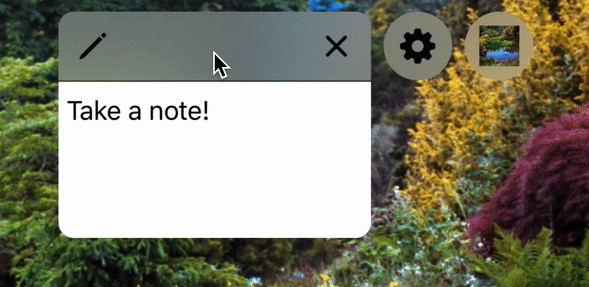
Actions
You can add an action when the button is expanded or collapsed using the built in controls.
CUIExpandableButton(
    expanded: $expanded,
    sfSymbolName: "bell.fill",
) {
    Text("Additional actions can be performed when expanding/collpasing")
        .frame(width: 200)
        .padding(8)
} action: {
    print("Button was pressed")
}
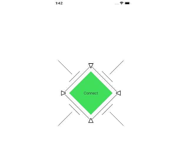
There is also an option to provide no content to show, in case you want a non-expanding button that’s styled like your expanding button.
CUIExpandableButton(
    expanded: $expanded,
    sfSymbolName: "bell.fill",
) {
    print("Button was pressed")
}
Installation
CUIExpandableButton supports Swift Package Manager. To use it the following to your Package.swift file:
dependencies: [
    .package(name: "CUIExpandableButton", url: "https://github.com/robhasacamera/CUIExpandableButton.git", from: "0.1.2")
],
Support for CocoaPods and Carthage are being considered for future releases.
Addtional Notes
A sample project, ButtonDemo.xcodeproj, can be found in the SampleApp folder.
It is worth noting that CUIExpandableButton fully supports dynamic type variants, dark mode, and the right to left layout direction.
Future Plans
Below are some of the current limitations for CUIExpandableButton. These are being considered for future releases.
- Hiding the header, separator, or the icon when expanded
- Collapsed button sizes other then 44 x 44
- Background corner radius customization when expanded
- Other button shapes
- Other backgrounds styles or materials
- Displaying a title/subtitle with the icon while collapsed