SlideOverCard
A SwiftUI card design, similar to the one used by Apple in HomeKit, AirPods and Apple Card setup, NFC scanning, Wi-Fi password sharing and more. It is specially great for setup interactions.
Installation
This repository is a Swift package, so all you gotta do is search and include it in your project under File > Swift Package Manager. Then, just add import SlideOverCard to the files where this package will be referenced and you're good to go!
Usage
You can add a card to your app in two different ways. The first one is by adding a .slideOverCard() modifier, which works similarly to a .sheet():
.slideOverCard(isPresented: $isPresented) {
  // Here goes your awesome content
}
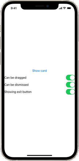
Here, $isPresented is a boolean binding. This way you can dismiss the view anytime by setting it to false. This view will have a transition, drag controls and an exit button set by default. You can override this by setting the dragEnabled, dragToDismiss and displayExitButton boolean parameters:
// This creates a card that can't be dragged
.slideOverCard(isPresented: $isPresented, dragEnabled: false) {
}

// This creates a card that can be dragged, but can't be dismissed
.slideOverCard(isPresented: $isPresented, dragToDismiss: false) {
}

// This creates a card with no exit button
.slideOverCard(isPresented: $isPresented, displayExitButton: false) {
}
In case you want to execute code when the view is dismissed (either by the exit button or drag controls), you can also set an optional onDismiss closure parameter:
// This card will print some text when dismissed
.slideOverCard(isPresented: $isPresented, onDismiss: {
    print("I was dismissed")
}) {
}
Alternatively, you can add the card using a binding to an optional or even instantiate it by your own with SlideOverCardView. Please note that this way it won't be automatically positioned in the screen or have transitions.
// This uses a binding to an optional object in a switch statement
.slideOverCard(item: $activeCard) { item in
    switch item {
        case .loginView:
            LoginView()
        default:
            ..........
    }
}
// Using the standalone view
if isPresented {
  SlideOverCardView(isPresented: $isPresented) {
    // Here goes your super-duper cool content
  }
}
Accessory views
This package also includes a few accessory views to enhance your card layout. The first one is the SOCActionButton() button style, which can be applied to any button to give it a default "primary action" look, based on the app's accent color. The SOCAlternateButton() style will reproduce the same design, but with gray. And SOCEmptyButton() will create an all-text "last option" kind of button. You can use them like this:
Button("Do something", action: {
  ...
}).buttonStyle(SOCActionButton())
There's also the SOCExitButton() view. This view will create the default exit button icon used for the card (based on https://github.com/joogps/ExitButton).
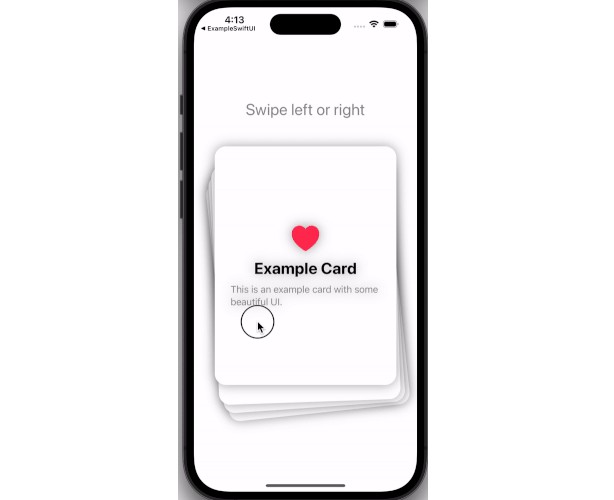
Example
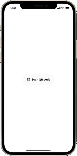
The SwiftUI code for a demo view (which can be seen on the top portion of this page) can be found here. It's an Xcode preview, and you can experience it right within the package folder, under Swift Package Dependencies, in your project.