HexGrid
A SwiftUI component that arranges subviews in a hexagonal grid.
Overview
The library is based on the SwiftUI’s Layout protocol and thus has the following deployment requirement:
iOS 16.0+, iPadOS 16.0+, macOS 13.0+, Mac Catalyst 16.0+, tvOS 16.0+, watchOS 9.0+
The component’s signature:
HexGrid(_ data: Data,
        id: KeyPath<Data.Element, ID>,
        spacing: CGFloat = .zero,
        @ViewBuilder content: @escaping (Data.Element) -> Content)
The Data.Element should conform to OffsetCoordinateProviding. This protocol has a single requirement of providing an offsetCoordinate with row and column in a hex grid. The component assumes odd-q offset coordinate system.
The component assumes that subviews fill the bounds of the hexagon.
The package also exports a Hexagon shape with a flat-top orientation.
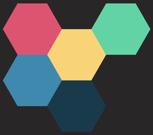
Examples
A grid of colors:
HexGrid(cells) { cell in
    Color(cell.colorName)
}
But you can put images or literally any view into subviews!
HexGrid(cells) { cell in
    AsyncImage(url: cell.url) { image in
        image.resizable().aspectRatio(contentMode: .fill)
    } placeholder: {
        ProgressView().frame(maxWidth: .infinity, maxHeight: .infinity)
    }
}
Installation
You can add HexGrid to an Xcode project by adding it as a package dependency.
If you want to use HexGrid in a SwiftPM project,
it’s as simple as adding it to a dependencies clause in your Package.swift:
dependencies: [
    .package(url: "https://github.com/ksemianov/HexGrid", from: "0.1.0")
]
License
This library is released under the MIT license. See LICENSE for details.