LNPopupUI
LNPopupUI is a SwiftUI library for presenting views as popups, much like the Apple Music and Podcasts apps.
This is a SwiftUI wrapper of my LNPopupController framework, adapted to work with SwiftUI.


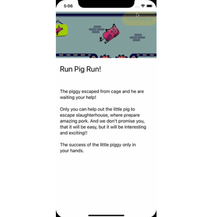
See a video of the modern popup look & feel here and a video of the classic popup look & feel here.
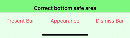
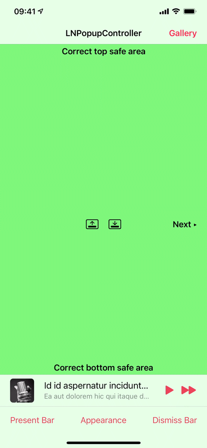
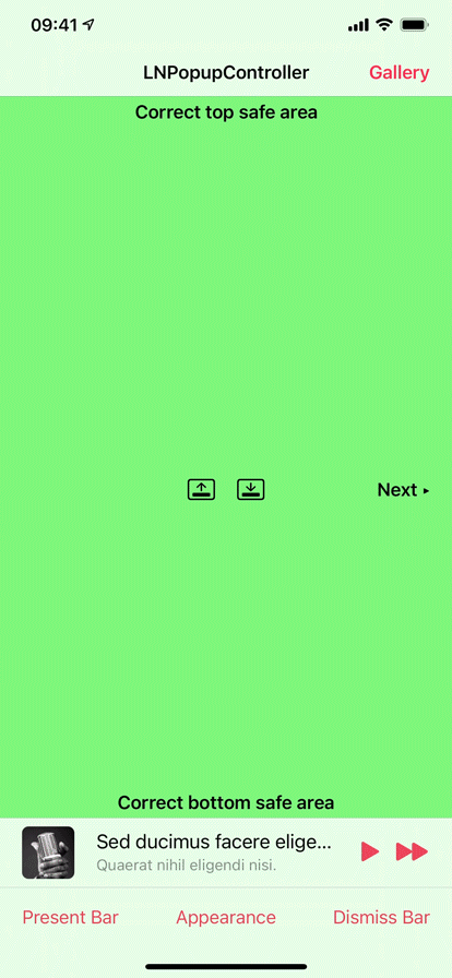
Once a popup bar is presented with a content view, the user can swipe or tap the popup bar at any point to present the content view. After finishing, the user dismisses the popup by either swiping or tapping the popup close button.
The library extends SwiftUI’s View with new functionality for presenting and customizing popups with content views, as well as setting information such as the popup bar’s title, image and bar button items. When a popup bar is presented, the popup bar automatically adapts to the view it was presented on for best appearance.
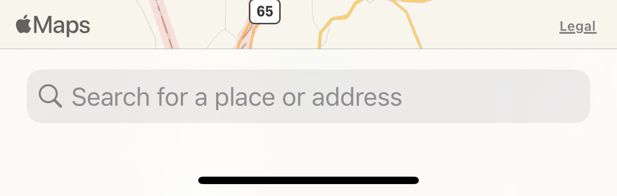
Generally, it is recommended to present the popup bar on the outermost view, such as TabView or NavigationView. For example, if you have a view contained in a navigation view, which is in turn contained in a tab view, it is recommended to present the popup on the tab view.
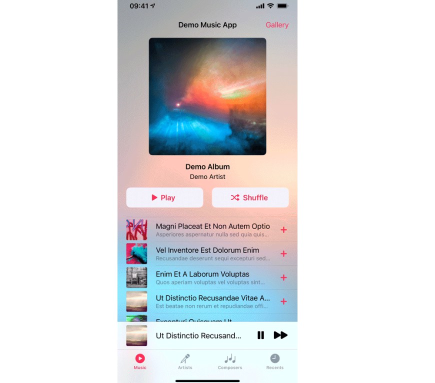
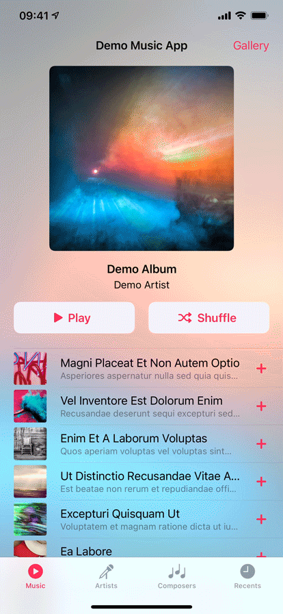
Check the demo project for a quick recreation of Apple’s music app.
Features
- Available for iOS 13 and above, as a SPM package for SwiftUI
- A SwiftUI library, wrapping my LNPopupController framework; the library works internally with SwiftUI’s generated UIKit content to present the framework in a native manner
Adding to Your Project
Swift Package Manager
LNPopupUI supports SPM versions 5.1.0 (Xcode 11) and above. In Xcode, click File -> Swift Packages -> Add Package Dependency, enter https://github.com/LeoNatan/LNPopupUI. Select the version you’d like to use.
You can also manually add the package to your Package.swift file:
.package(url: "https://github.com/LeoNatan/LNPopupUI.git", from: "1.0.0")
And the dependency in your target:
.target(name: "BestExampleApp", dependencies: ["LNPopupUI"]),
Using the Library
Project Integration
Import the module in your project:
import LNPopupUI
Popups
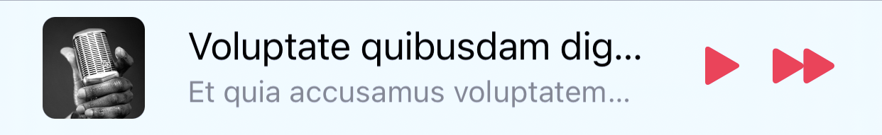
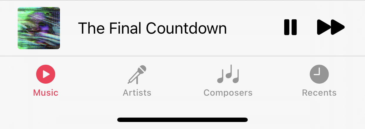
Popup consist of a popup bar and a popup content view. Information for the popup bar, such as the title, image and bar button items, is received by using the provided modifier API.
To present the popup, call the popup(isBarPresented:isPopupOpen:content) method:
TabView {
	//Top content view
}
.popup(isBarPresented: $isPopupBarPresented, isPopupOpen: $isPopupOpen) {
	PlayerView(song: currentSong)
}
To present and dismiss the popup bar programmatically, toggle the isPopupBarPresented bound var. To open or close the popup programmatically, toggle the isPopupOpen bound var.
For more information, see the documentation in LNPopupUI.swift.
Popup Bar Content
Popup bar content is provided as modifiers of the popup content view.
VStack {
	//Popup content view
}
.popupTitle(song.title)
.popupImage(Image(song.imageName))
.popupProgress(playbackProgress)
.popupBarItems({
	HStack(spacing: 20) {
		Button(action: {
			isPlaying.toggle()
		}) {
			Image(systemName: "play.fill")
		}

		Button(action: {
			next()
		}) {
			Image(systemName: "forward.fill")
		}
	}
})
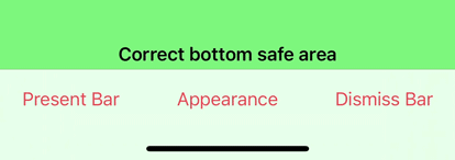
Appearance and Behavior
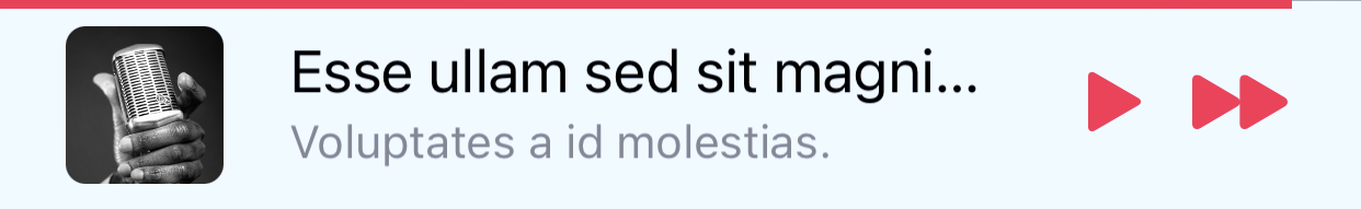
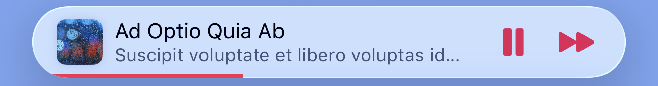
LNPopupUI provides two distinct styles of popup look and feel, one based on modern Music app look and feel, and one based on the previous, iOS 9-style look and feel. Popup bar styles are arbitrarily labeled "prominent" for modern style popup bar and "compact" for iOS 9-style. Popup interaction styles are labeled "snap" for modern style snapping popups and "drag" for iOS 9 interactive popup interaction. Popup close buttons styles are labeled "chevron" for modern style chevron close button and "round" for iOS 9-style close buttons. For each, there is a "default" style for choosing the most suitable one for the current platform and operating system version.
The defaults are:
- Prominent bar style
- Snap interaction style
- Chevron close button style
- No progress view style
You can also present completely custom popup bars. For more information, see Custom Popup Bar View.
By default, for navigation and tab views, the appearance of the popup bar is determined according to the container’s bottom bar's appearance. For other container views, a default appearance is used, most suitable for the current environment.

To disable inheriting the bottom bar’s appearance, call the popupBarInheritsAppearanceFromDockingView() modifier with false.
Bar Style
Customizing the popup bar style is achieved by calling the .popupBarStyle() modifier.
.popup(isBarPresented: $isPopupPresented, isPopupOpen: $isPopupOpen) {
	//Popup content view
}
.popupBarStyle(.compact)
Interaction Style
Customizing the popup interaction style is achieved by calling the .popupInteractionStyle() modifier.
.popup(isBarPresented: $isPopupPresented, isPopupOpen: $isPopupOpen) {
	//Popup content view
}
.popupInteractionStyle(.drag)
Progress View Style
Customizing the popup bar progress view style is achieved by calling the .popupBarProgressViewStyle() modifier.
.popup(isBarPresented: $isPopupPresented, isPopupOpen: $isPopupOpen) {
	//Popup content view
}
.popupBarProgressViewStyle(.top)
To hide the progress view, set the bar progress view style to .none.
Close Button Style
Customizing the popup close button style is achieved by calling the .popupCloseButtonStyle() modifier.
.popup(isBarPresented: $isPopupPresented, isPopupOpen: $isPopupOpen) {
	//Popup content view
}
.popupCloseButtonStyle(.round)
To hide the popup close button, set the popupCloseButtonStyle to .none.
Text Marquee Scroll
Supplying long text for the title and/or subtitle will result in a scrolling text, if text marquee scroll is enabled. Otherwise, the text will be truncated. To enable text marquee scrolling, use the popupBarMarqueeScrollEnabled() modifier.
Custom Popup Bar View
You can display your own view as the popup bar, instead of the system-provided ones, by using the .popupBarCustomView() modifier.
.popup(isBarPresented: $isPopupPresented, isPopupOpen: $isPopupOpen) {
	//Popup content view
}
.popupBarCustomView(wantsDefaultTapGesture: false, wantsDefaultPanGesture: false, wantsDefaultHighlightGesture: false) {
  //Custom popup bar view content
}
The wantsDefaultTapGesture, wantsDefaultPanGesture and wantsDefaultHighlightGesture arguments control whether the default system gestures of the popup bar should be enabled or disabled.
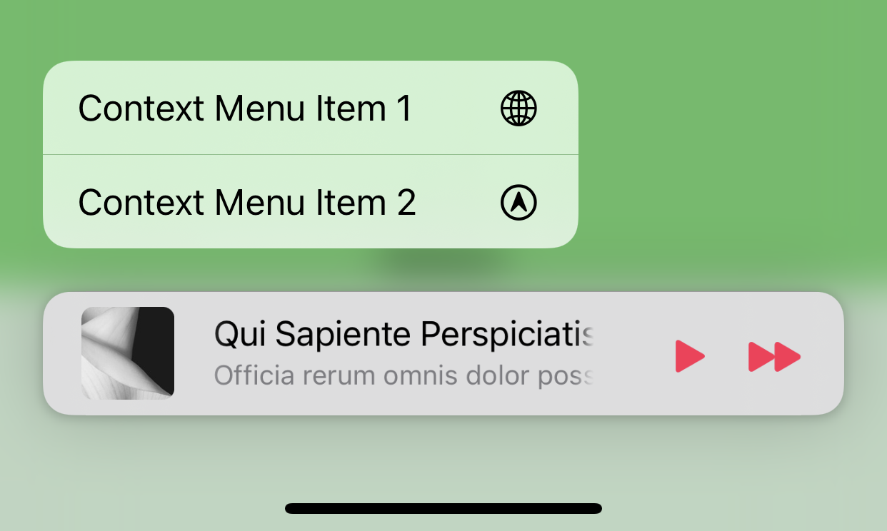
Context Menus
You can add a context menu to your popup bar by calling the .popupBarContextMenu() modifier.
.popup(isBarPresented: $isPopupPresented, isPopupOpen: $isPopupOpen) {
	//Popup content view
}
.popupBarContextMenu {
	Button(action: {
		print("Context Menu Item 1")
	}) {
		Text("Context Menu Item 1")
		Image(systemName: "globe")
	}

	Button(action: {
		print("Context Menu Item 2")
	}) {
		Text("Context Menu Item 2")
		Image(systemName: "location.circle")
	}
}
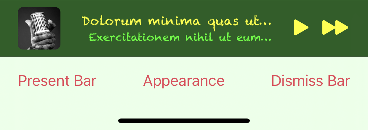
Lower-level Bar Customization
LNPopupUI exposes the .popupBarCustomizer() modifier, which allows lower-level customization through the UIKit LNPopupBar object.
.popup(isBarPresented: $isPopupPresented, isPopupOpen: $isPopupOpen) {
//Popup content view
}
.popupBarInheritsAppearanceFromDockingView(false)
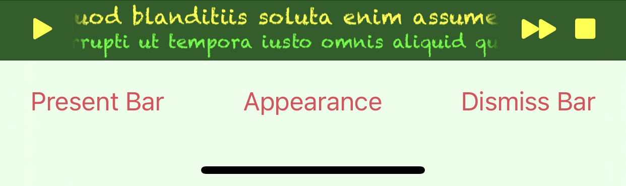
.popupBarCustomizer { popupBar in
let paragraphStyle = NSMutableParagraphStyle()
paragraphStyle.alignment = .right
paragraphStyle.lineBreakMode = .byTruncatingTail
popupBar.standardAppearance.backgroundEffect = UIBlurEffect(style: .dark)
popupBar.standardAppearance.titleTextAttributes = [ .paragraphStyle: paragraphStyle, .font: UIFont(name: "Chalkduster", size: 14)!, .foregroundColor: UIColor.yellow ]
popupBar.standardAppearance.subtitleTextAttributes = [ .paragraphStyle: paragraphStyle, .font: UIFont(name: "Chalkduster", size: 12)!, .foregroundColor: UIColor.green ]
popupBar.tintColor = .yellow
}
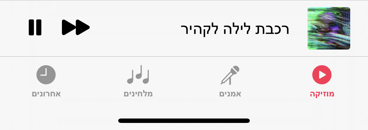
Full Right-to-Left Support
The library has full right-to-left support.
Acknowledgements
The library uses:
- MarqueeLabel Copyright (c) 2011-2020 Charles Powell
Additionally, the demo project uses:
- LoremIpsum Copyright (c) 2013-2020 Lukas Kubanek