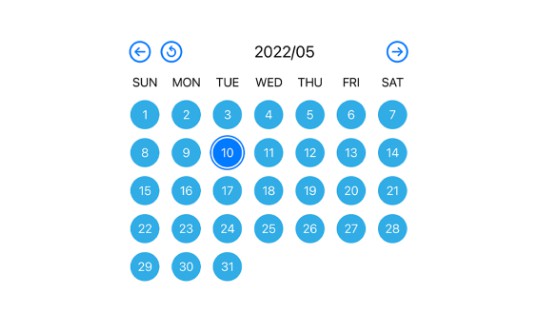
FXDatePicker
A SwiftUI library for a customizable DatePicker.
Features
- Supports both Hijri and Gregorian calendars.
- Allows adding images below days using Image or SF Symbols.
- Supports Arabic and English languages.
- Compatible with Dark and Light Modes.
- Offers full customization.
FXDatePicker vs. iOS DatePicker
- Customization: FXDatePicker allows for extensive customization, including the ability to add icons below dates. In contrast, the iOS DatePicker offers basic functionality with limited customization options.
- User Interface: FXDatePicker features a modern, adaptable interface for a tailored user experience, while the iOS DatePicker maintains a standard, unchangeable appearance.
- Flexibility: FXDatePicker is ideal for creating distinctive, engaging date-picking experiences. The iOS DatePicker is more suited for applications that require basic date selection.
Usage
Step 1: Add a Binding Date Variable
Create a Date variable in your Swift file to save the date selection from the picker.
@State private var selectedDate: Date = Date()
Step 2: Configure specialDates (Optional)
Create an array of specialDates if you want to display images on specific dates. This step is optional. If you prefer a standard calendar without special dates, you can skip this.
let specialDates: [SpecialDate] = [
    // Your special dates and images here
]
Step 3: Initialize FXDatePicker
Add the FXDatePicker to your view. You can use it with or without specialDates.
Example using specialDates:
FXDatePickerView(selectedDate: $selectedDate, specialDates: specialDates)
Example without specialDates:
FXDatePickerView(selectedDate: $selectedDate)
Range
FXDatePicker also supports selecting dates within specified ranges. This can be particularly useful for applications where you need to restrict date selection to a certain period. Below are examples of how to use FXDatePicker with different types of date ranges.
Using ClosedRange
To use a closed range (a range with both a start and an end date), first create a ClosedRange<Date> variable. For example, to create a range for the current month:
private var closeRange: ClosedRange<Date> {
    let calendar = Calendar.current
    let startOfToday = calendar.startOfDay(for: Date())

    guard let endOfRange = calendar.date(bySetting: .day, value: 18, of: startOfToday) else {
        fatalError("Could not create start or end date for range")
    }

    return startOfToday...endOfRange
}
Then, initialize FXDatePicker with this range:
FXDatePickerView(selectedDate: $selectedDate, specialDates: specialDates, in: cloaseRange)
Using PartialRangeFrom
For a range starting from a specific date and extending indefinitely into the future:
FXDatePickerView(selectedDate: $selectedGregorianDate, specialDates: specialDates, in: Date()...)
Using PartialRangeThrough
For a range that starts at any time in the past and ends at a specific date:
FXDatePickerView(selectedDate: $selectedGregorianDate, specialDates: specialDates, in: ...Date())
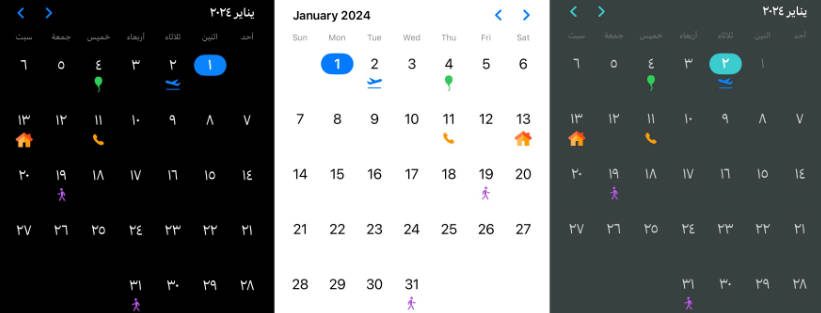
Using specialDates to Add Custom Markers
The specialDates array allows you to add custom markers to specific dates in your calendar. You can use either custom images or SF Symbols to highlight these dates. Each special date is defined with its type (SpecialDateType), which can be an ImageType for images or an SFSymbolsType for SF Symbols. Format the dates in the "Day/Month/Year" format.
Adding SF Symbols to Dates
To mark a date with an SF Symbol, create a SpecialDate instance with dateString and dateType set to .sfSymbols. Provide the date, the symbol's name, and its color:
SpecialDate(dateString: "2/1/2024",
dateType: .sfSymbols(SFSymbolsType(imageName: "airplane.departure",
color: .blue)))
]
In the above example, an airplane departure symbol in blue color will appear on 2nd January 2024.
Adding Images to Dates
For a custom image, set dateType to .image and provide the date along with the name of the image:
     SpecialDate(dateString: "13/1/2024",
     dateType: .image(ImageType(imageName: "home")))
Customize | Available modifiers:
calenderType
FXDatePickerView(selectedDate: $selectedDate, specialDates: specialDates)
.calenderType(.hijri(.islamicUmmAlQura))
The default is .gregorian.
Hijri Calendar:
For the Hijri calendar, you need to specify the type of calendar. The default in Saudi Arabia is .islamicUmmAlQura. However, you can choose from several types of Hijri calendars, such as .islamic, .islamicCivil, or .islamicTabular.
Example setting a different Hijri calendar type:
.calenderType(.hijri(.islamicCivil))
Customization Note:
Adapting to Local Moon Sighting: The Hijri calendar is based on the lunar cycle, and its dates can vary based on moon sightings. This variation can sometimes necessitate adjusting the calendar by a day or so.
Flexibility for Users: It's advisable to allow users to change the Hijri calendar type within your app. This flexibility can accommodate regional differences and personal preferences in moon sighting practices, ensuring that your app remains relevant and useful for a diverse user base.
datePickerTheme
Customize the theme of the DatePicker using datePickerTheme. For example:
FXDatePickerView(selectedDate: $selectedDate, specialDates: specialDates)
.datePickerTheme(main:
 .init(
accentColor: Color(uiColor: UIColor(red: 0.23, green: 0.80, blue: 0.81, alpha: 1.00)),
monthTitle: .white,
daysName: Color(uiColor: UIColor(red: 0.45, green: 0.48, blue: 0.48, alpha: 1.00)),
daysNumbers: Color(uiColor: UIColor(red: 0.83, green: 0.84, blue: 0.84, alpha: 1.00)),
previousDaysNumber: Color(uiColor: UIColor(red: 0.44, green: 0.47, blue: 0.47, alpha: 1.00)),
backgroundStyle: .color(Color(uiColor: UIColor(red: 0.22, green: 0.25, blue: 0.25, alpha: 1.00)))
 )
backgroundStyle accept Color or any kind of Gradient for example using radialGradient as backgroundColor
FXDatePickerView(selectedDate: $selectedDate, specialDates: specialDates)
            .datePickerTheme(main:
                .init(
                accentColor: Color(UIColor(red: 0.82, green: 0.26, blue: 0.42, alpha: 1.00)),
                monthTitle: Color(UIColor(red: 0.86, green: 0.87, blue: 0.88, alpha: 1.00)),
                daysName: Color(UIColor(red: 0.80, green: 0.80, blue: 0.83, alpha: 1.00)),
                daysNumbers: Color(UIColor(red: 0.83, green: 0.83, blue: 0.87, alpha: 1.00)),
                previousDaysNumber: Color(UIColor(red: 0.66, green: 0.66, blue: 0.69, alpha: 1.00)),
                backgroundStyle:
                        .radialGradient(
                       Gradient(colors:
                          [Color(UIColor(red: 0.19, green: 0.19, blue: 0.22, alpha: 1.00)),
                           Color(UIColor(red: 0.11, green: 0.11, blue: 0.14, alpha: 1.00))
                          ]
                               ),
                          center: .center,
                          startRadius: 1,
                         endRadius: 300)
                   )
               )
The default theme has a white background with a blue accent color. Adjust the colors or gradients according to your preference for a personalized DatePicker appearance.
hideMarkers
The hideMarkers() modifier allows you to use the FXDatePickerView as a regular calendar without displaying any special date markers. This is particularly useful if you want a cleaner look or if the special date indicators are not needed for certain use cases.
Example
To apply this modifier, simply chain .hideMarkers() to your FXDatePickerView instance. Here’s how you can do it:
FXDatePickerView(selectedDate: $selectedDate, specialDates: specialDates)
    .hideMarkers()
Here's how it looks with the hideMarkers() modifier applied:
With this modifier, the FXDatePickerView will render without showing any markers associated with the specialDates. This keeps the calendar view simple and focused on basic date picking functionality.
disableSwipe
The .disableSwipe() modifier is used with the FXDatePickerView to disable the swipe gesture functionality. This can be particularly useful in scenarios where you want to prevent users from changing the date by swiping, ensuring that navigation through dates is controlled through other means (like buttons or external controls).
Example
To apply this modifier, simply chain .disableSwipe() to your FXDatePickerView instance. Here’s how you can do it:
FXDatePickerView(selectedDate: $selectedDate, specialDates: specialDates)
    .disableSwipe()
In this example, the FXDatePickerView will no longer respond to swipe gestures for date navigation, and users will need to use buttons provided in the UI to change the selected date.
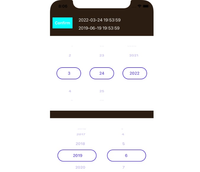
hideDatePicker
The .hideDatePicker() modifier is used with the FXDatePickerView to hide the change months/year using PickerView view tap on Month title.
Example
To apply this modifier, simply chain .hideDatePicker() to your FXDatePickerView instance. Here’s how you can do it:
FXDatePickerView(selectedDate: $selectedDate, specialDates: specialDates)
    .hideDatePicker()
This modifier hides the UI elements responsible for changing months or years when tapping on the Month title within the FXDatePickerView.
Installation
Swift Package Manager
dependencies: [
    .package(url: "https://github.com/X901/FXDatePicker.git")
]
Requirements
- iOS 14+
- Xcode 13+