FxSwipeAction
A SwiftUI library for a uniqe and customizable SwipeAction
FxSwipeAction is a SwiftUI library that enables developers to easily add swipe actions to SwiftUI views. With its simple integration and extensive customization options, it enhances user interaction by providing an intuitive and responsive swipe interface.Features
- Versatile: Enable swipe actions on any SwiftUI view, including List and VStack.
- Icon Support: Add custom icons or SF Symbols to swipe actions for a more intuitive interface.
- Fully Customizable: Tailor the appearance of swipe actions to match your app's design.
- Intelligent Interaction: Swipe actions automatically close when interacting with other items in FXSwipeViewGroup.
Usage
Step 1: improt FxSwipeAction
import FxSwipeAction
Step 2: add fxSwipeActions
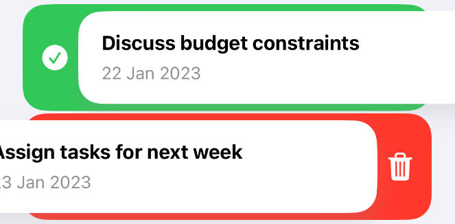
Add swipe actions to your view. You can add a single action to either the leading or trailing side, or to both. To ensure a unique and user-friendly experience, it's recommended to use only one action per side.
Important Notice: Add a frame height after fxSwipeActions. The library uses GeometryReader to determine its size, so setting the frame before might not work as expected.
CarwView()
.fxSwipeActions(
    leading: FXSwipeActionButton(
        iconType: .system("checkmark.circle.fill"),
        type: .leading,
        action: {
            // Your action here
        },
        tint: .green
    ),
    trailing: FXSwipeActionButton(
        iconType: .system("trash.fill"),
        type: .trailing,
        action: {
            // Your action here
        },
        tint: .red
    )
)
// Remember to set the frame height
.frame(height: 80)
Step 3: Customize (Optional)
Customize the look and feel of your swipe actions using the fxSwipeActionsStyle modifier. This feature offers a wide range of customization options, allowing you to fine-tune the appearance of the swipe actions and content to match your app's design language. Here's a breakdown of the customization options:
// fxSwipeActions ...
.fxSwipeActionsStyle(
    main: .init(
        cornerRadius: 20, // Rounds the corners of the swipe action button
        swipeSpacing: 0,  // Sets the space between the content and the swipe action button
        padding: 12       // Determines the padding at the top and bottom of the swipe action
    ),
    shadow: .init(
        shadowColor: .gray.opacity(0.2),  // Sets the color and opacity of the shadow
        shadowRadius: 8,                  // Determines the blur radius of the shadow
        shadowOffset: CGSize(width: 0, height: 10) // Sets the offset of the shadow
    ),
    style: .init(
        fontColor: .white,   // Changes the color of the text in the swipe action
        fontSize: 20,        // Sets the size of the text in the swipe action
        iconColor: .white,   // Alters the color of the icon in the swipe action
        backgroundColor: .white // Applies to the background of the content, not the swipe action
    )
)
Customization Options Explained:
cornerRadius: This modifies the roundness of the swipe action button's corners.
swipeSpacing: Adjusts the gap between your content and the swipe action button.
padding: Sets the top and bottom padding of the swipe action area, ensuring it fits neatly within your layout.
shadowColor, shadowRadius, shadowOffset: These properties allow you to add and customize a shadow effect for the swipe action button, giving it depth and prominence.
fontColor, fontSize: These settings control the appearance of text within the swipe action, letting you match it to your app's typography.
iconColor: Change the color of the icons used in the swipe action for better visibility or to align with your app's color scheme.
backgroundColor: Unlike the other properties, this sets the background color of the content that the swipe actions are applied to, not the swipe actions themselves. This can be useful for maintaining a consistent look for your content.
Step 4: for using it with VStsck
if you use it with VStack, you most add .padding(.horizontal) after fxSwipeActions for proper alignment.
Step 5: FXSwipeViewGroup (Optional)
To ensure that only one swipe action is active at a time within a group of views, wrap your entire view hierarchy with FXSwipeViewGroup. This is particularly useful in scenarios where multiple swipeable items are present, and you want to prevent multiple items from being swiped open simultaneously.
When FXSwipeViewGroup is used, it manages the swipe state across all child views. As soon as a swipe action is initiated on one item, any previously opened swipe actions on other items will automatically close. This helps maintain a clean and user-friendly interface.
Example Usage:
Wrap your view, such as a NavigationStack or a list of items, with FXSwipeViewGroup. Add the .fxSwipeActions() modifier to individual items within this group as needed.
FXSwipeViewGroup {
    NavigationStack {
        // Your content here...
        // For example, a card view with swipe actions
        .fxSwipeActions()
    }
}
Installation
Swift Package Manager
dependencies: [
    .package(url: "https://github.com/X901/FXSwipeAction.git")
]
Requirements
- iOS 15+
- Xcode 13+