SwiftUI Kit
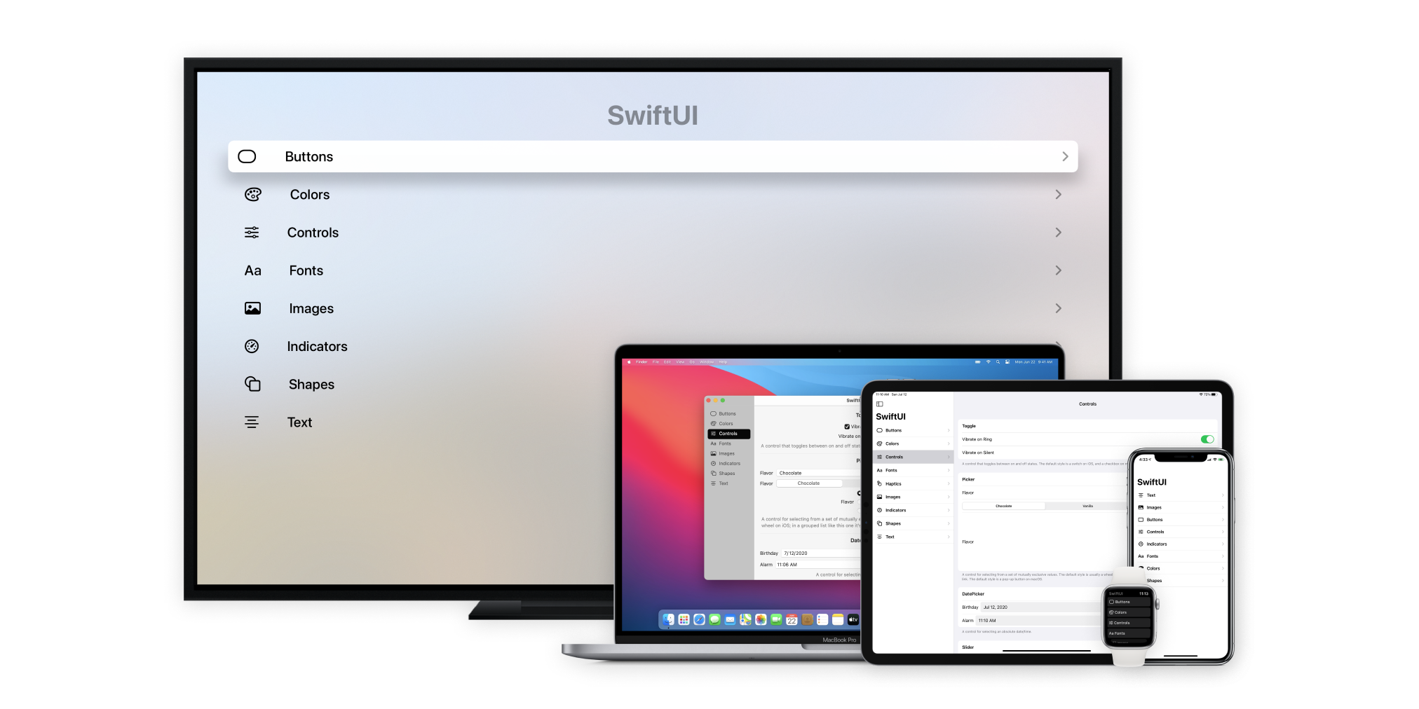
A SwiftUI system components and interactions demo app based on iOS 14, macOS Big Sur, watchOS 7, and tvOS 14.
Use the SwiftUI Kit app to see how SwiftUI views appear and interact when using the system defaults. You can view the source to see how particular examples work.
Includes Buttons, Colors, Controls, Fonts, Haptics, Images, Indicators, Shapes, Text, and more.

To run
Make sure you're using Xcode 12+ as well as a device running iOS 14+. Works on iPhone, iPad, Mac, Apple Watch, and Apple TV.
Accent color
To change the accent color and see how it affects the system components, go to the AccentColor section of Assets.xcassets in Xcode. You can then change the Light and Dark accent colors that will be applied to the app.
Contributing
Please feel free to submit pull requests in order to contribute back to SwiftUI Kit. This is for the SwiftUI community!
SwiftUI Resources
- Recreate - A video series about recreating popular UI with SwiftUI
- Primitive - Learn SwiftUI for designers
Apple Resources
- Apple Human Interface Guidelines - Apple’s design guidelines for creating best-in-class apps.
- SF Symbols – Apple’s comprehensive library of vector-based symbols included in Apple’s system fonts that you can incorporate into your app.