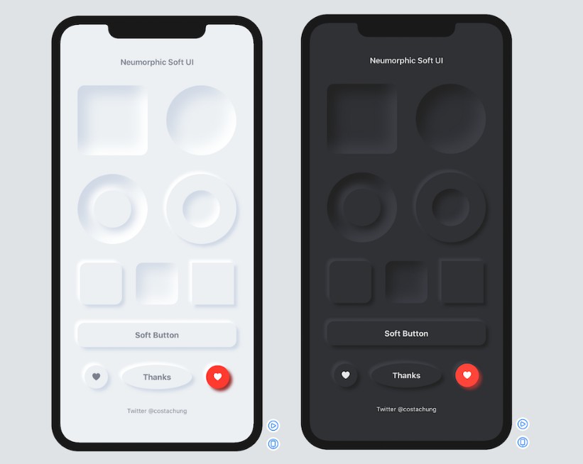
Neumorphic SwiftUI : Neumorphism Soft UI
Neumorphic is a SwiftUI utility to build Neumorphism Soft UI easily using custom view modifier and custom button style. It supports all shapes.
Hi, I’m Costa. It is simple to create outer shadow in SwiftUI by writing two lines of code. However, we can’t easily create inner shadow in SwiftUI. That’s the reason why I build this tool to make it simple and reusable.
Installation
Requirements
.iOS(.v13),.macOS(.v10_15)
Swift Package Manager
- In Xcode, open your project and navigate to File → Swift Packages → Add Package Dependency.
- Paste the repository URL (https://github.com/costachung/neumorphic/) and click Next.
- For Rules, select version.
- Click Finish.
Swift Package
.package(url: "https://github.com/costachung/neumorphic/", .upToNextMajor(from: "1.2.0"))
Usage
Import Neumorphic package to your view.
import Neumorphic
Simply use .softOuterShadow and .softInnerShadow methods to create outer shadow and inner shadow respectively.
Create Rounded Rectangle with Outer Shadow

RoundedRectangle(cornerRadius: 20).fill(Color.Neumorphic.main).softOuterShadow()
Create Rounded Rectangle with Inner Shadow

RoundedRectangle(cornerRadius: 20).fill(Color.Neumorphic.main).softInnerShadow(RoundedRectangle(cornerRadius: 20))
Create Circles

  HStack {
      Circle().fill(Color.Neumorphic.main).softOuterShadow()
      Circle().fill(Color.Neumorphic.main).softInnerShadow(Circle())
  }
Create Soft Button

Button(action: {}) {
    Text("Soft Button").fontWeight(.bold)
}
.softButtonStyle(RoundedRectangle(cornerRadius: 20))
Create Soft Button with custom style

HStack {
    Button(action: {}) {
        Image(systemName: "heart.fill")
    }.softButtonStyle(Circle())

    Button(action: {}) {
        Image(systemName: "heart.fill")
    }.softButtonStyle(Circle(), mainColor: Color.red, textColor: Color.white, darkShadowColor: Color(rgb: 0x993333, alpha: 1), lightShadowColor:Color("redButtonLightShadow"))
}
Customization
softInnerShadow
You can change the color, spread of the shadow, and the shadow radius of the inner shadow.
softInnerShadow<S : Shape>(_ content: S, darkShadow: Color, lightShadow: Color, spread: CGFloat, radius: CGFloat)
softOuterShadow
You can change the color, offset of the shadow, and the shadow radius of the outer shadow.
softOuterShadow(darkShadow: Color, lightShadow: Color, offset: CGFloat, radius:CGFloat)

Example of using background method to add it under TextField:
            VStack {
                HStack {
                    Image(systemName: "magnifyingglass").foregroundColor(secondaryColor).font(Font.body.weight(.bold))
                    TextField("Search ...", text: $name).foregroundColor(secondaryColor)
                }
                .padding()
                .background(
                    RoundedRectangle(cornerRadius: 30).fill(mainColor)
                    .softInnerShadow(RoundedRectangle(cornerRadius: 30), darkShadow: darkShadowColor, lightShadow: lightShadowColor, spread: 0.05, radius: 2)
                )
            }
            .padding()
Or, something like this:

ZStack(alignment: .bottom){
                RoundedRectangle(cornerRadius: 20).fill(mainColor)
                .softInnerShadow(RoundedRectangle(cornerRadius: 20), darkShadow: darkShadow, lightShadow: lightShadow, spread: 0.3, radius: 2)
                .frame(width: 30, height:150)

                RoundedRectangle(cornerRadius: 20).fill(barColor)
                    .frame(width: 30, height:100)
            }
Example Project
Check out the neumorphic-ios-example XCode project to see how to build neumorphic UI and buttons. If you use the default shadow colors of Neumorphic, you can also get dark mode support for free.
Soft Button Style Customization
softButtonStyle<S : Shape>(_ content: S, padding: CGFloat, mainColor: Color, textColor: Color, darkShadowColor: Color, lightShadowColor: Color, pressedEffect: SoftButtonPressedEffect)
Soft Button - Pressed Effects

                    HStack {
                        Spacer()
                        Button(action: {}) {
                            Text(".none").fontWeight(.bold)
                        }.softButtonStyle(Capsule(), pressedEffect: .none)
                        Spacer()
                        Button(action: {}) {
                            Text(".flat").fontWeight(.bold)
                        }.softButtonStyle(Capsule(), pressedEffect: .flat)
                        Spacer()
                        Button(action: {}) {
                            Text(".hard").fontWeight(.bold)
                        }.softButtonStyle(Capsule(), pressedEffect: .hard)
                        Spacer()
                    }
Soft Toggle
SoftSwitchToggleStyle

Toggle("Toggle", isOn: $toggleIsOn)
  .softSwitchToggleStyle(tint: .green, labelsHidden: true)
SoftToggleStyle

For example, Play and Stop Button
    Toggle(isOn: $toggleIsOn, label: {
        if toggleIsOn {
            Image(systemName: "stop.fill")
                .font(.title)
        }
        else{
            Image(systemName: "play.fill")
                .font(.title)
        }
    })
    .softToggleStyle(Circle(), padding: 20)