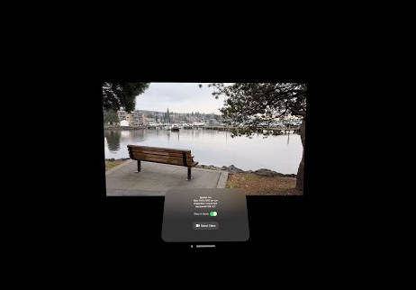
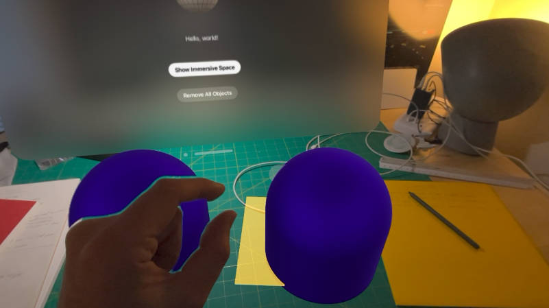
For years, 3D software engineers around the globe have been trying to solve a seemingly simple question: “Is my content in the right spot?”.
Hello my name is Ivan and for the past week I have been fighting and trying to understand why in heck my RealityKit content is being clipped and overall not in the right spot.

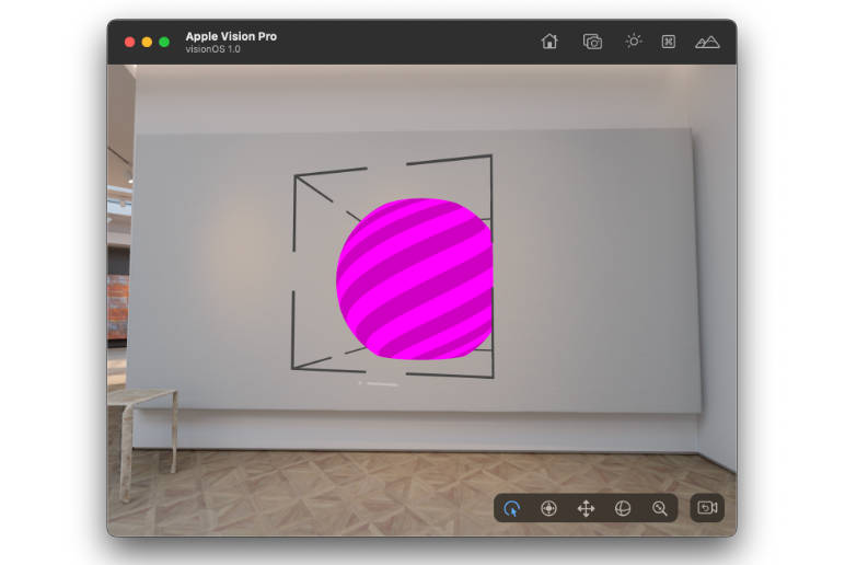
After a few days of placing colorful spheres in random places and troubleshooting, I arrived at the conclusion that volumes in visionOS previews are, in their current form, broken. The size of the clipped content is seemingly arbitrary and so is its position. I opened a radar (FB13129449) to hopefully get it resolved, but it also means that for now, we have to stick to the fully-fledged simulator.
Without the ability to do some quick reload and tweaks, answering the “Is my content in the right spot?” question becomes a whole lot more difficult. While Xcode does provide a Bounding box debug visualization, it is not very helful considering it shows the models and OS elements, but not the one thing that is truly useful: the bounds of the volume itself. Furthermore, if you had the audacity to start your application in a way that isn’t aligned with the original view direction, the bounding box aren’t aligned with your volume’s origin but rather the ARKit’s world origin (or so I assume).
As such, I decided to create a small utility that draw big ugly blocky boxes in each corner so you can tell what’s what. It’s not terribly complicated but it’s pretty darn useful. Plus the great thing about open source is that I can rant in the readme.
How do I use it?
Import RealityBounds into your project (File > Add Package Dependencies...) then paste this repo’s URL (https://github.com/IvanMathy/RealityBounds) into the top right search box.
import SwiftUI
import RealityKit
import RealityBounds

struct GameWindow: View {
  var body: some View {
    RealityView { content in
      content.add(BoundsVisualizer())
    }
  }
}

This assumes your volume is the default size, as in [1, 1, 1]. If not, you can easily provide custom dimensions:
content.add(BoundsVisualizer(bounds: [1,2,3]))
Important
Make sure you resize your window with .defaultSize(width: 1, height: 2, depth: 3, in: .meters) first.a

You can also customize the size and the length of the indicators, to change the visual appearance of the bounding box:
content.add(BoundsVisualizer(bounds: [1,1,1], size: 0.01, length: 0.4))

As the virtual evironment are pretty busy, the default color can easily get lost. You can change the color/material of the indicators by passing a material:
let mat = UnlitMaterial(color: .green)
content.add(BoundsVisualizer(bounds: [1,1,1], material: mat))

Why does it not work in Xcode previews?
Because previews clip the content differently than volumetric windows and I cannot for the life of me figure out how to get it to work properly. I have opened a Radar about it as previously mentioned.
Anything else?
You should follow me on Mastodon because that is where I primarily post about visionOS development. I am also on the other platforms under the @OKatBest handle.
