FillableLoaders
Completely customizable progress based loaders drawn using custom CGPaths written in Swift.

Waves

Plain

Spike

Rounded
Demo:
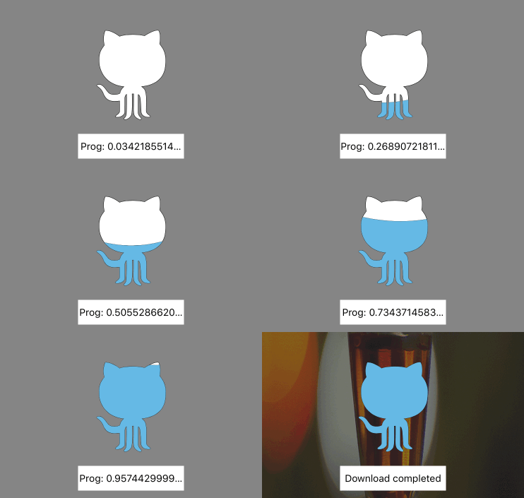
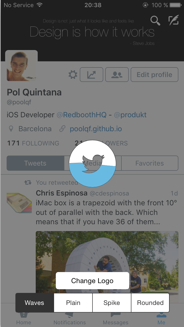
Changelog:
- 1.3.0 (24 Sep 2016)
- Swift 3.0
- 1.2.6 (8 Apr 2016)
- Fixing issue with width assert
- Adapted to Swift 2.2
- 1.2.5 (11 Dec 2015)
- Precompiled framework using Xcode 7.2
- 1.2.4 (28 Oct 2015)
- Fixing issue when showing loader after removing it
- 1.2.2 (27 Oct 2015)
- Precompiled framework using Xcode 7.1
- 1.2.1 (25 Oct 2015)
- Added the possibility to add a loader to a desired UIView
- Updated to Swift 2.0
- 1.1.1 (2 Sep 2015)
- Added Carthage Support
- Added animation when hidding loader
- 1.0.1 (17 Aug 2015)
- Removed unused code
- 1.0.0 (7 Aug 2015)
- Progress based loaders :tada:
- Added documentation to all the public properties and functions
- 0.0.2 Initial Release (3 Aug 2015)
Quick Start:
- Progress based behaviour
Therea are only 2 necessary things to make the progress based loader work:
- Create the loader using
showProgressBasedLoaderWithPath(path:)orcreateProgressBasedLoaderWithPath(path:) - To update the fill progress, update the
progressproperty of the loader, which goes from0.0to1.0
- Creation
There are four main methods to create the loaders:
showProgressBasedLoaderWithPath(path:), createProgressBasedLoaderWithPath(path:),showLoaderWithPath(path:) and createLoaderWithPath(path:)
showLoaderWithPath(path:) or showProgressBasedLoaderWithPath(path:) are going to call the create one, and after it, are going to call the showLoader() method.
So, it is just a helper method to do everything at once.
If you want to create the loader, and not show it at the same moment, you can use createProgressBasedLoaderWithPath(path:) or createLoaderWithPath(path:) to create it, and when you want to show it, just call showLoader()
Sample code:
//PROGRESS BASED:

var loader = WavesLoader.createProgressBasedLoaderWithPath(path)
loader.loaderColor = UIColor.redColor()
        ...
//Do other stuff
        ...
loader.showLoader()

//BASIC

var loader = WavesLoader.createLoaderWithPath(path)
loader.loaderColor = UIColor.redColor()
        ...
//Do other stuff
        ...
loader.showLoader()
- Showing loader in desired view:
All the methods wave the variant version where you can pass it the view in which you want to add the loader:
showProgressBasedLoaderWithPath(path:onView:)createProgressBasedLoaderWithPath(path:onView:)showLoaderWithPath(path:onView:)createLoaderWithPath(path:onView:)
- Deletion:
Just call the method removeLoader() and the loader will disappear and will also be removed from its superview.
Sample code:
loader.removeLoader()
Customization:
Apart from being able to customize the loader shape, you can also customize other properties of the loader. Take a look at the list:
- progressBased: Bool
Indicates if the loader movement is progress based or not (Default: false) - progress: CGFloat
Loader fill progress from 0.0 to 1.0 . It will automatically fire an animation to update the loader fill progress - backgroundColor: UIColor?
Background of the loader view (transparent by default) - loaderColor: UIColor?
Color of the filled loader - loaderBackgroundColor: UIColor?
Color of the unfilled loader - loaderStrokeColor: UIColor?
Color of the path stroke - loaderStrokeWidth: CGFloat
Width of the path stroke - loaderAlpha: CGFloat
Alpha of the loader view (1.0 by default) - cornerRadius: CGFloat
Corner radius of the loader view (0.0 by default) - duration: NSTimeInterval
Duration of the animations (10.0 by default) - rectSize: CGFloat
Height of the loader view - swing: Bool
Bool to indicate if the loader has to swing when going up (small rotation, not available for the Plain loader)
Extra property for Spikes and Rounded loaders:
- -spikeHeight: CGFloat
Height of the spike
Installation:
• CocoaPods
use_frameworks!

pod 'FillableLoaders', '~>1.3.0'
• Carthage
github "poolqf/FillableLoaders" ~> "1.3.0"
• Manually
To manually add FillableLoaders to your project you just need to copy the Source folder files.
How to create my own CGPath?
:warning: The CGPath bounds cannot exceed the bounds of the loaderView:
- Width: Screen width
- Height: rectSize property
• Manually
let path = CGPathCreateMutable()
CGPathMoveToPoint(path, nil, 0, height/2)
CGPathAddLineToPoint(path, nil, width + 100, height/2)
CGPathAddLineToPoint(path, nil, width + 100, height*2)
CGPathAddLineToPoint(path, nil, 0, height*2)
CGPathCloseSubpath(path)
return path
• PaintCode
PaintCode is a realy powerful Mac app that can do a lot of things.
You can just draw things, and it will automagically create the code for you
In this case we can use it to create BezierPaths, and extract from there the CGPath.
In the case of drawing a star, it is going to give us this code:
//// Star Drawing
var starPath = UIBezierPath()
starPath.moveToPoint(CGPointMake(180, 25))
starPath.addLineToPoint(CGPointMake(195.16, 43.53))
starPath.addLineToPoint(CGPointMake(220.9, 49.88))
starPath.addLineToPoint(CGPointMake(204.54, 67.67))
starPath.addLineToPoint(CGPointMake(205.27, 90.12))
starPath.addLineToPoint(CGPointMake(180, 82.6))
starPath.addLineToPoint(CGPointMake(154.73, 90.12))
starPath.addLineToPoint(CGPointMake(155.46, 67.67))
starPath.addLineToPoint(CGPointMake(139.1, 49.88))
starPath.addLineToPoint(CGPointMake(164.84, 43.53))
starPath.closePath()
UIColor.grayColor().setFill()
starPath.fill()
The only thing we have to do here is extract the CGPath from the UIBezierPath like so:
let myPath = starPath.CGPath
var myLoader = WavesLoader.showProgressBasedLoaderWithPath(myPath)
• SVG + PaintCode
A feature that I LOVE from PaintCode is that you can import an .svg file, and it is going to create the code to create its BezierPath. Completely awesome.
That's how I did the Github and Twitter logos, for example.
Technical details:
- Swift 3.0
- Animations using CAKeyFrameAnimation
