Indicator Button
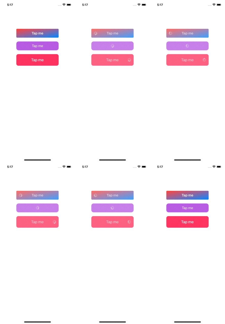
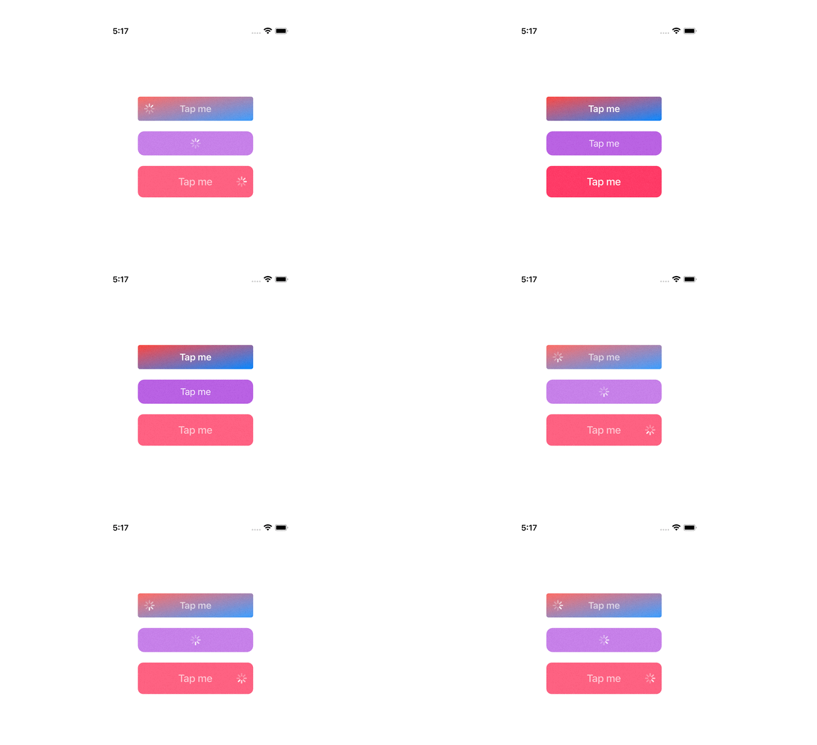
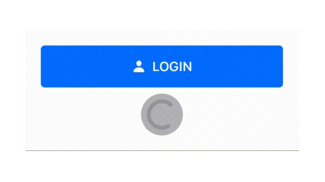
Custom of loading buttons in Swift.

Features
- Customizable: You can easily inherit and create beautiful loading buttons for your great application.
Getting started
Declaration.
var loadingButton: LoadingButton!
loadingButton = LoadingButton(text: "Tap me",
                              textColor: UIColor.white,
                              font: UIFont.systemFont(ofSize: 18, weight: .semibold),
                              backgroundColor: .systemBlue,
                              cornerRadius: 4.0,
                              indicatorPosition: .left)
Show loading indicator.
loadingButton.start()
Hide loading indicator.
loadingButton.stop()
Appearance
Supported appearance properties are:
| Property | Type | Description |
|---|---|---|
animatedScale |
CGFloat |
Animated scale |
animatedScaleDuration |
Double |
Animated scale duration |
borderColor |
UIColor |
Border color |
borderWidth |
CGFloat |
Border width |
cornerRadius |
CGFloat |
Corner radius |
shadowColor |
UIColor |
The color of the layer's shadow |
shadowOffset |
CGSize |
The offset of the layer's shadow |
shadowOpacity |
Float |
The opacity of the layer's shadow |
shadowRadius |
CGFloat |
The blur radius of the layer's shadow |
gradientEnabled |
Bool |
Enable gradient background color |
gradientStartColor |
UIColor |
Start of color gradient |
gradientEndColor |
UIColor |
End of color gradient |
gradientDirection |
Int |
Direction of color gradient 0~7 |
Predefined position of indicator.
public enum IndicatorPosition {
    case left
    case center
    case right
}
Predefined directions for color gradient.
public enum GradientDirection: Int {
    case toTop         = 0
    case toRight       = 1
    case toBottom      = 2
    case toLeft        = 3
    case toTopRight    = 4
    case toTopLeft     = 5
    case toBottomRight = 6
    case toBottomLeft  = 7
}
Requirements
- Swift 5.0
- iOS 11.0+
Installation
...
Incoming improvements
- More loading indicators.
- Add test cases.
- CocoaPods library.


