SwiftUI LoadingButton
Simple Loading Animation Button for SwiftUI.
? Getting Started
Requirements
- Xcode 11+
- SwiftUI
- iOS 14+
- macOS 10.15+
Installaion
Swift Package Manager(SPM)
File ➜ Swift Packages ➜ Add Package Dependancy..
.package(url: "https://github.com/Changemin/LoadingButton", from: "1.1.2")
?Usage
LoadingButton(action: { }, isLoading: <Binding>Bool, style: LoadingButtonStyle) {
    // View on the button
    // style is optional parameter
action: Actions to do when button clickedisLoading:<Binding>Booltype. you can control loading status with this.style(Optional) : Custom style withLoadingButtonStyle
?Custom Modifiers
LoadingButtonStyle(width: CGFloat,
                   height: CGFloat,
                   cornerRadius: CGFloat,
                   backgroundColor: Color,
                   loadingColor: Color,
                   strokeWidth: CGFloat,
                   strokeColor: Color)

// All of the parameter is optional
width(Optional) : Width of buttonheight(Optional) : Height of buttoncornerRadius(Optional) : Corner radius of buttonbackgroundColor(Optional) : Background color of buttonloadingColor(Optional) : Background color of button whenLoading, default is 50% opacity ofbackgroundColorstrokeWidth(Optional) : Circle loading indicator stroke widthstrokeColor(Optional) : Circle loading indicator stroke Color(default: gray)
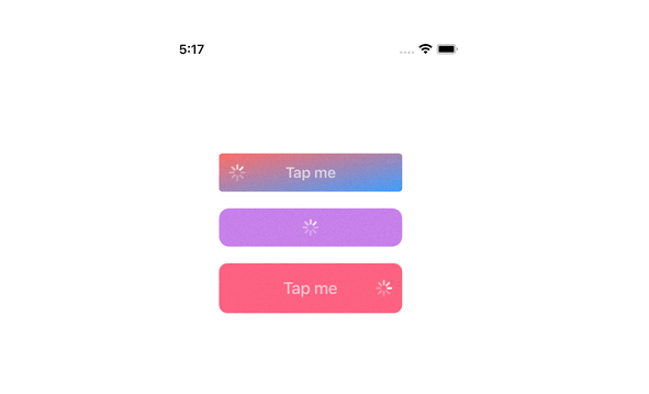
Example
? Simple
import SwiftUI
import LoadingButton

struct ContentView: View {
    @State var isLoading: Bool = false

    var body: some View {
        LoadingButton(action: {
            // Your Action here
        }, isLoading: $isLoading) {
            Text("LoadingButton").foregroundColor(Color.white)
        }
    }
}
Result


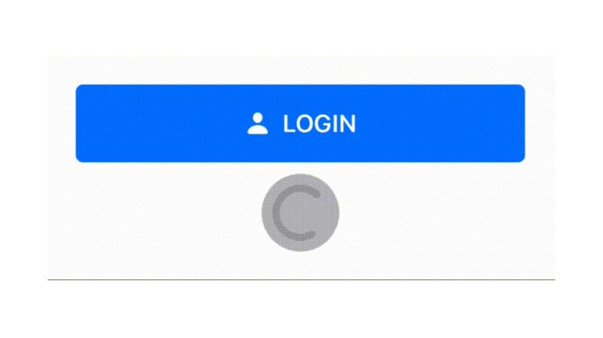
?? Applying Fully Custom Style
import SwiftUI
import LoadingButton

struct ContentView: View {
    @State var isLoading: Bool = false
    var style = LoadingButtonStyle(width: 312,
                              height: 54,
                              cornerRadius: 27,
                              backgroundColor: .orange,
                              loadingColor: Color.orange.opacity(0.5),
                              strokeWidth: 5,
                              strokeColor: .gray)

    var body: some View {
        LoadingButton(action: {
            // Your Action here
        }, isLoading: $isLoading, style: style) {
            Text("Styled LoadingButton").foregroundColor(Color.white)
        }
    }
}
Result


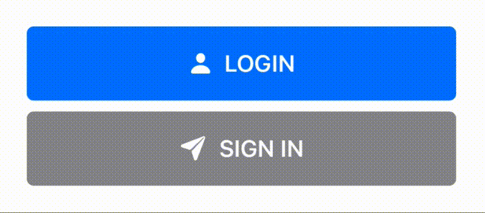
?? Styling Only Needs
import SwiftUI
import LoadingButton

struct ContentView: View {
    @State var isLoading: Bool = false

    var body: some View {
        LoadingButton(action: {
            // Your Action here
        }, isLoading: $isLoading, style: LoadingButtonStyle(cornerRadius: 27, backgroundColor: .orange)) {
            Text("Styled LoadingButton").foregroundColor(Color.white)
        }
    }
}
Same Result
✅ TODO
- [ ] End animation(normal, shake(when fail), expand)
- [ ] Support gradient background color